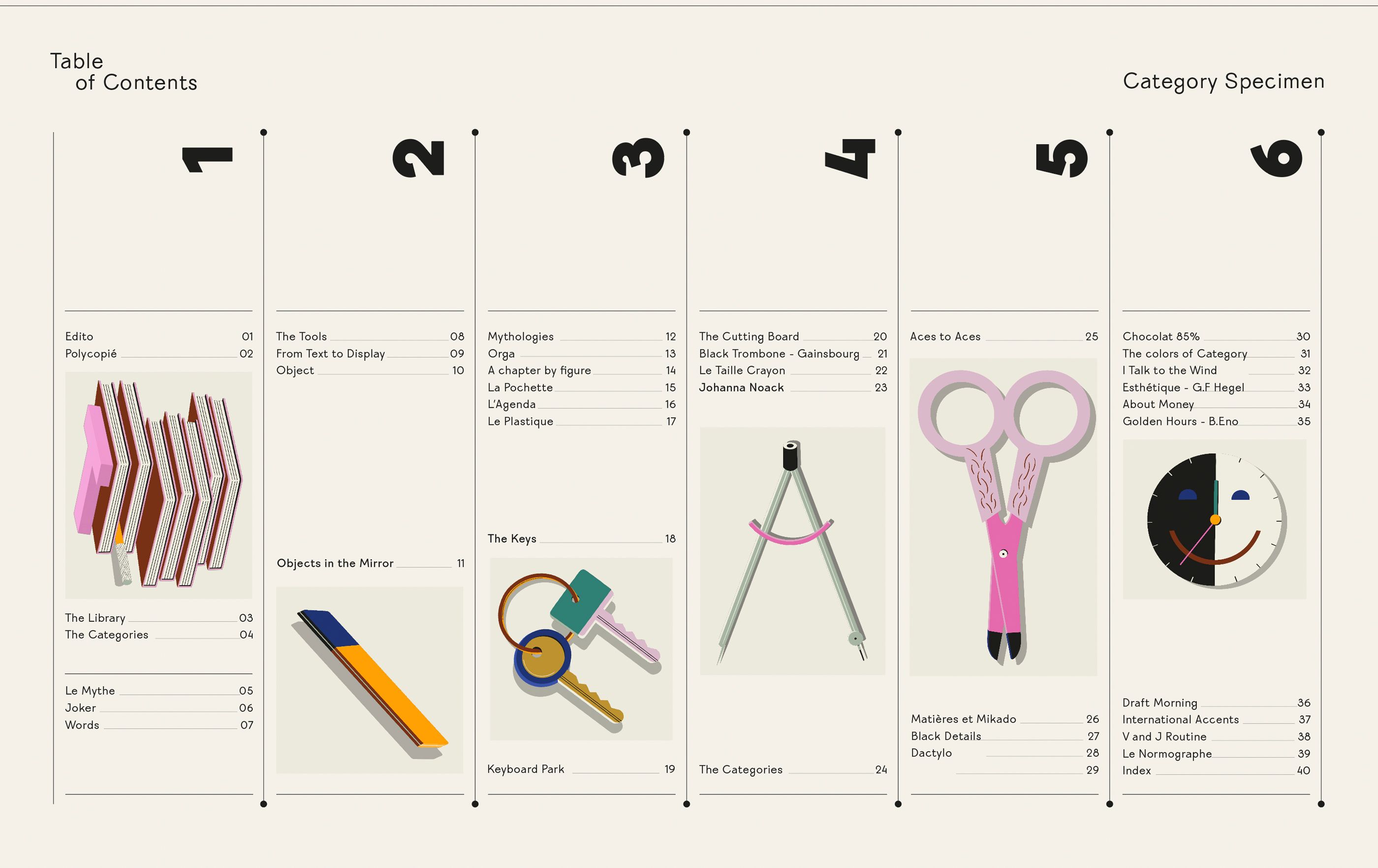
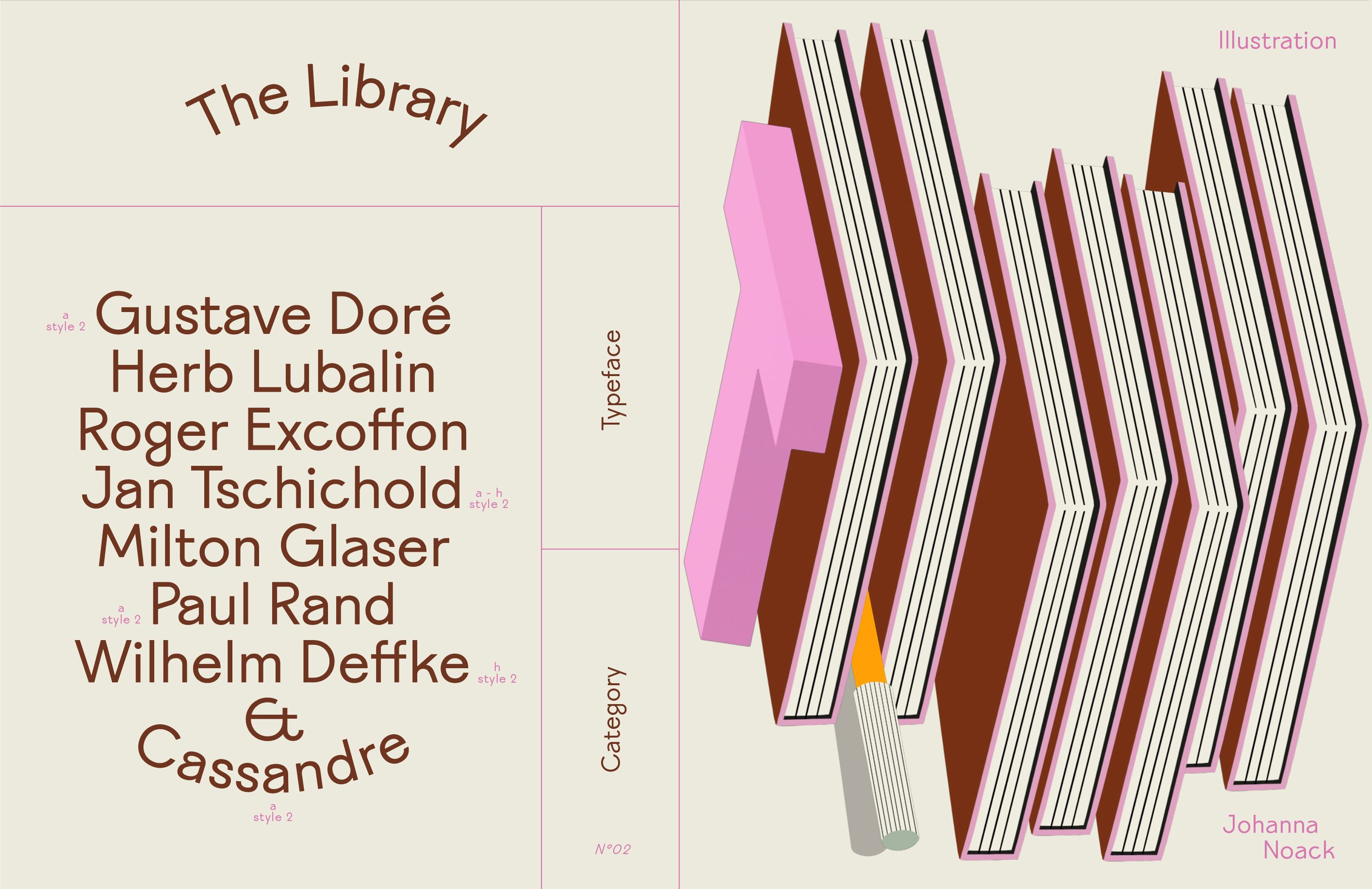
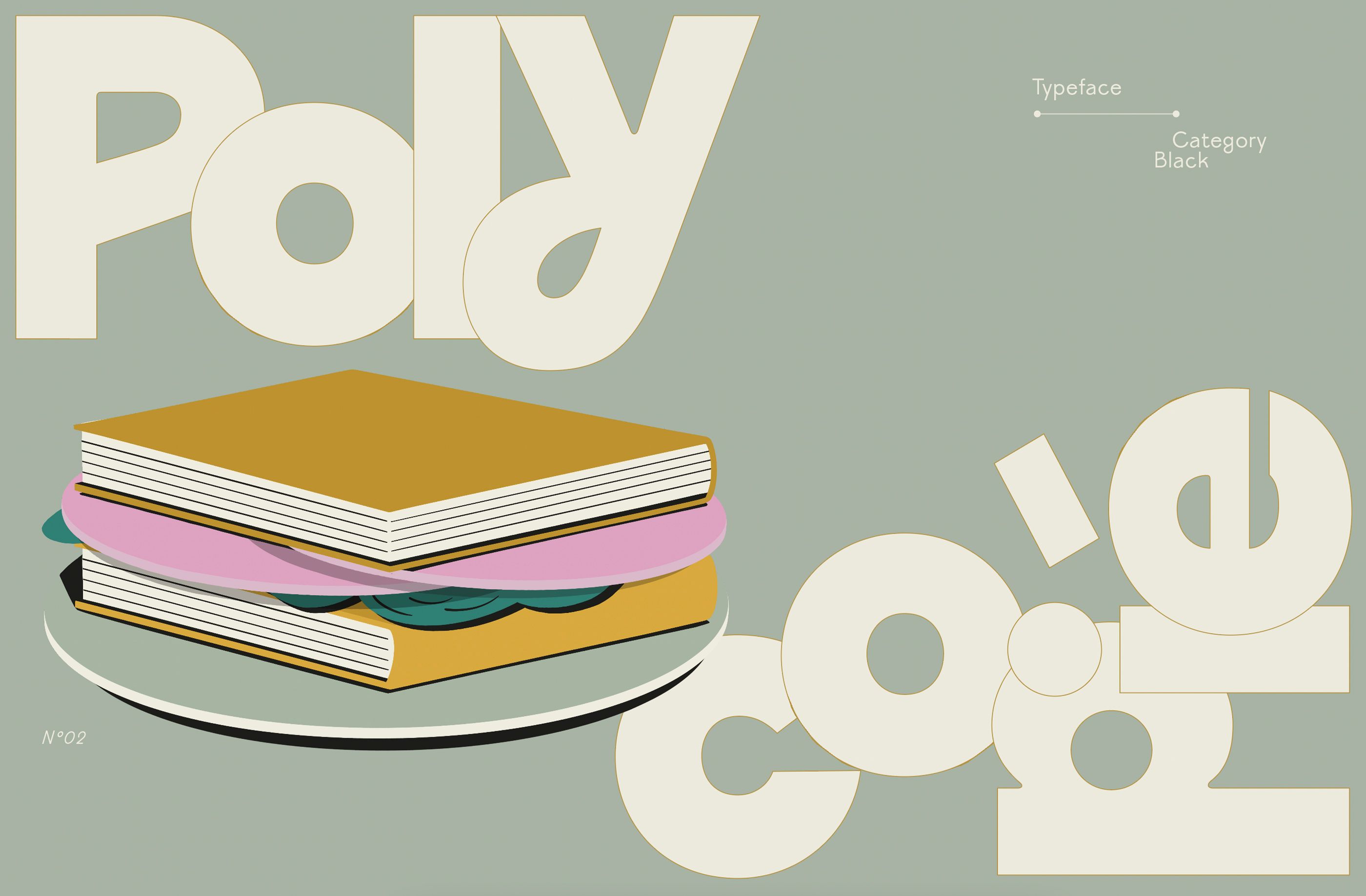
Bienvenue au studio. In our routine, our well-organized
mess filled with our everyday-work life object.
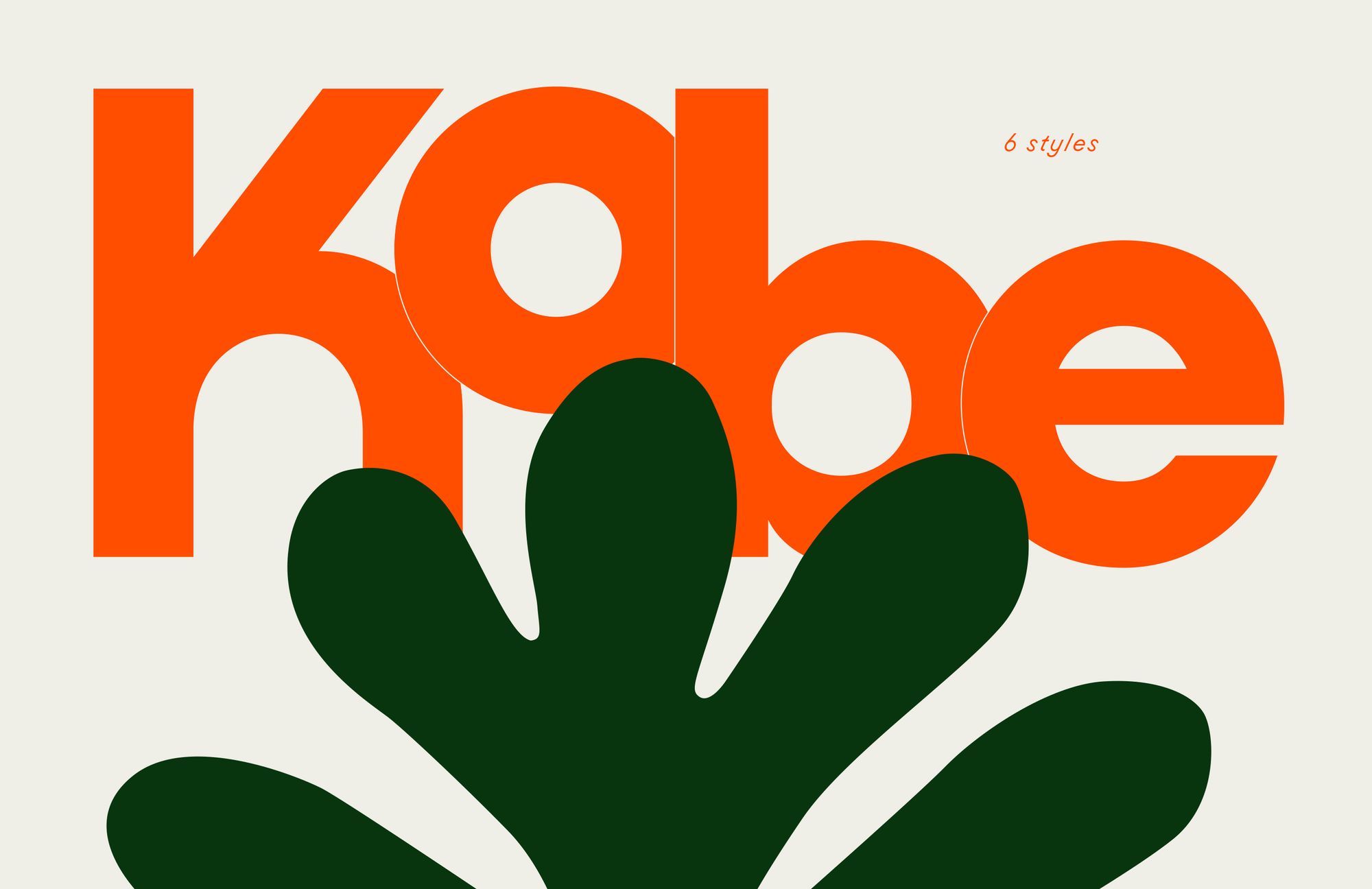
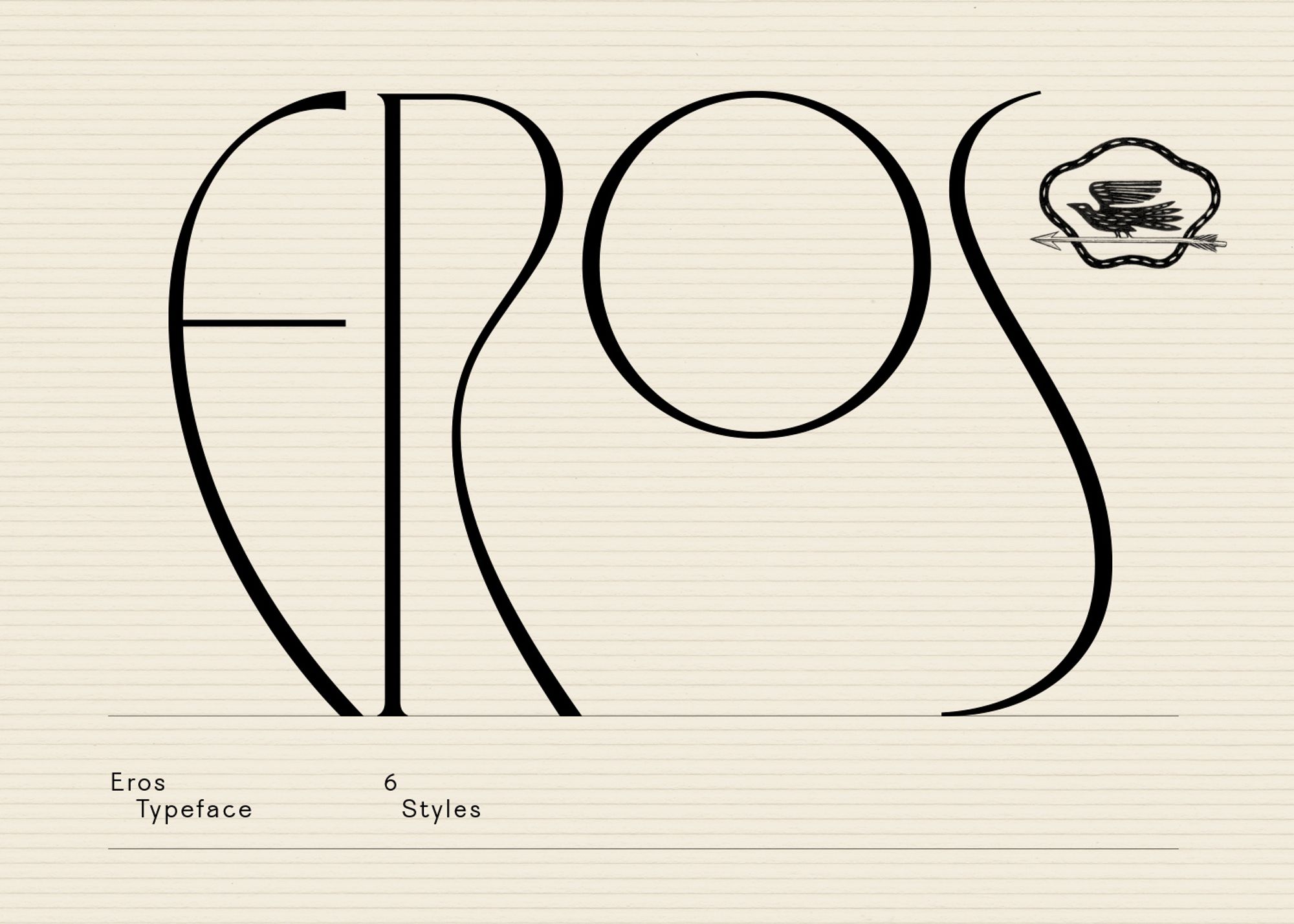
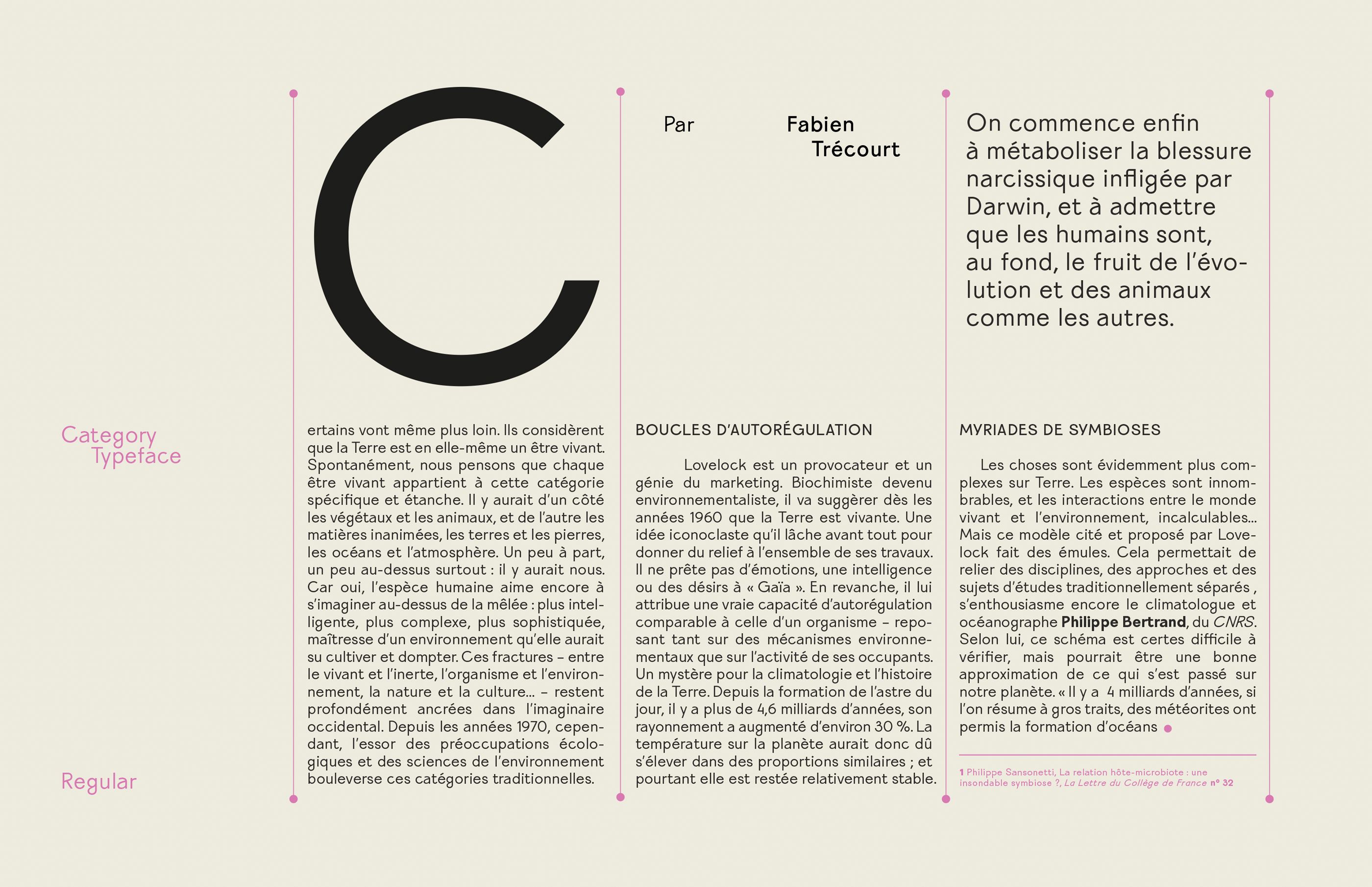
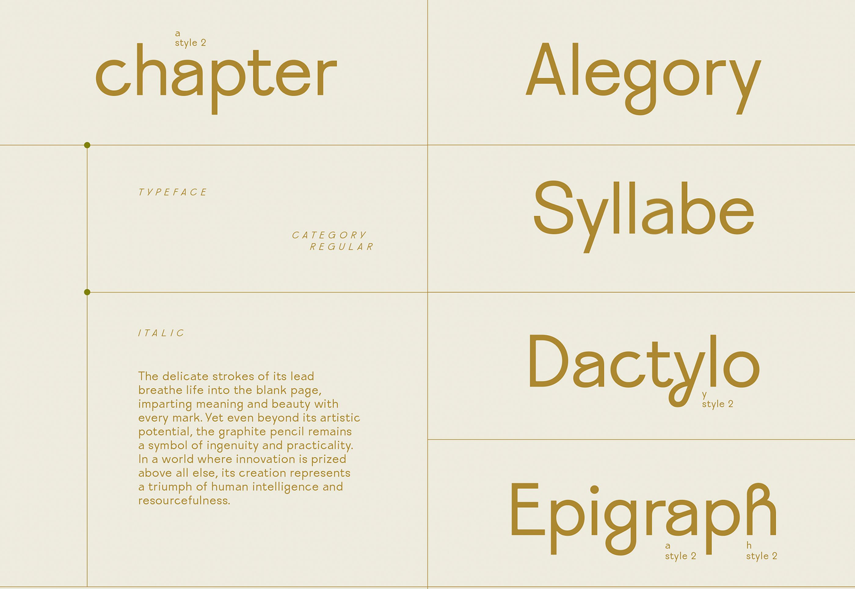
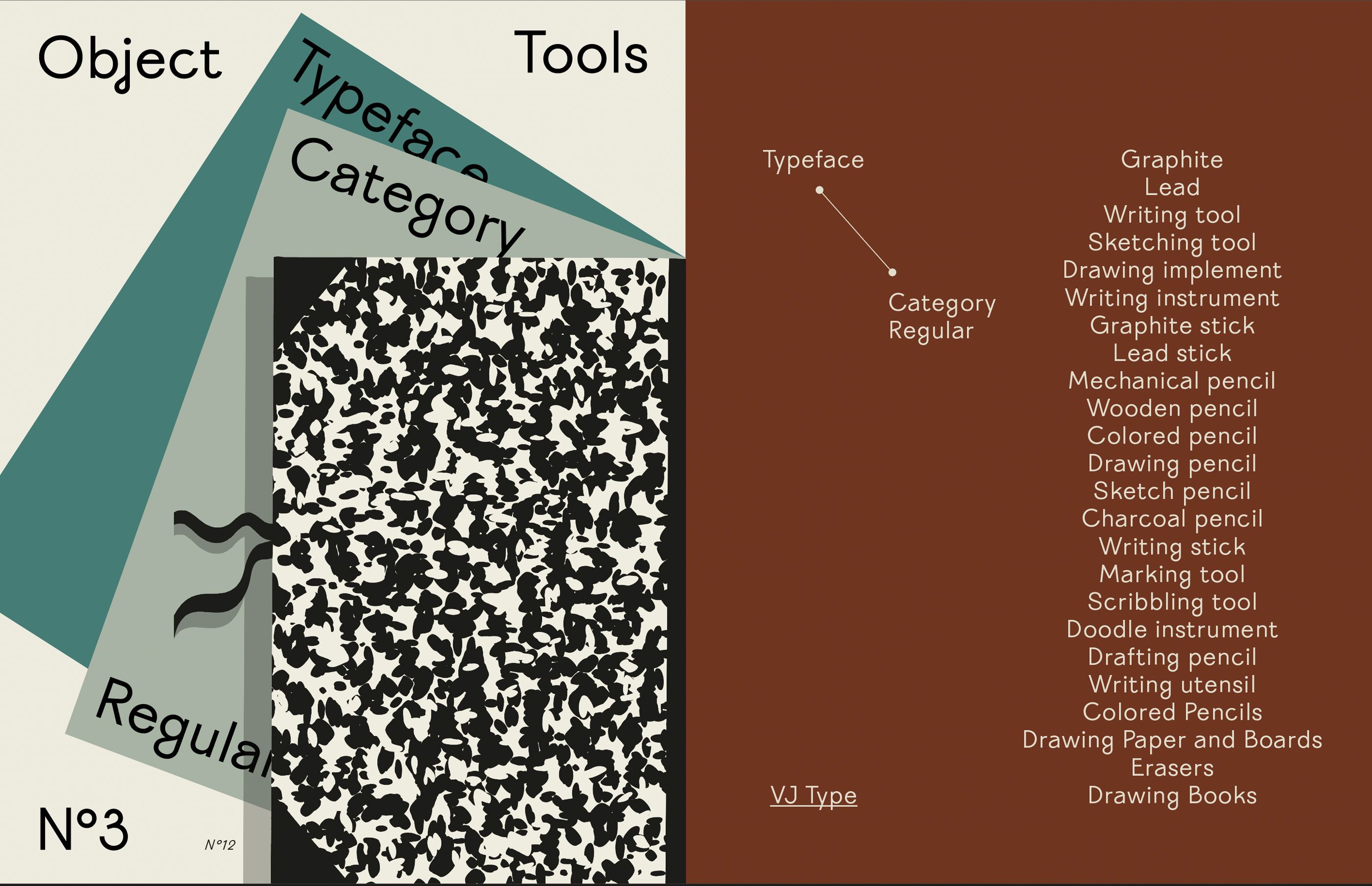
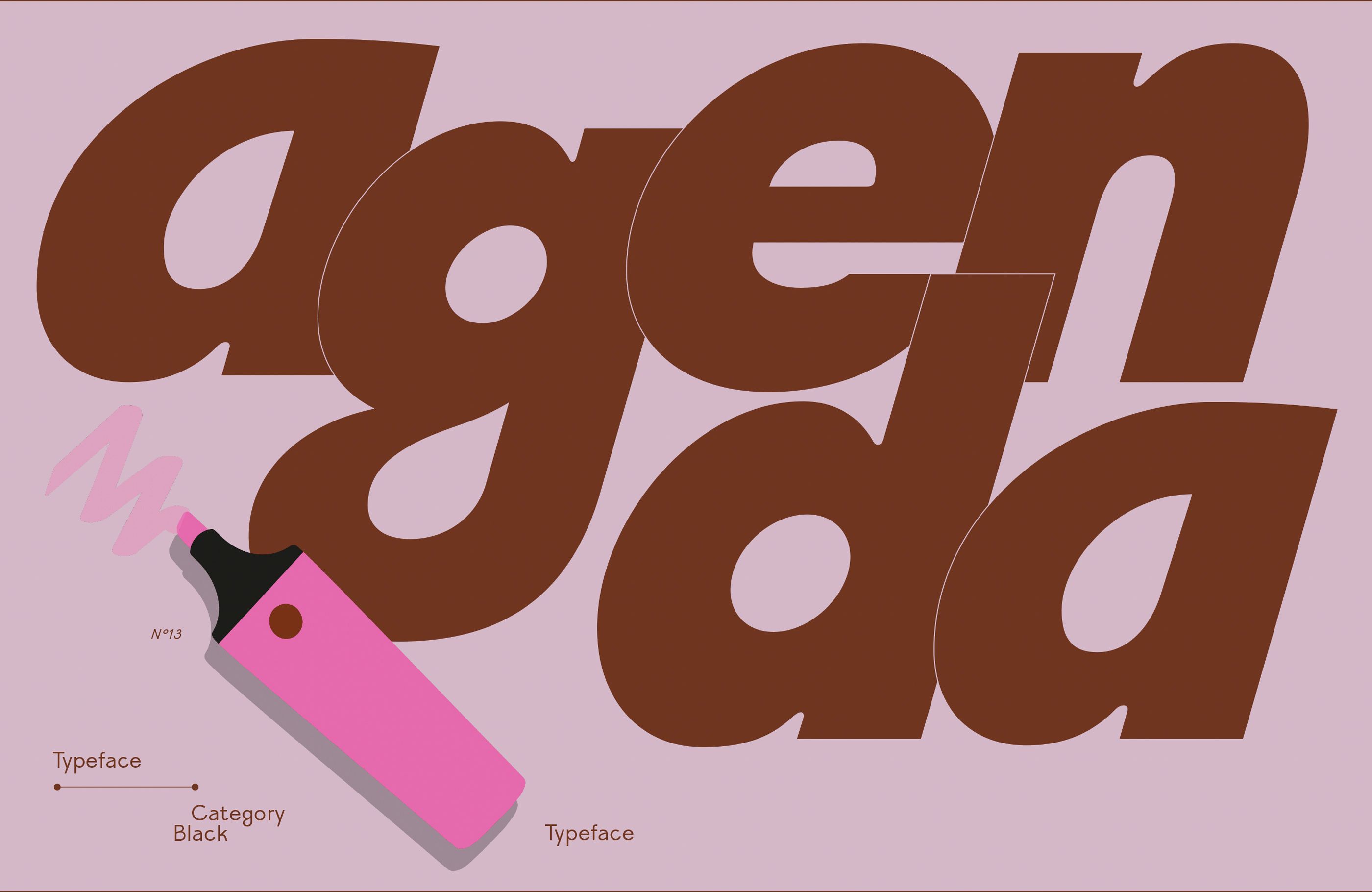
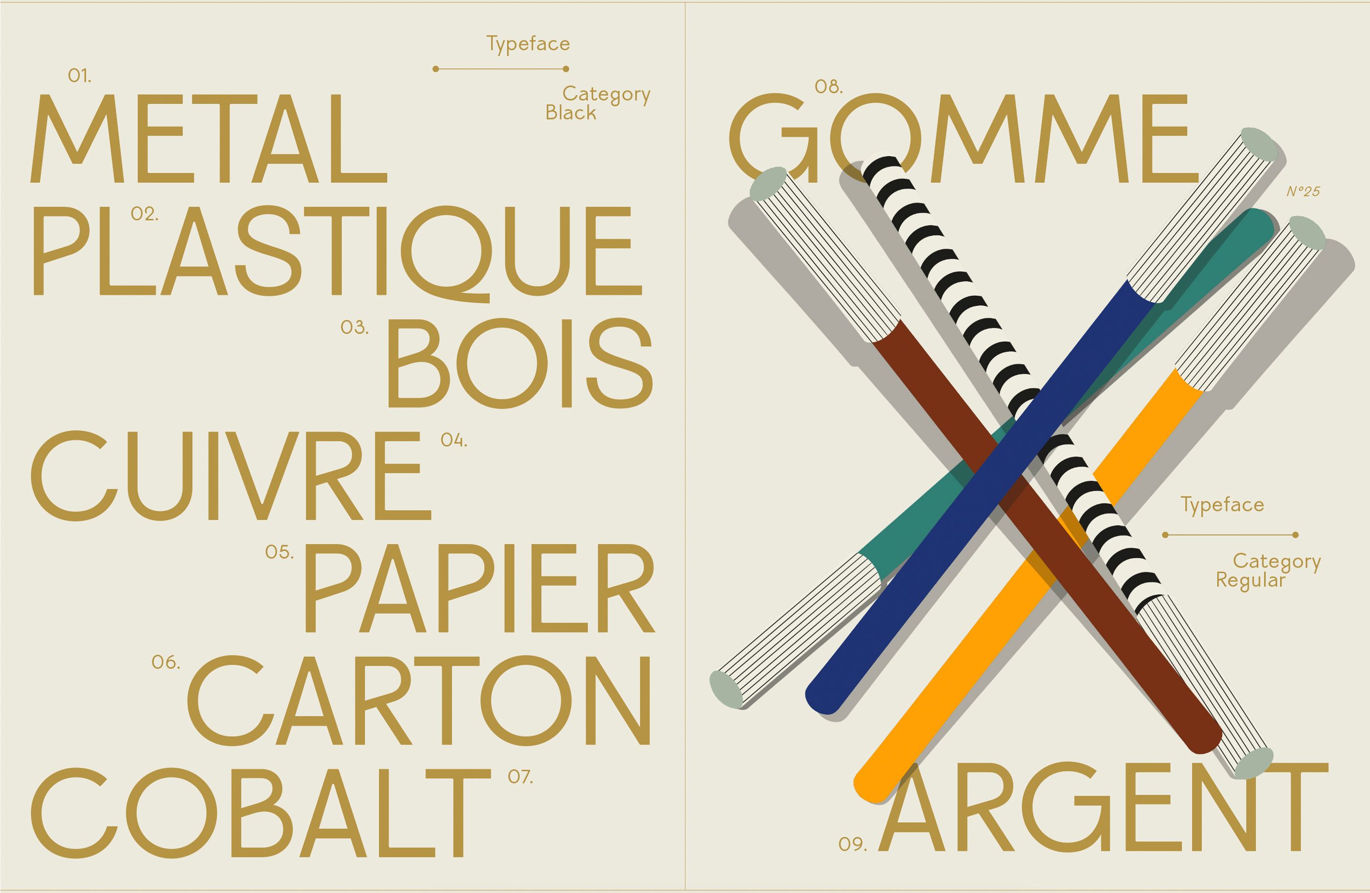
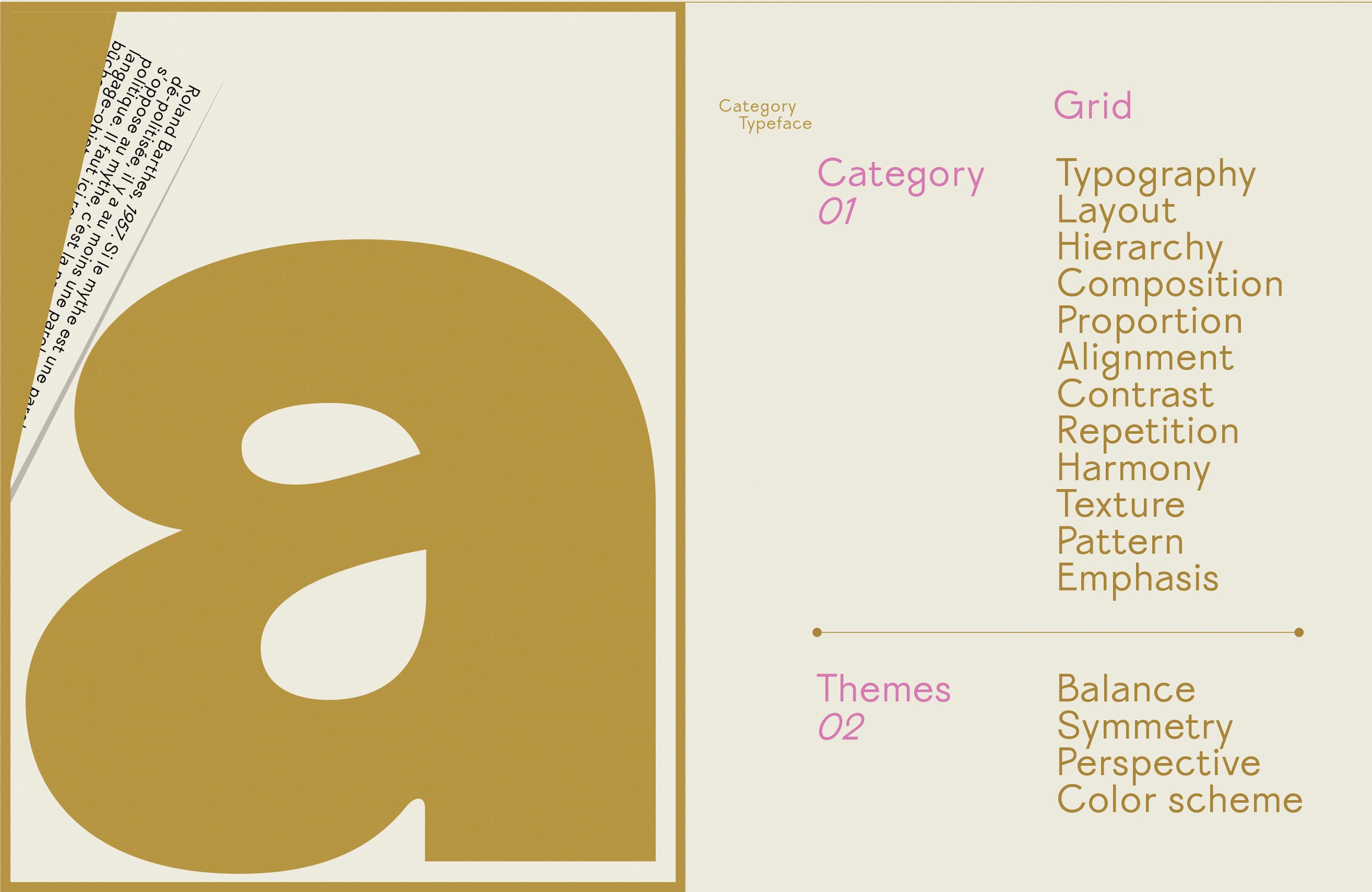
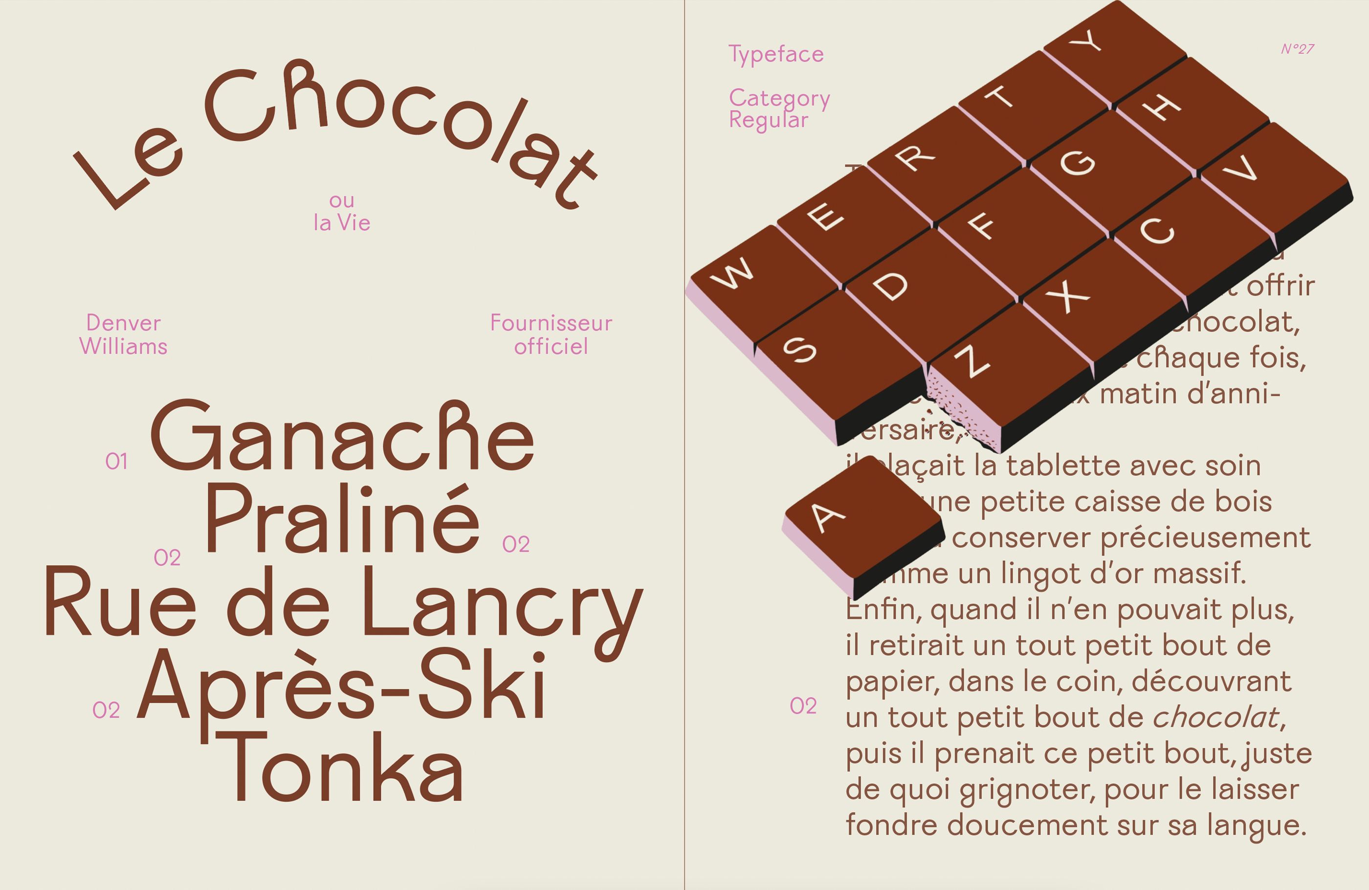
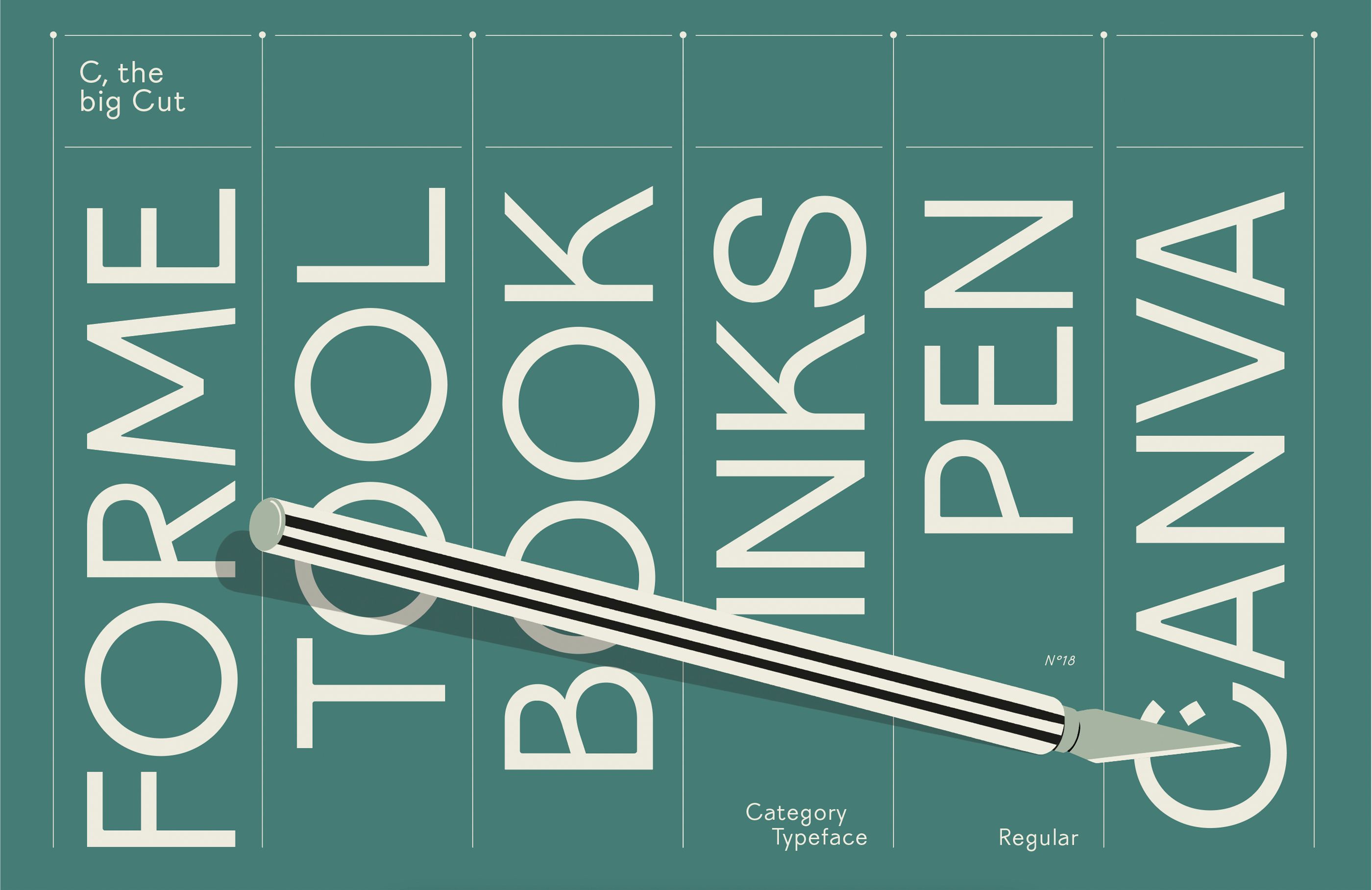
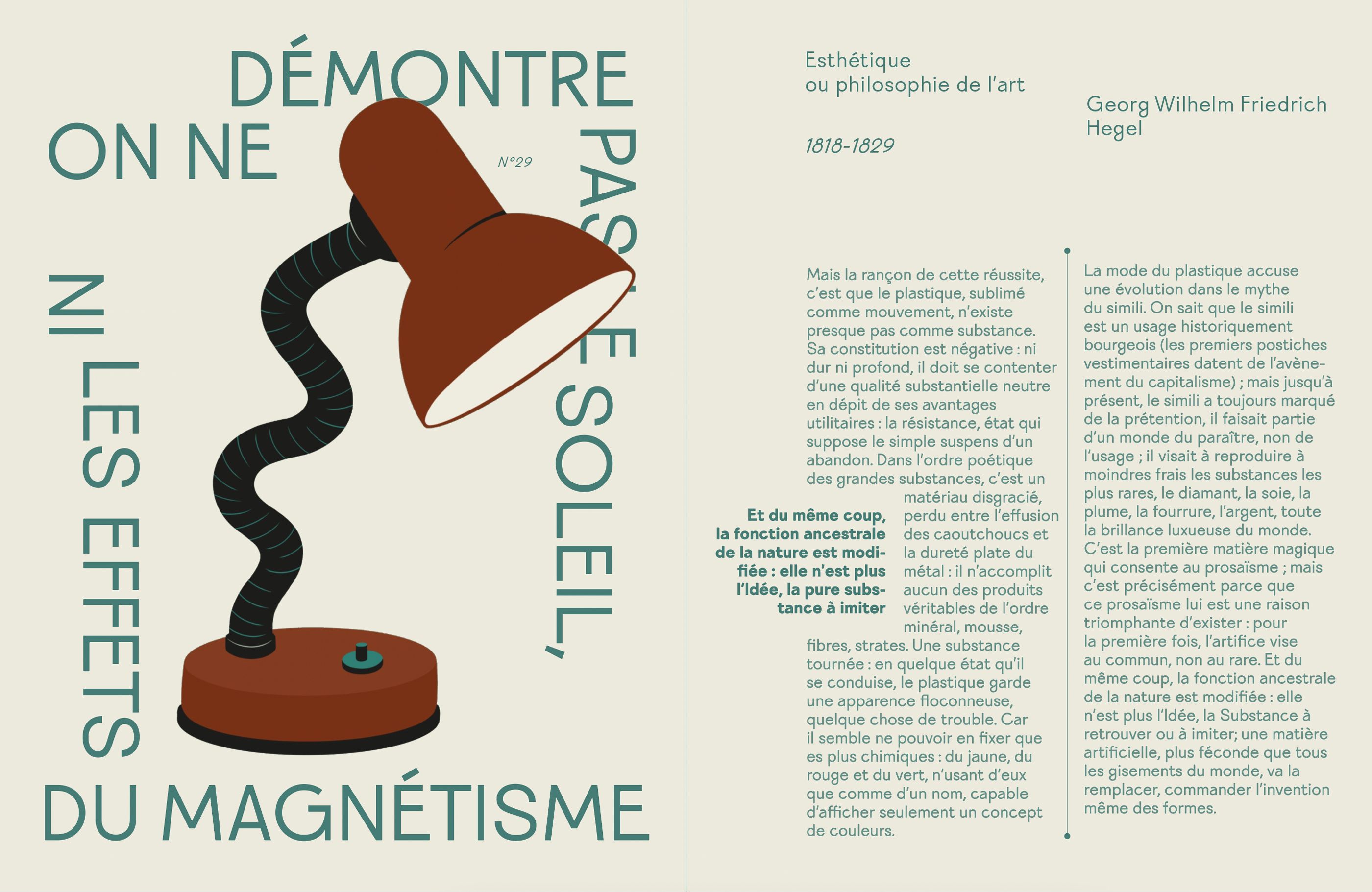
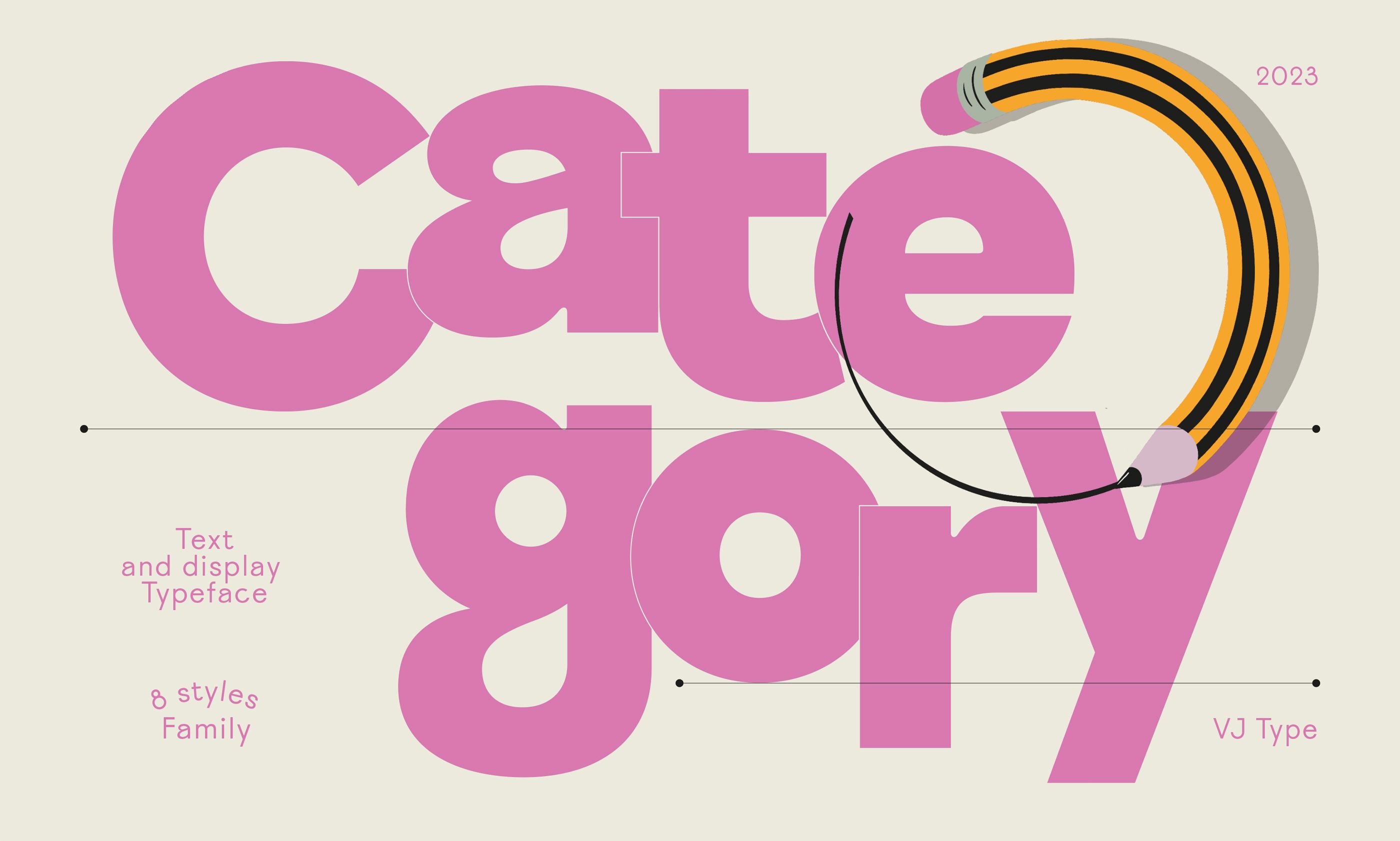
Category is a sensible and mocking expression of our working process: we started with the will of drawing a useful, legible, balanced, elegant text font. And this inevitable moment happened when we felt the urge to add stronger stylistic details. Almost unintentionally. Category mixes business with pleasure. It’s a sans serif font with utilitarian and stylistic functions. It was designed with this specific balance so it can be used for any kind of content: long texts, body-copy, titles, logotypes.
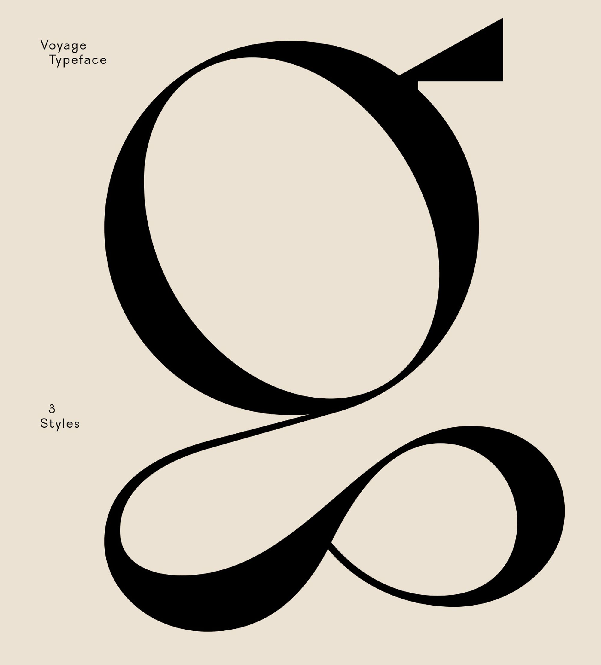
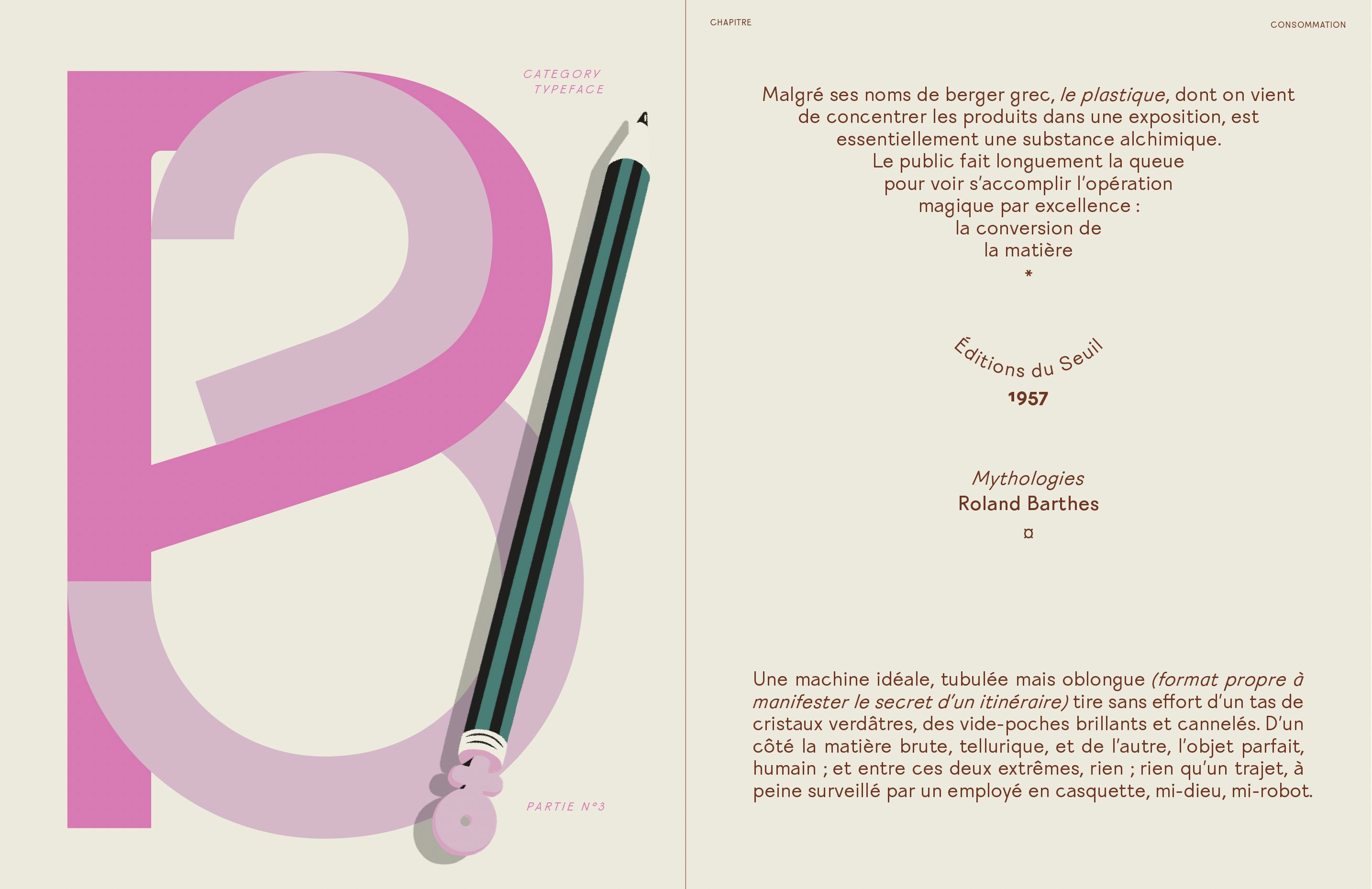
We like to think of Category as a universal and friendly font with a slight touch of eccentricity. It brings something sensitive to the geometric grotesk genre. The design originated from geometrical shapes with low-contrast and it features some graphic singularities that make it pure and elegant but yet reasonably curvy and funny. Lower-cases a g j and y are the best demonstration of that balance. The CBRP bring style to the uppercases set with its original angles.
Could we have the audacity to say Category is square yet round? ✿

