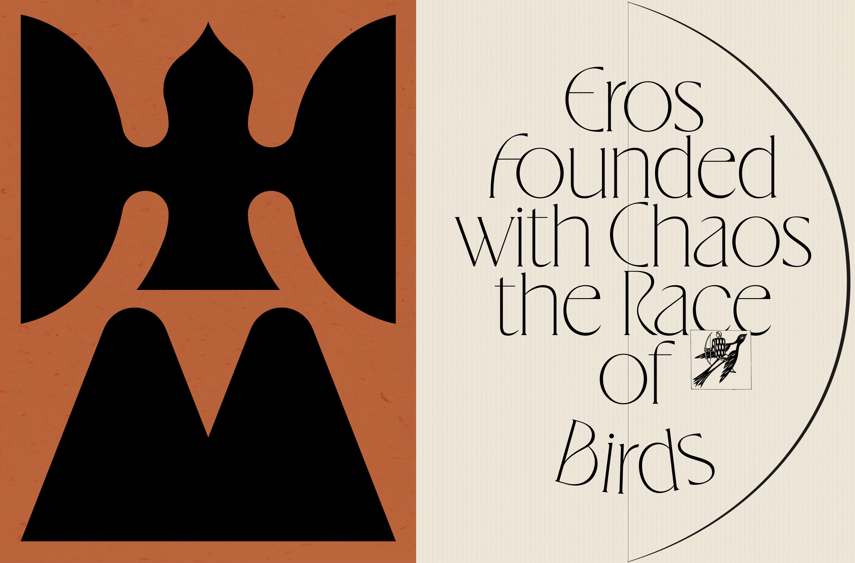
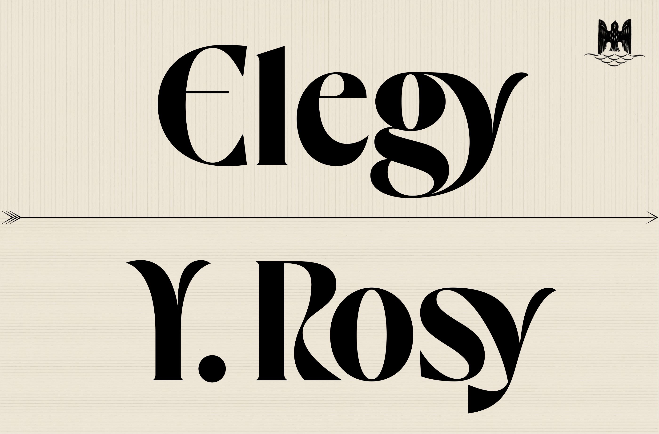
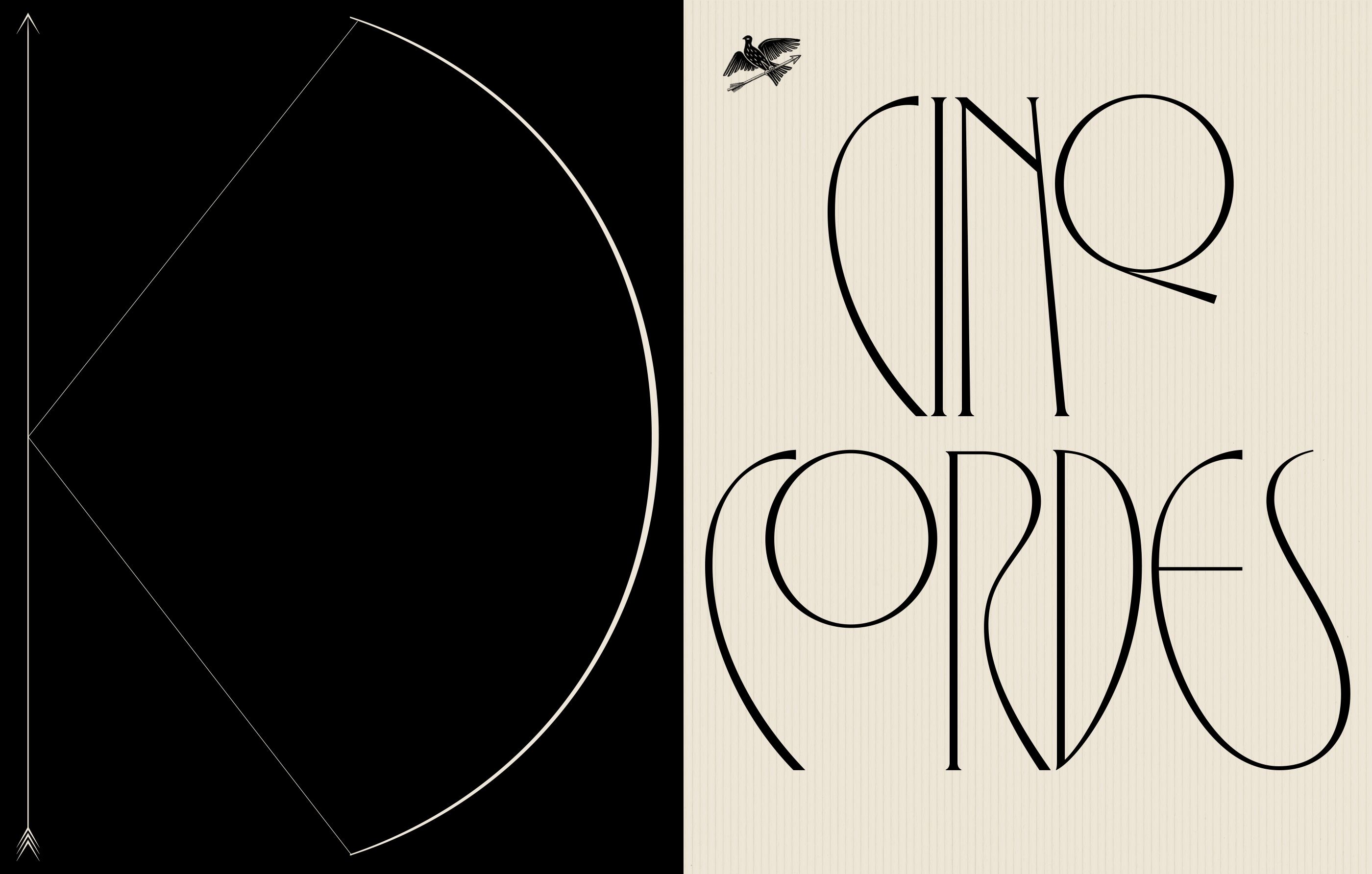
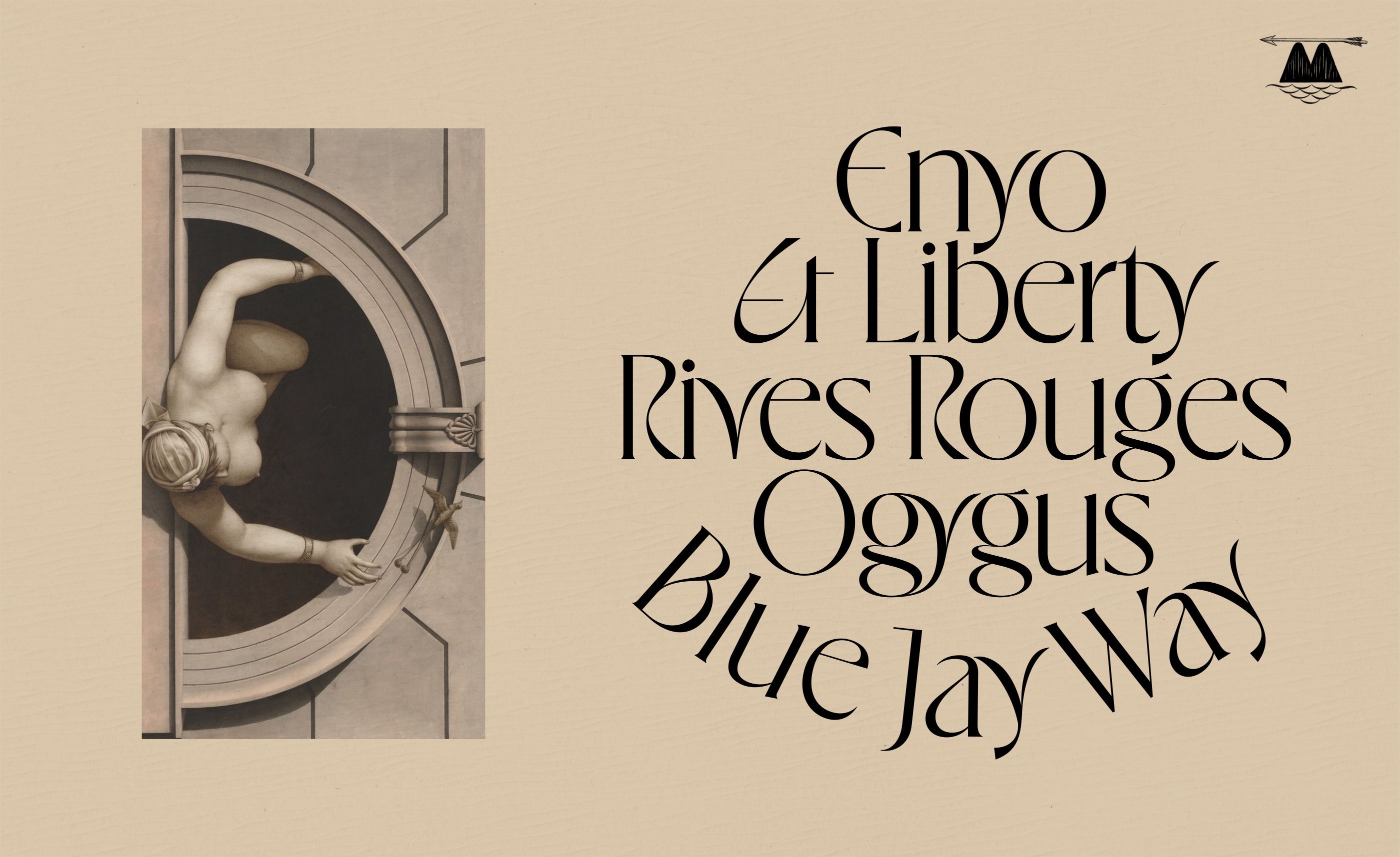
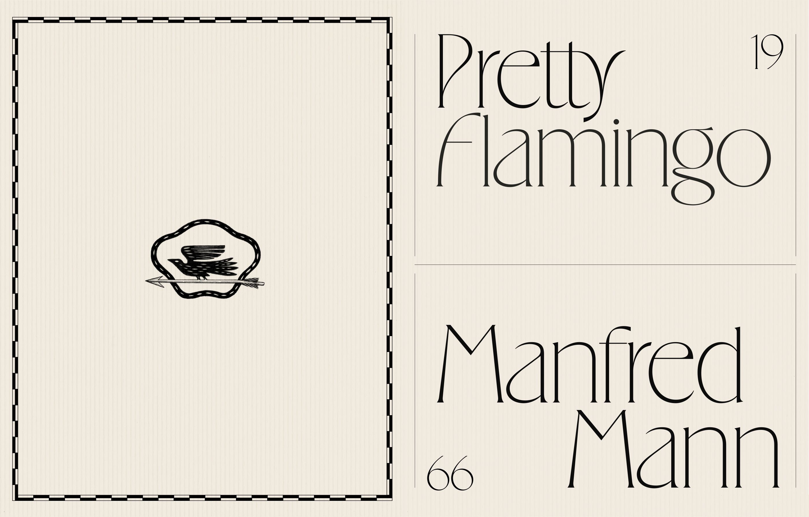
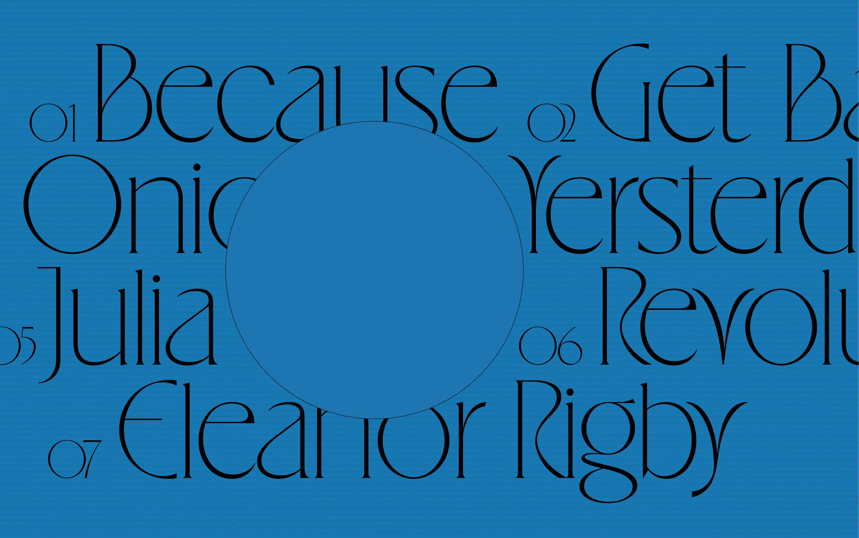
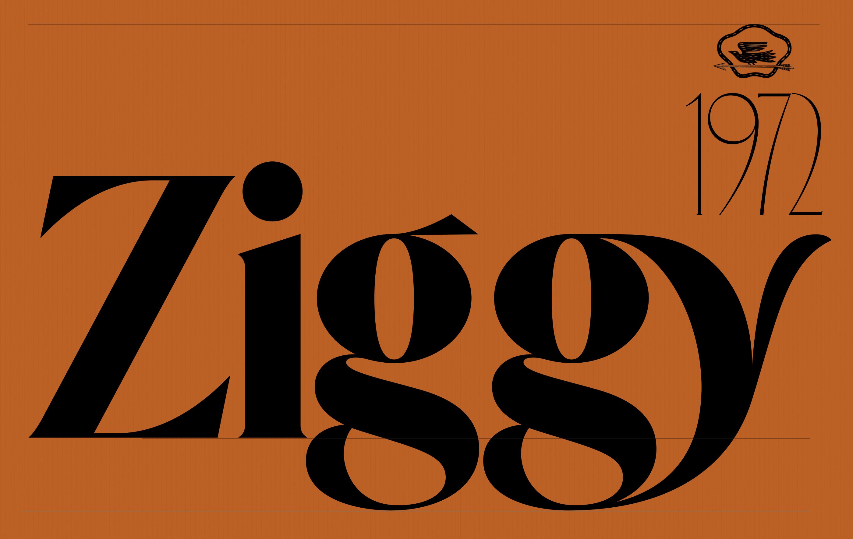
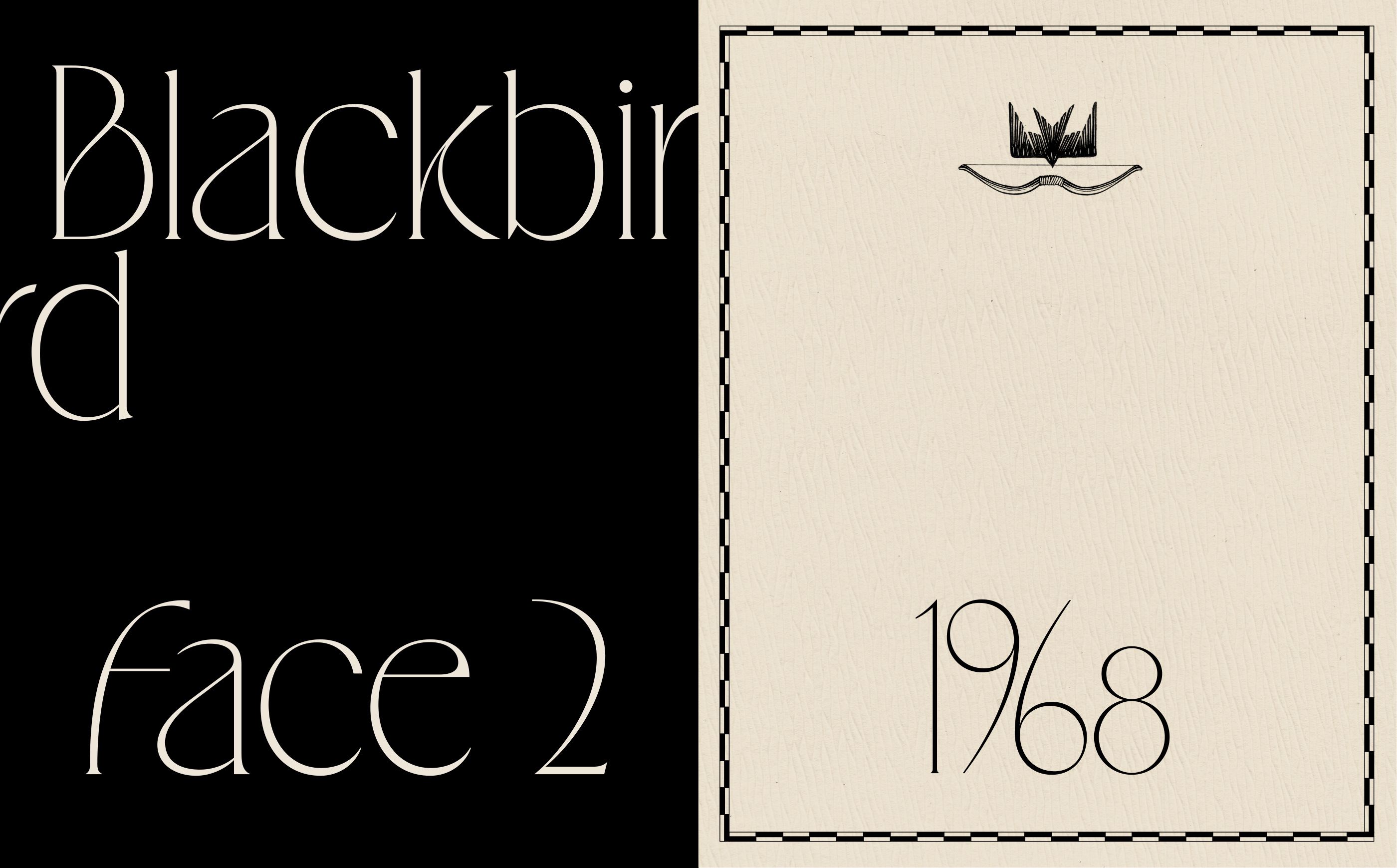
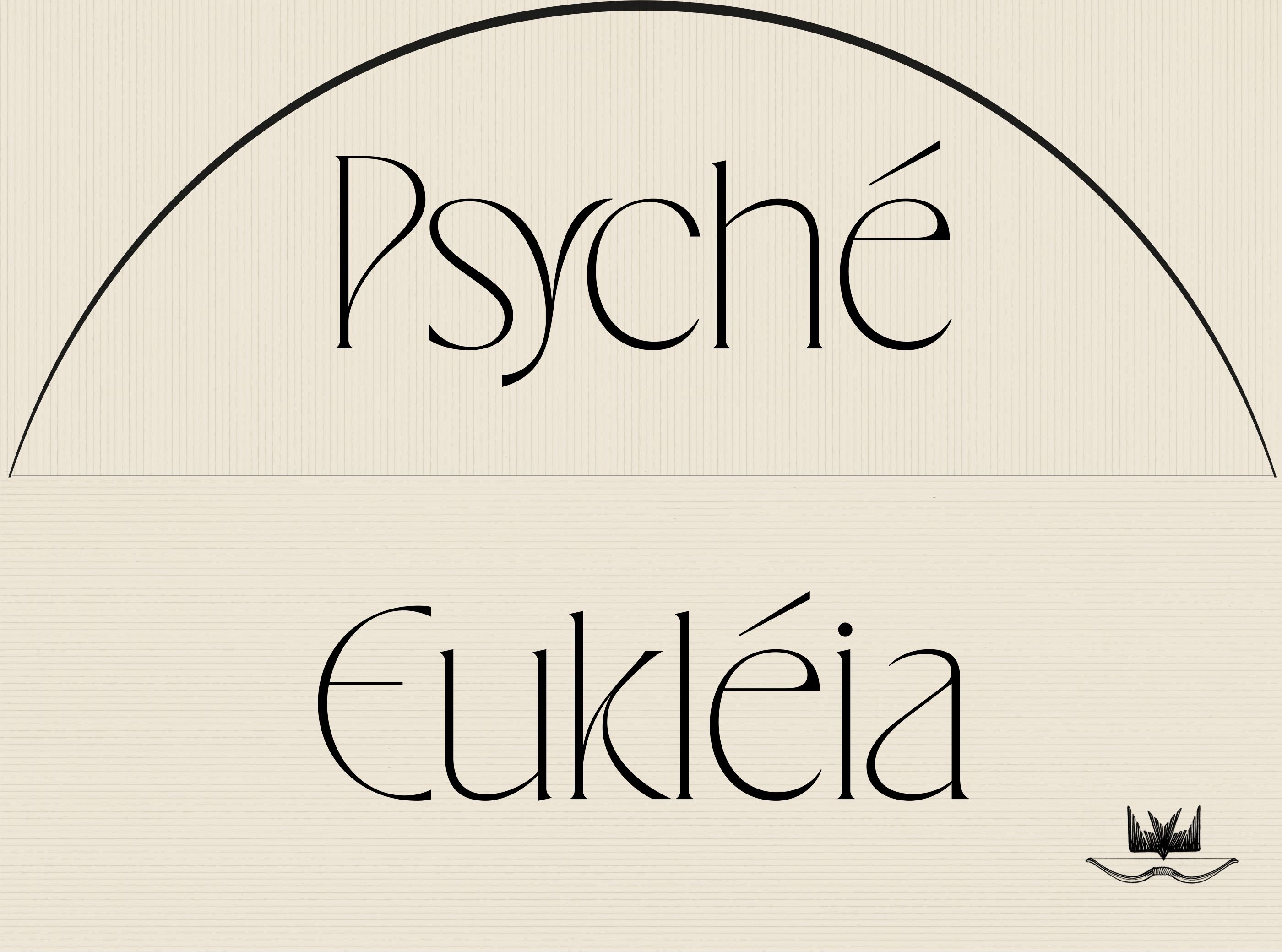
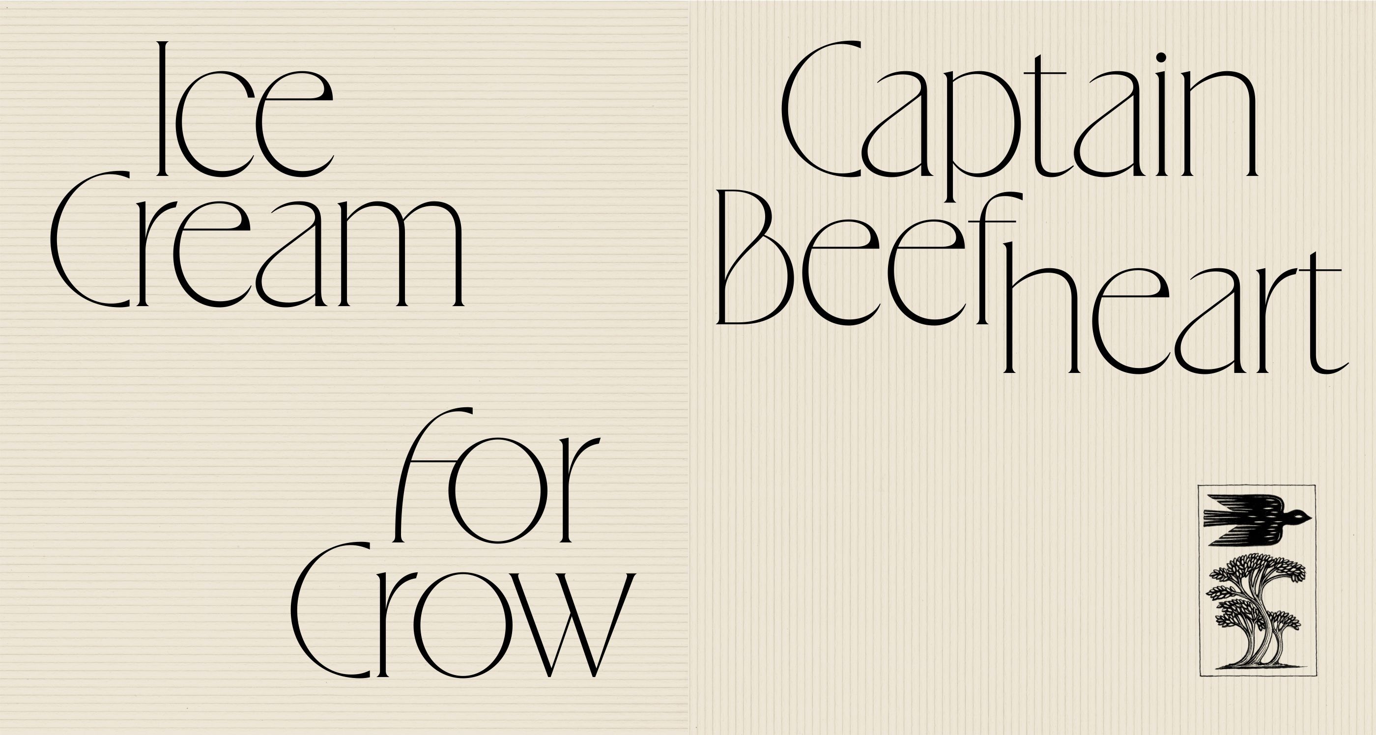
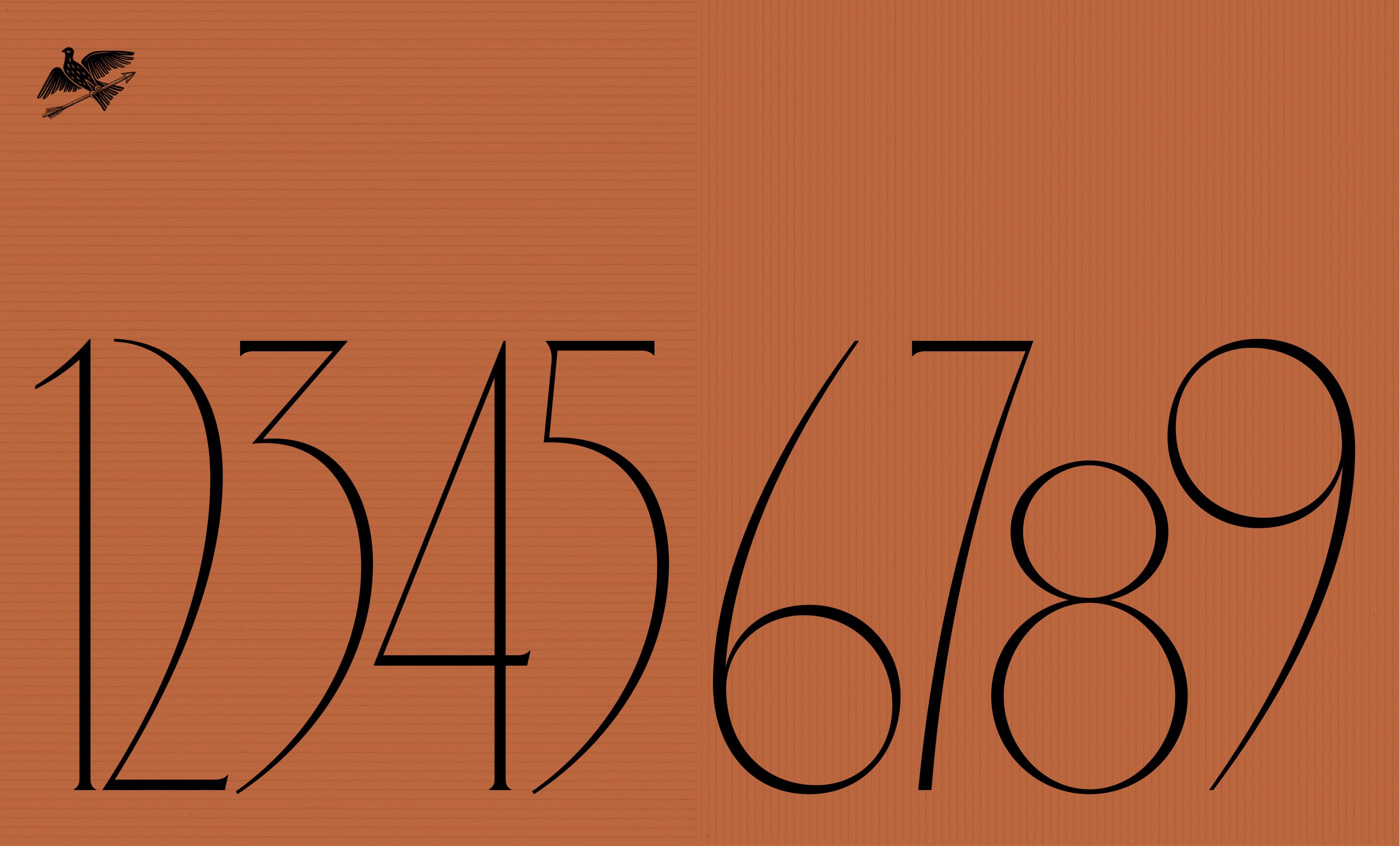
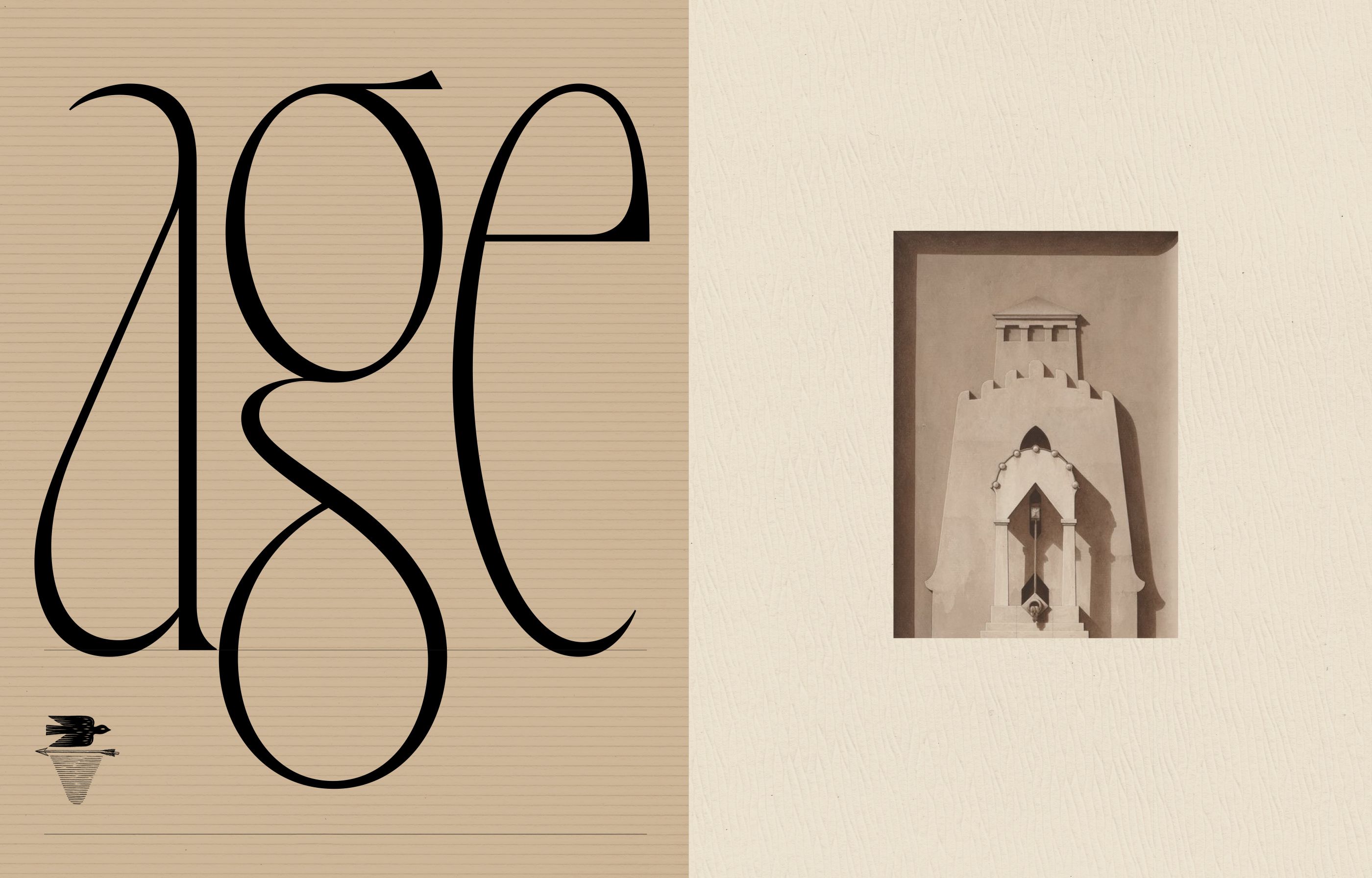
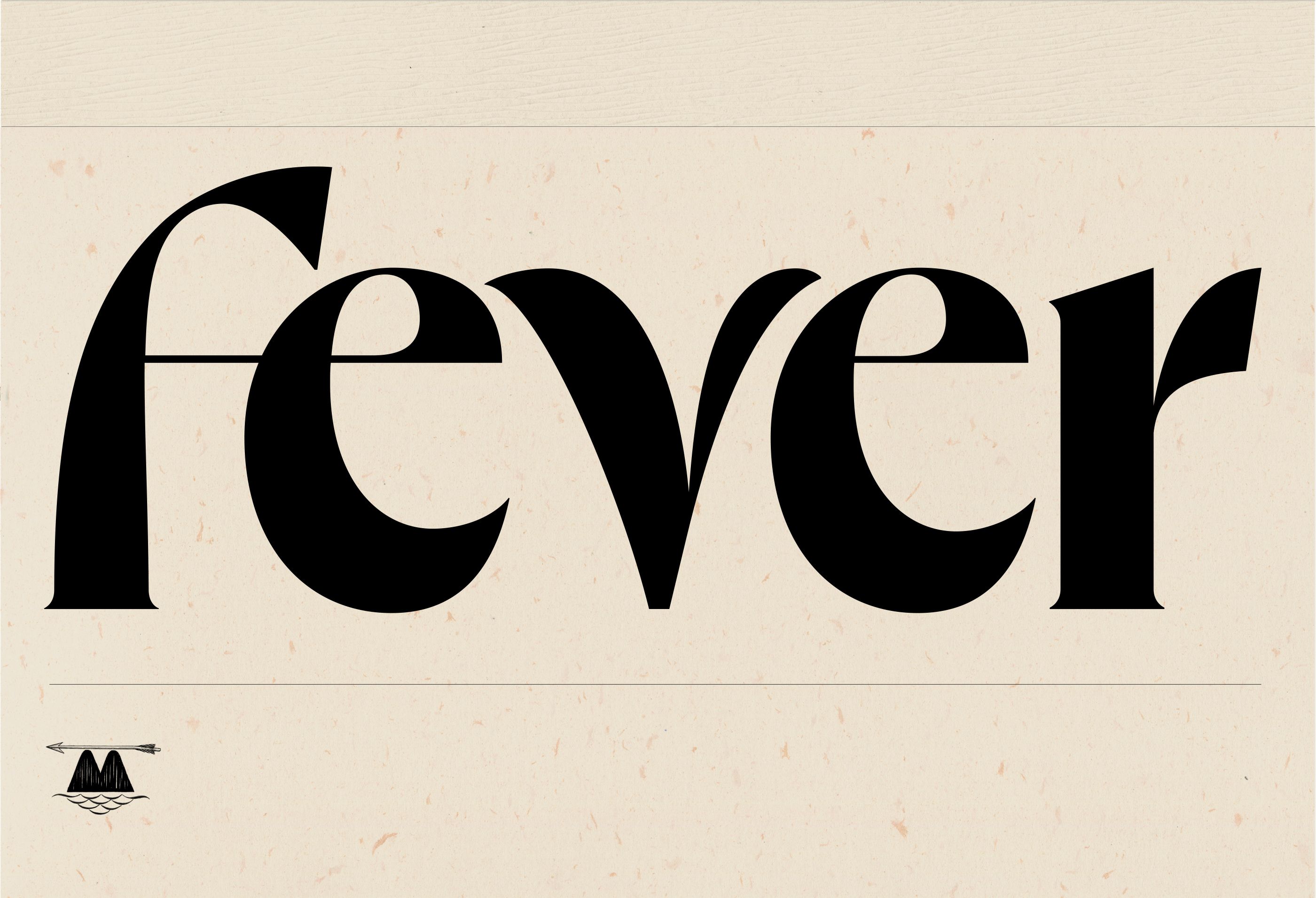
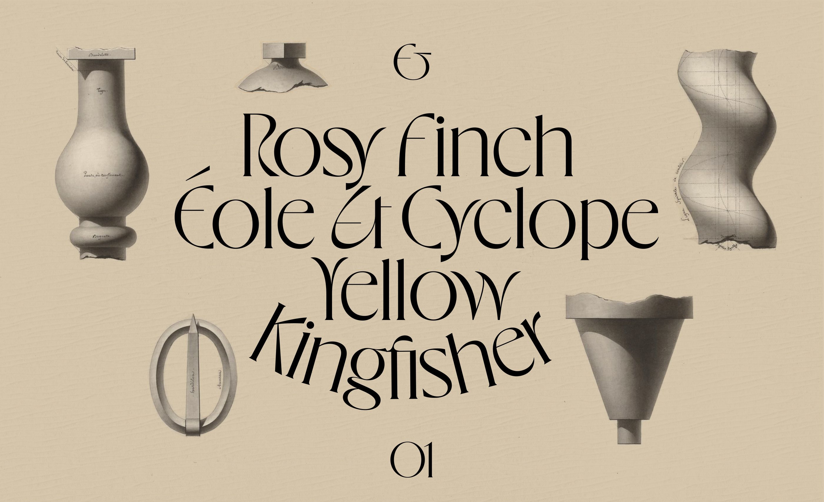
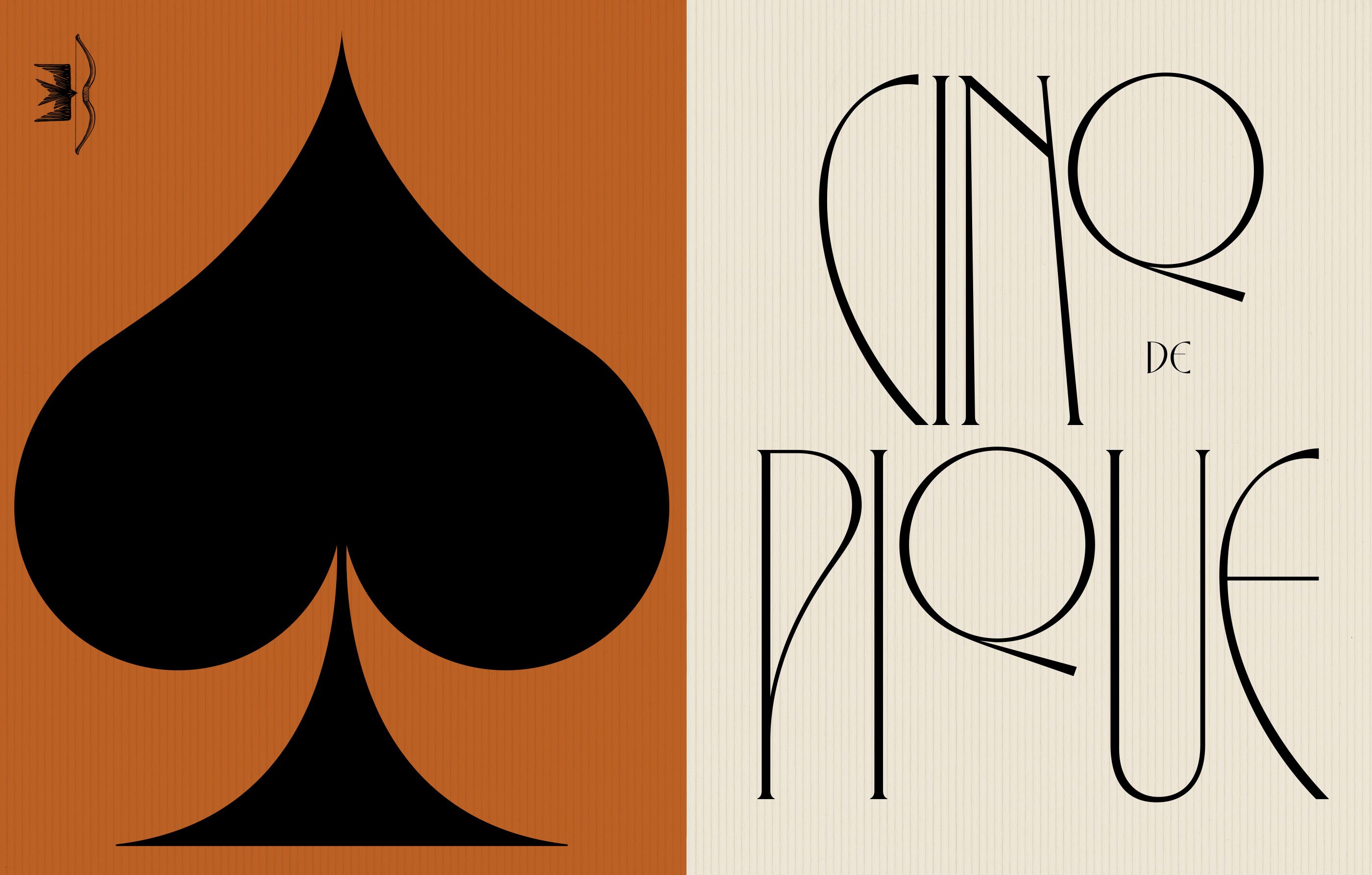
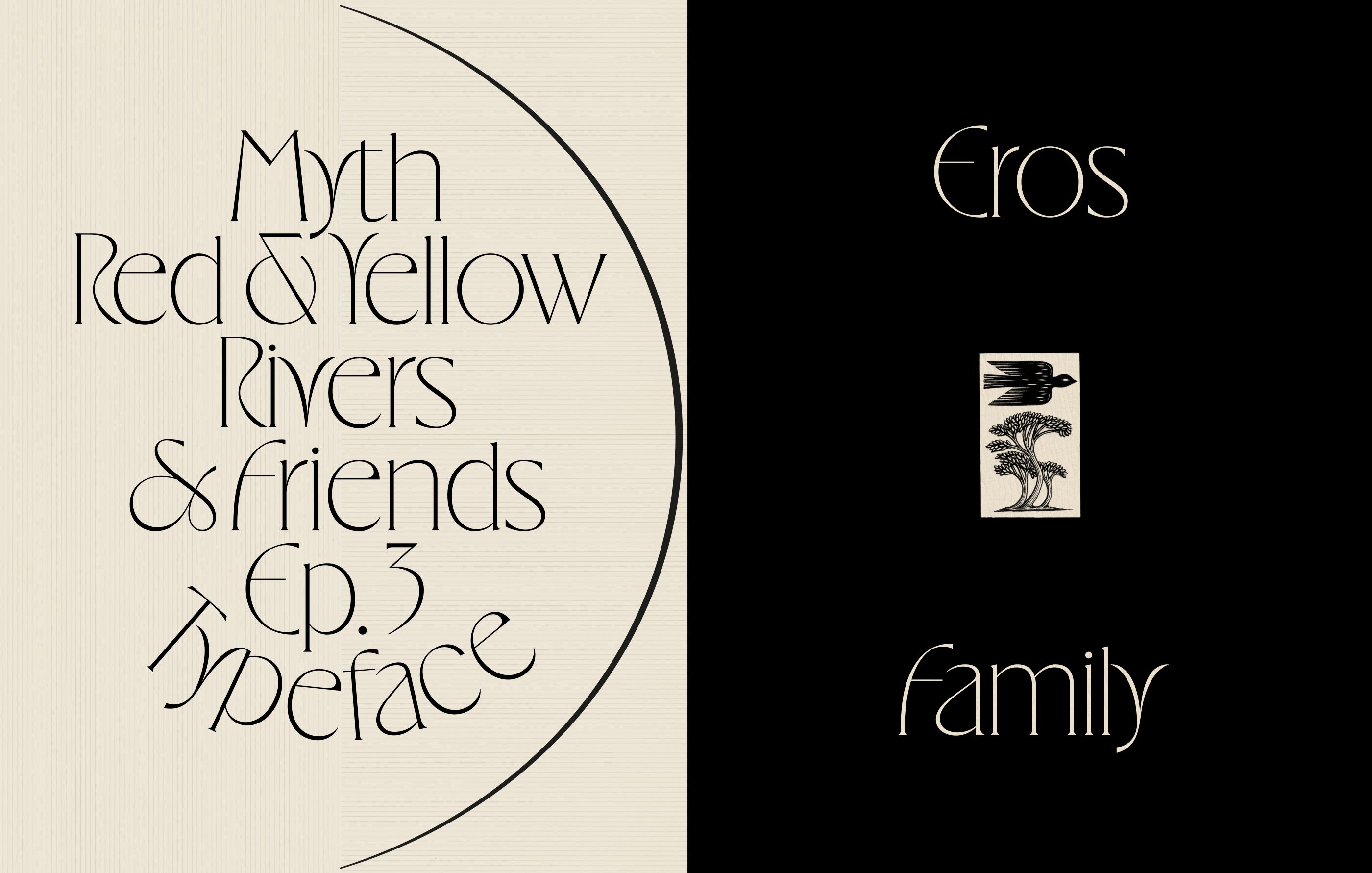
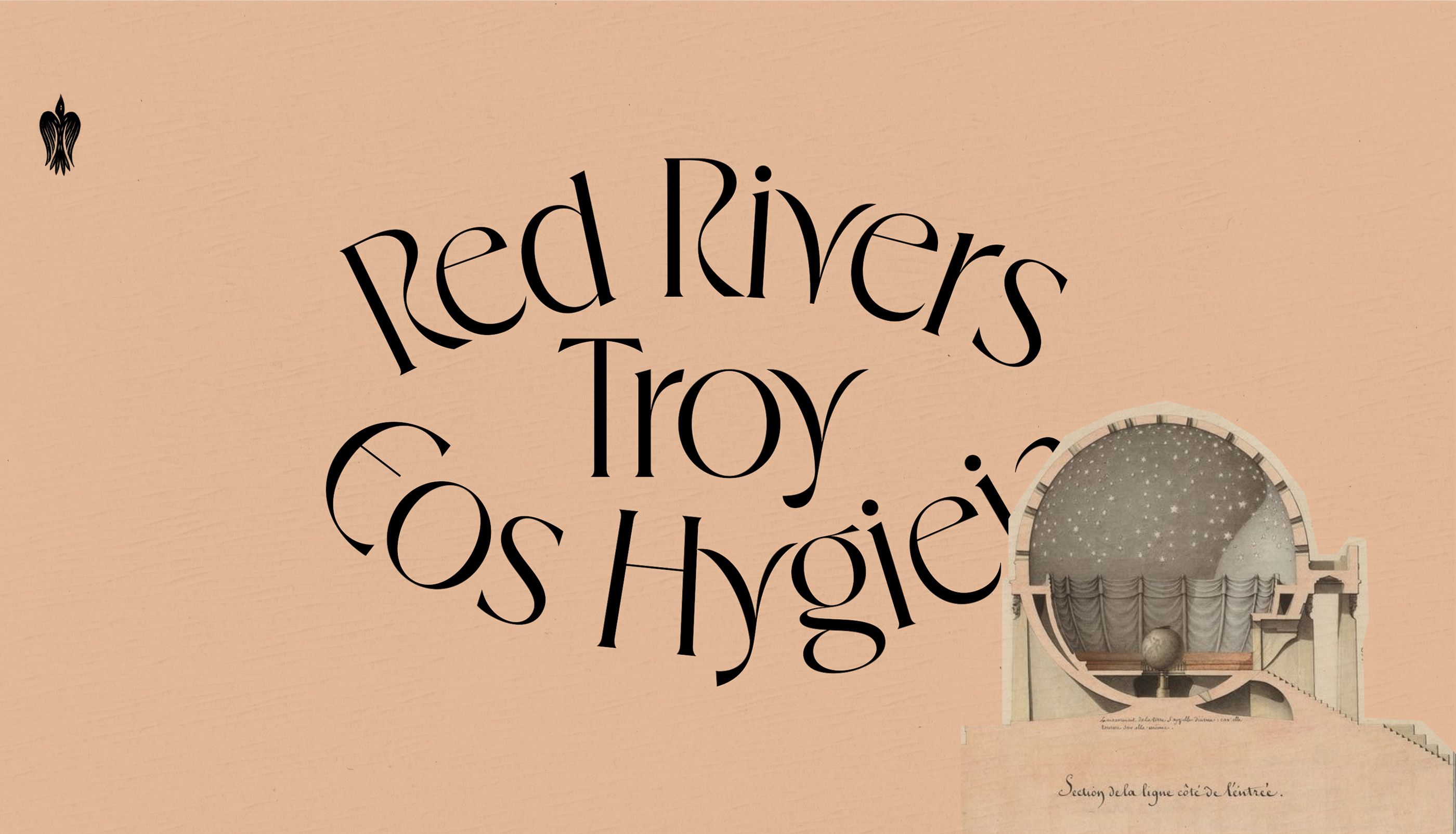
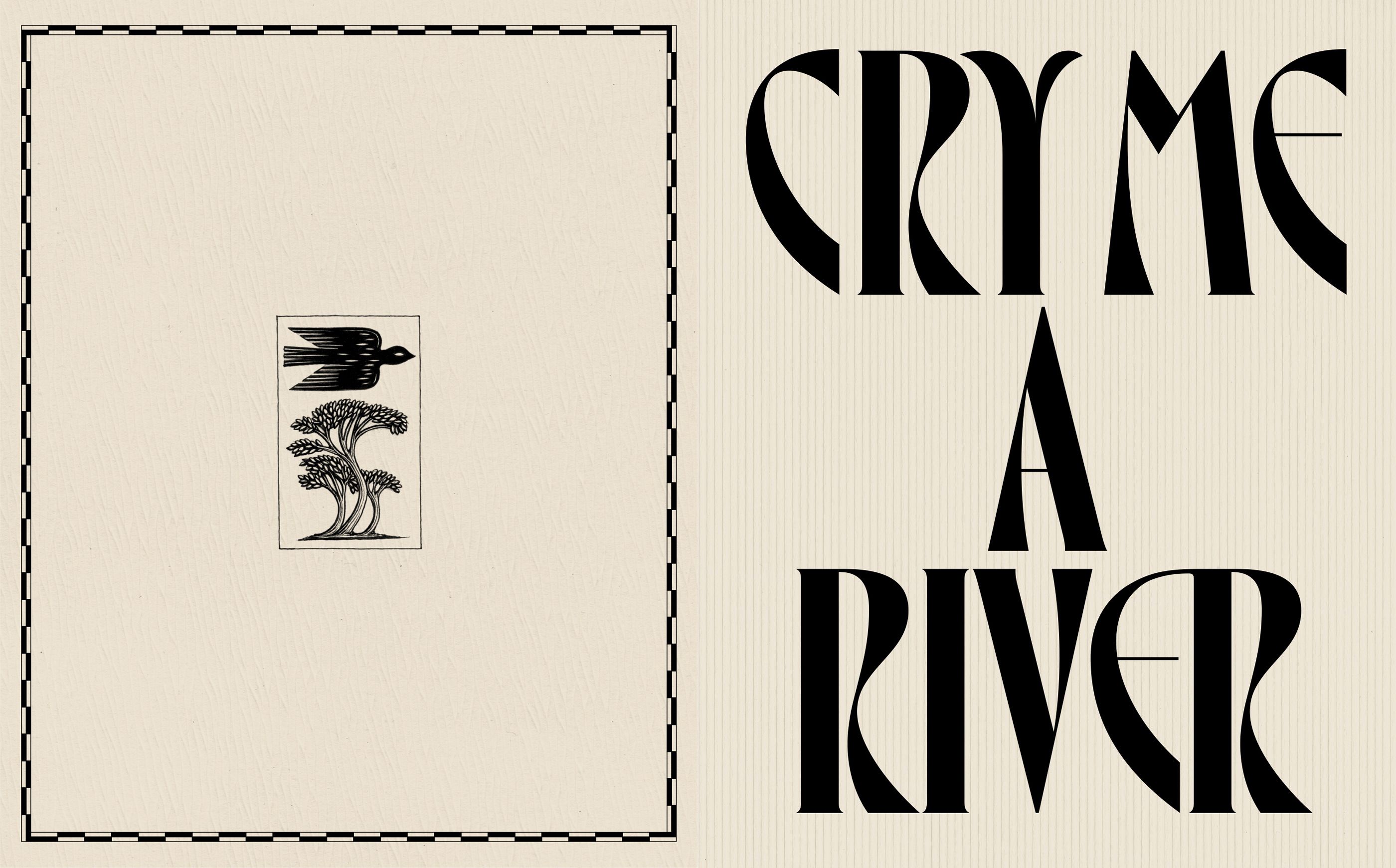
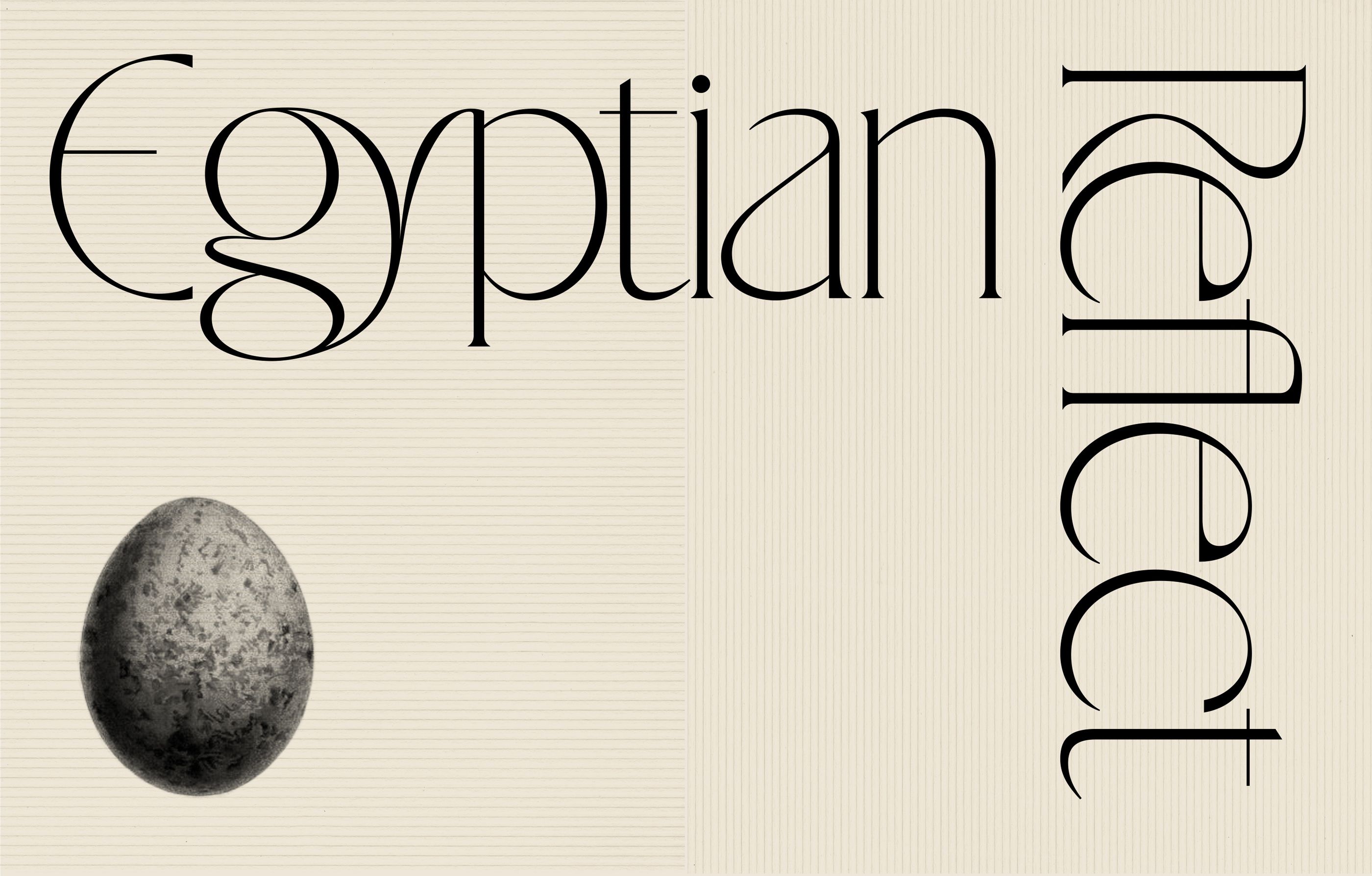
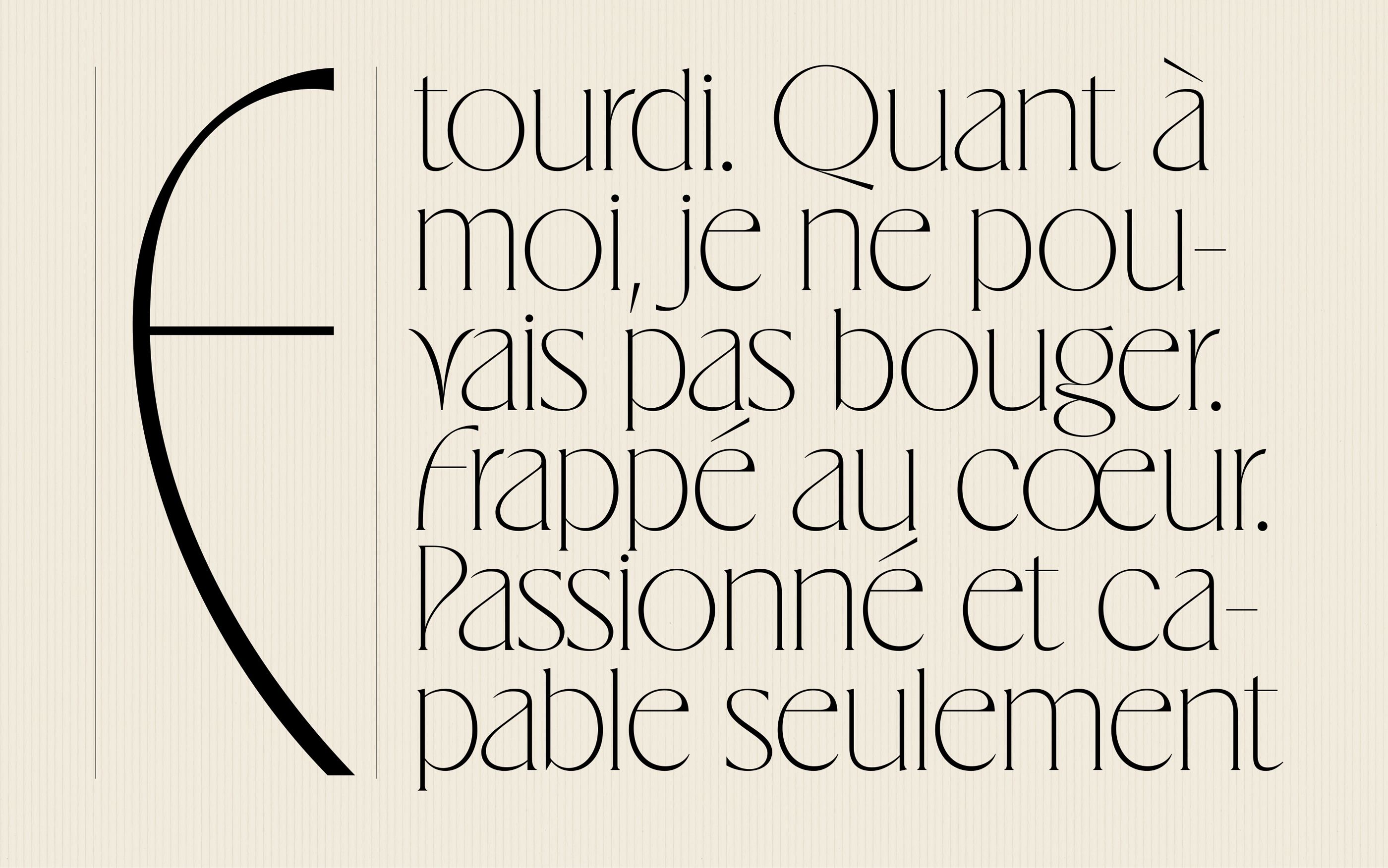
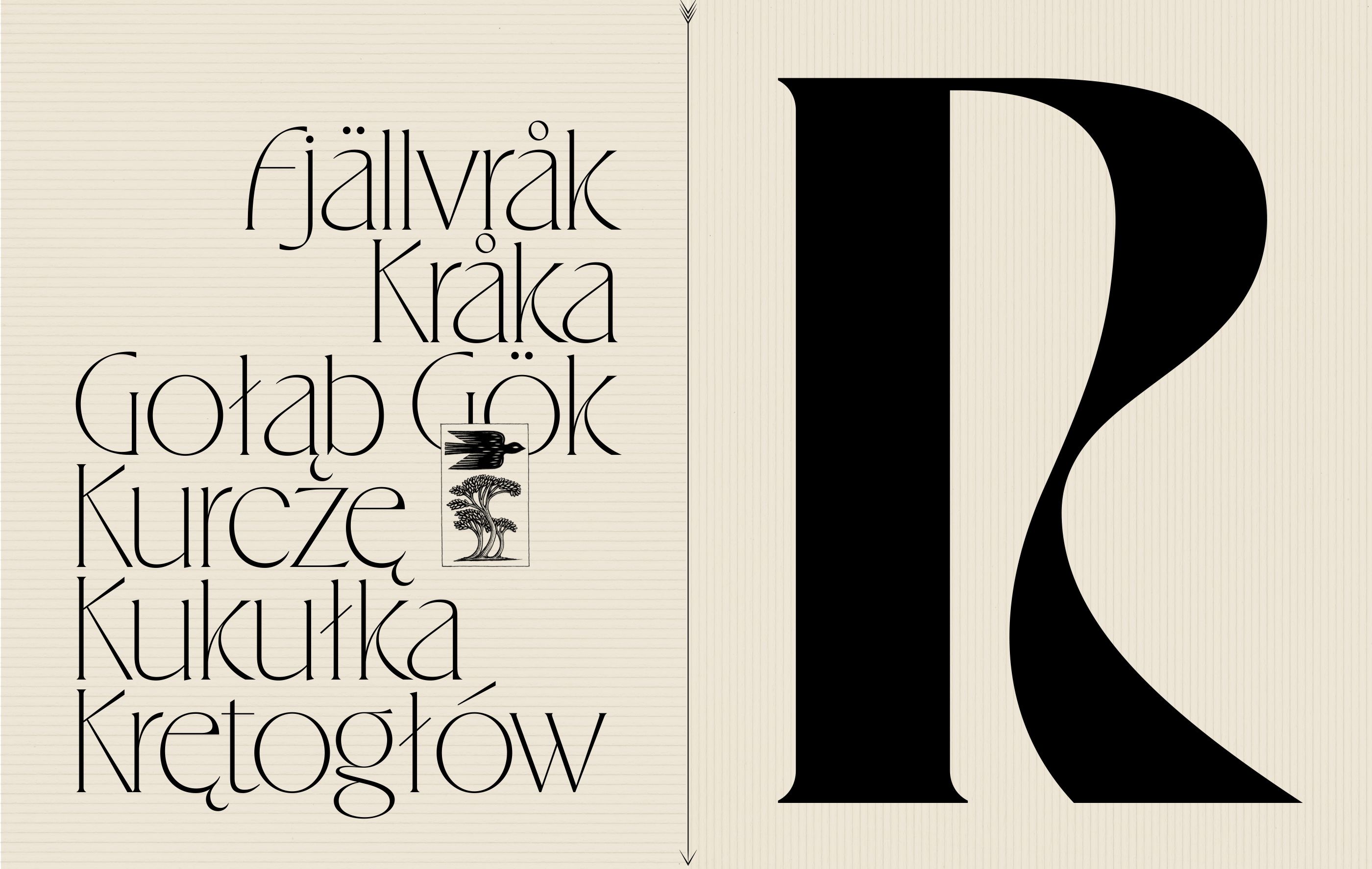
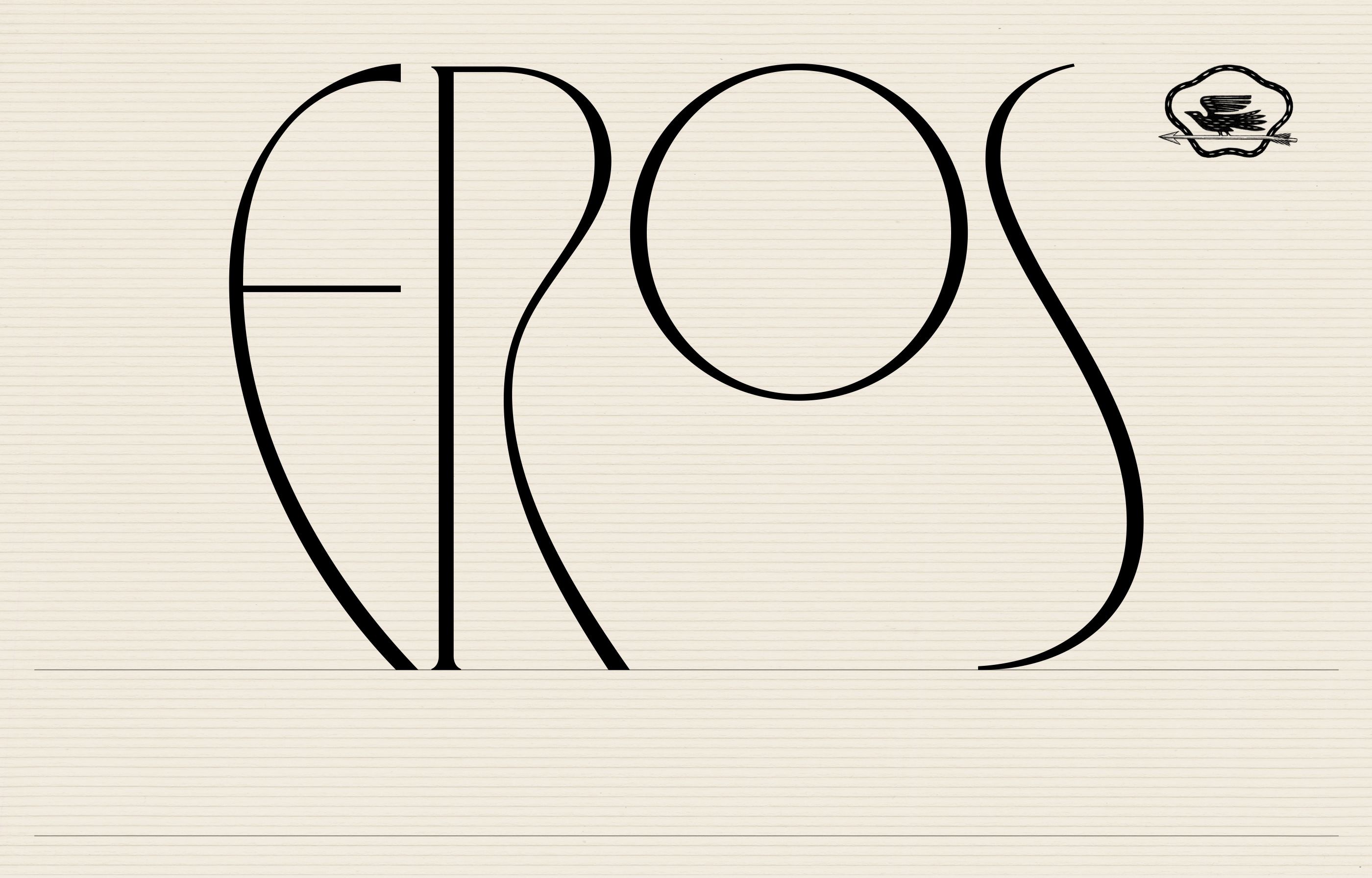
Eros lives up to its name. It is the loving fusion of 2 custom typefaces we drew in the past years: a condensed one for Le Théâtre des Bouffes du Nord and a regular one for Pharrell Williams and Jean Imbert’s common project in Saint-Tropez.
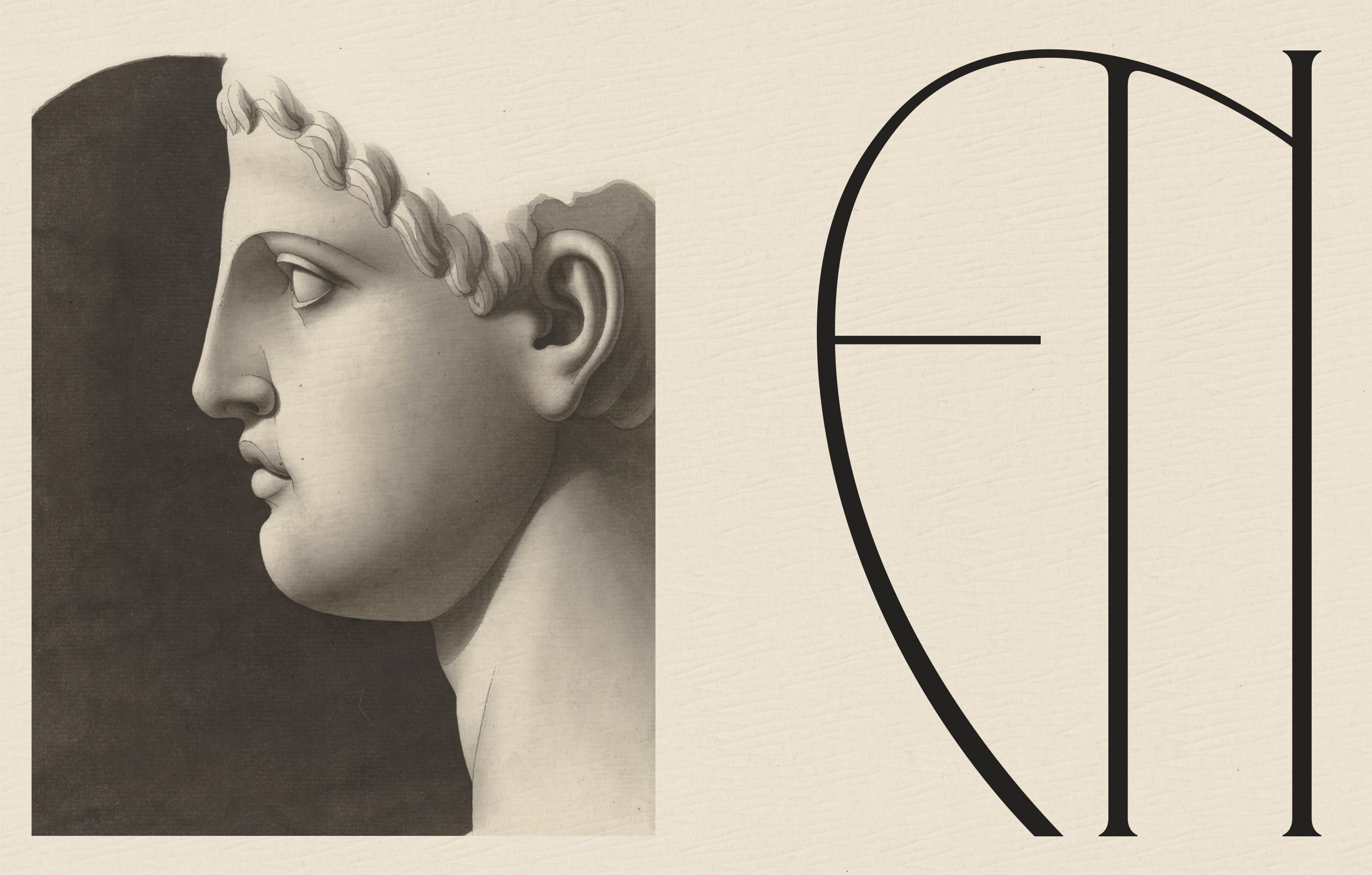
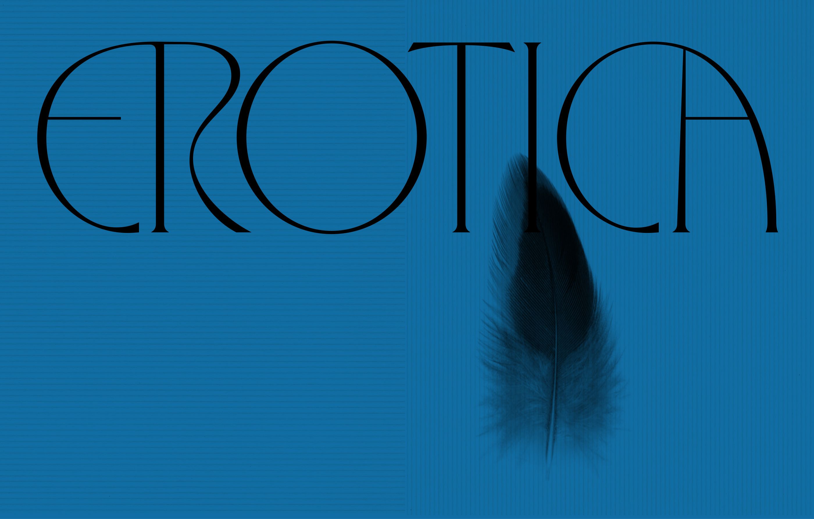
Eros' aesthetic is inspired by the work of the German typographer Otto Eckmann. Its forms are borrowed from the art movement of Jugendstil and Vienna Secession in the late 19th century and are redesigned with a strong contemporary touch that brings an elegant sharpness to the drawing.
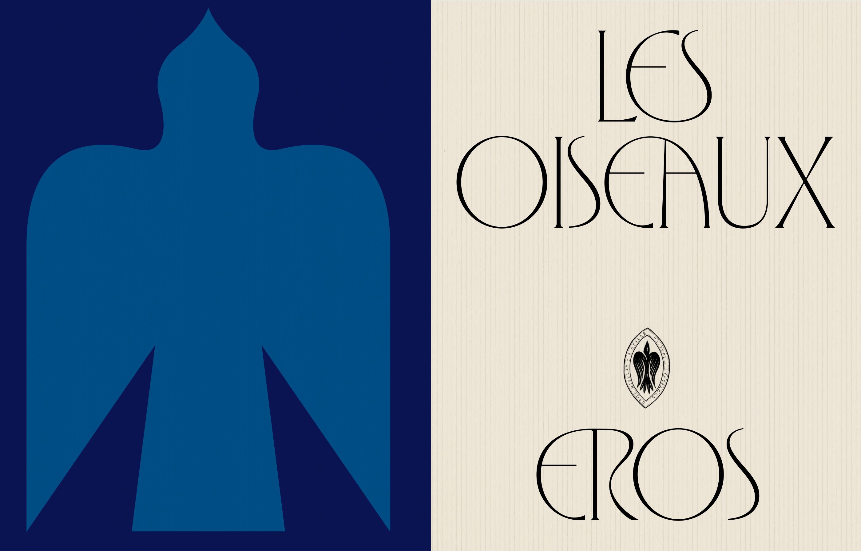
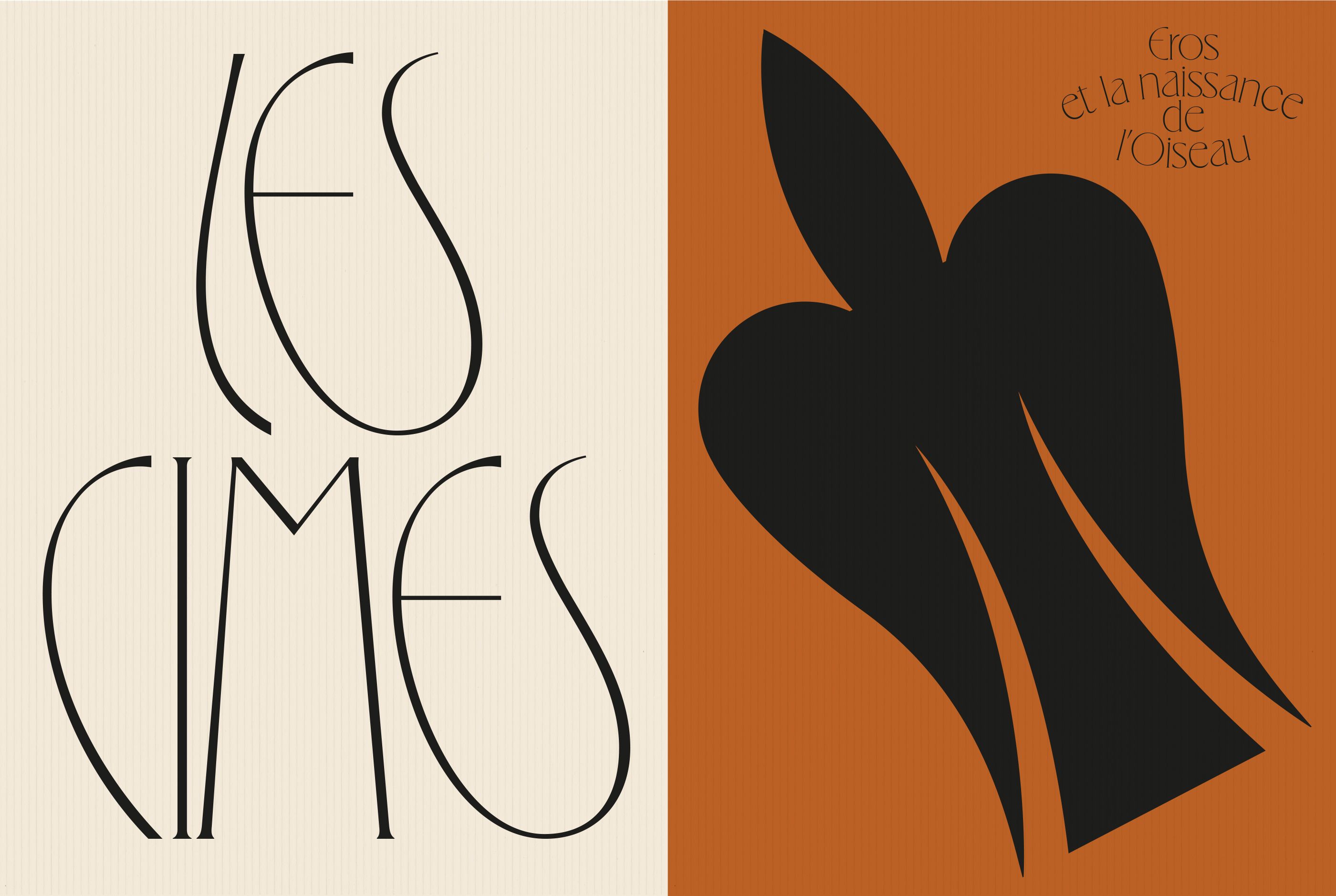
On a conceptual side, we found inspiration in the mythology of Eros, Greek God of love and sexuality, who is also the Creator of Birds. This has influenced the drawing with the letters dancing together, intertwined with sensuality.
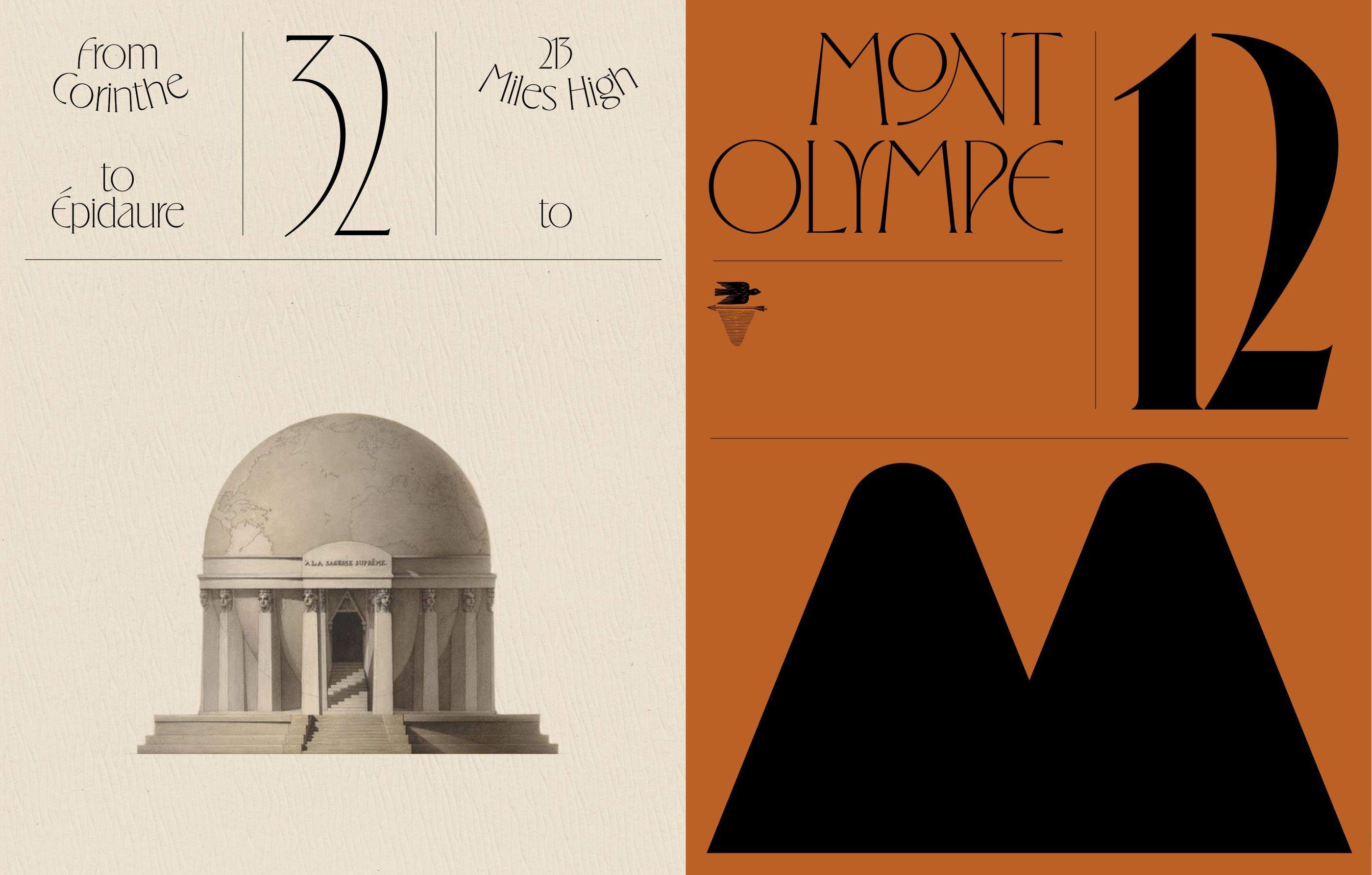
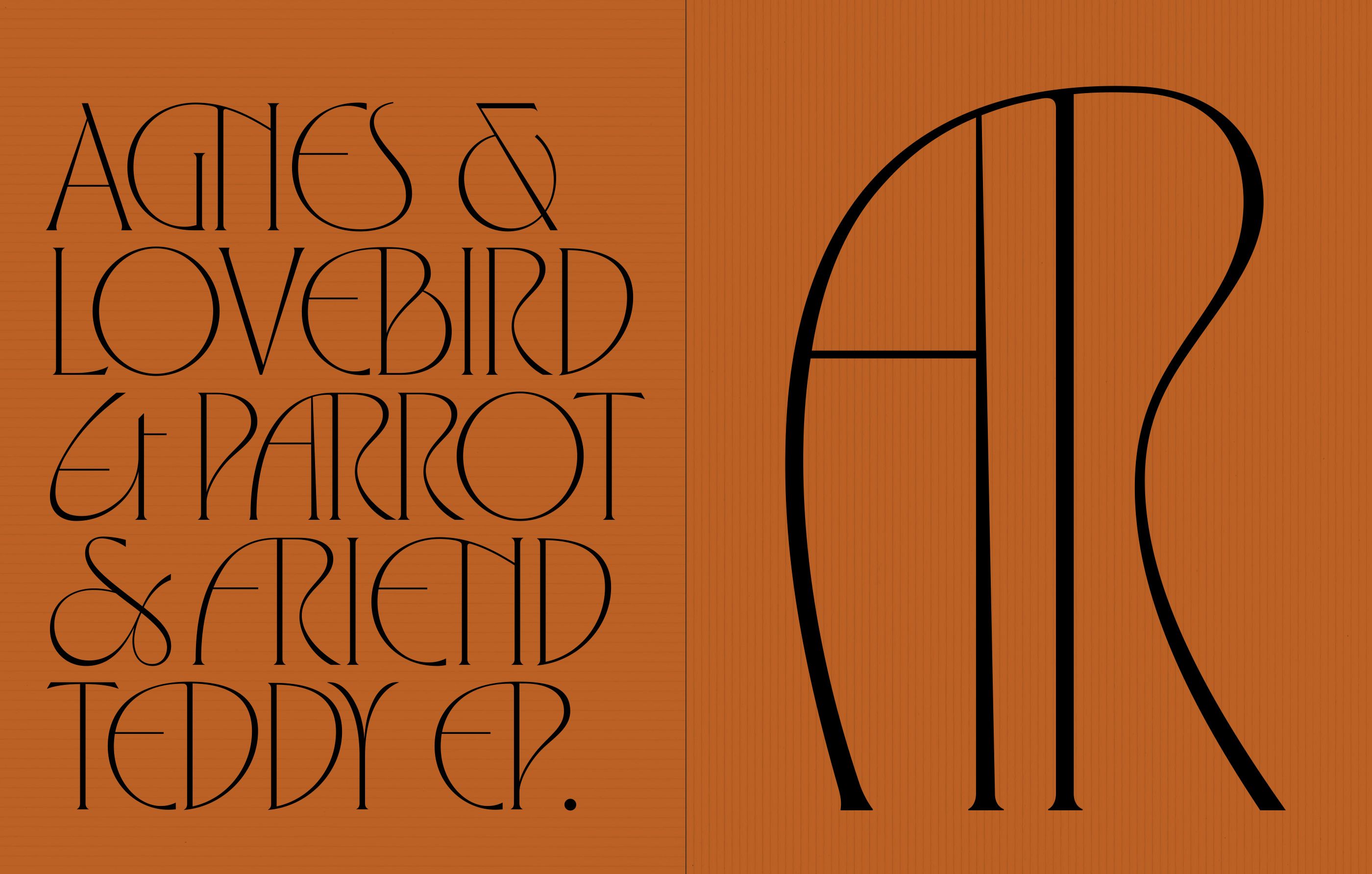
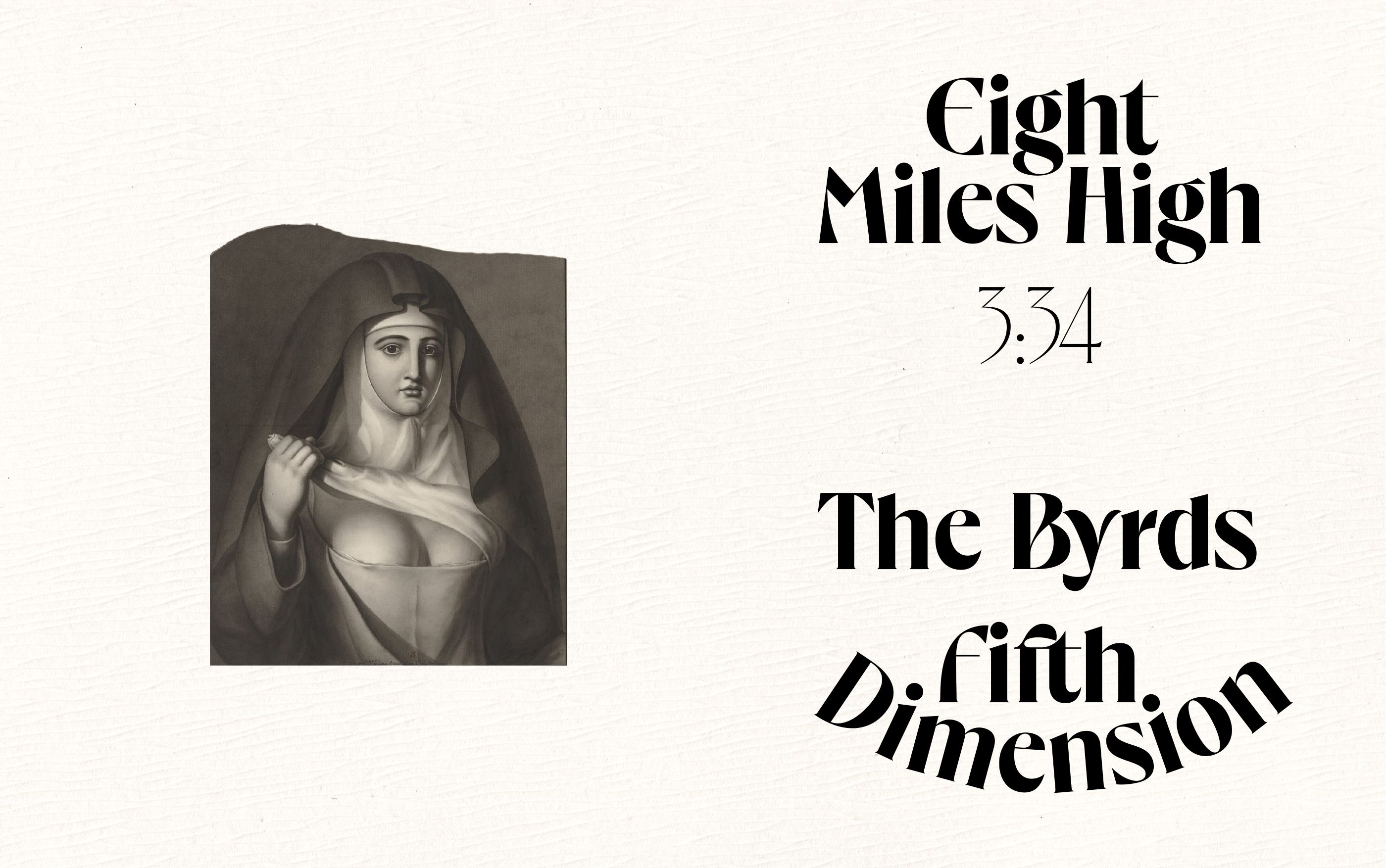
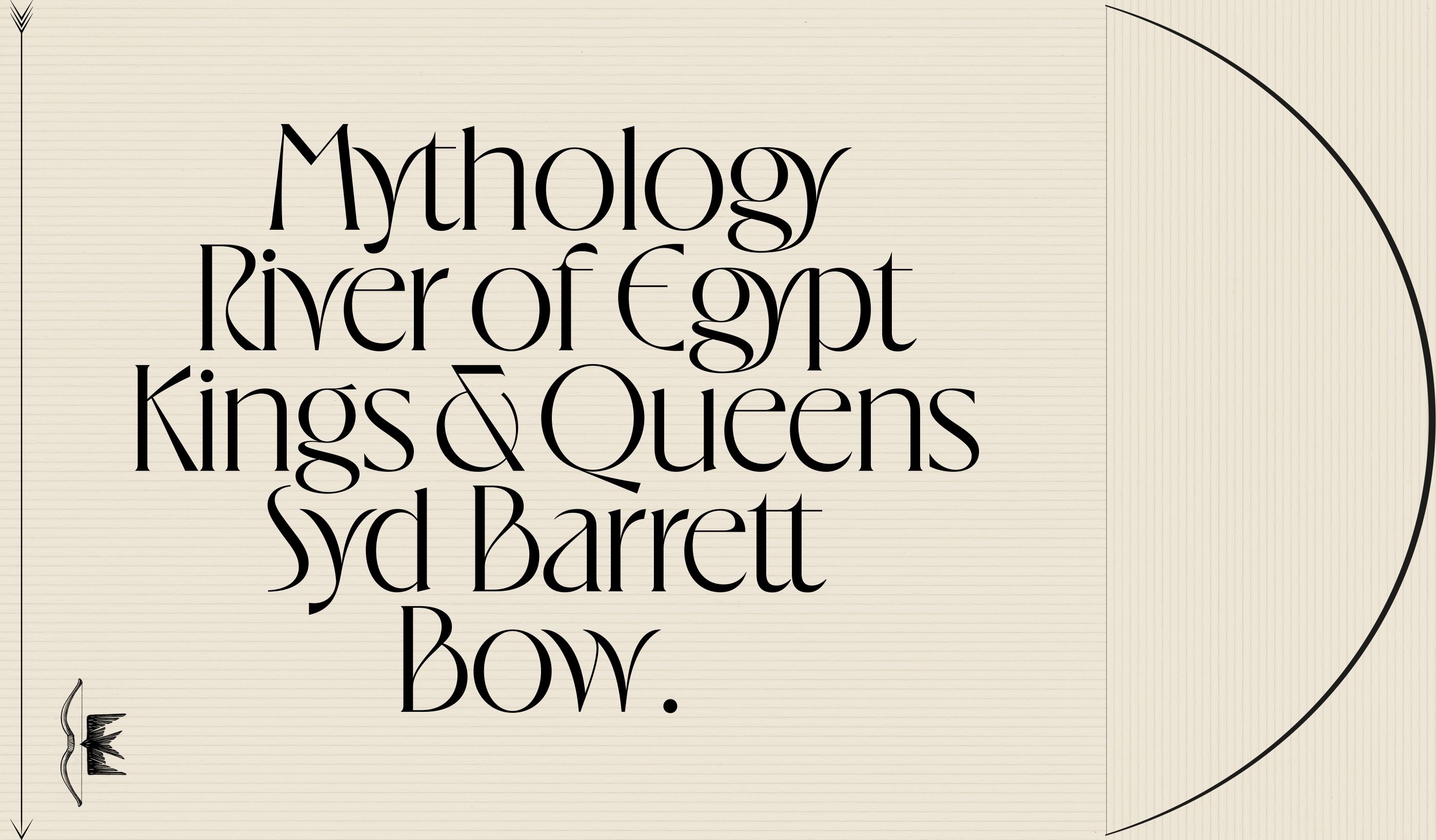
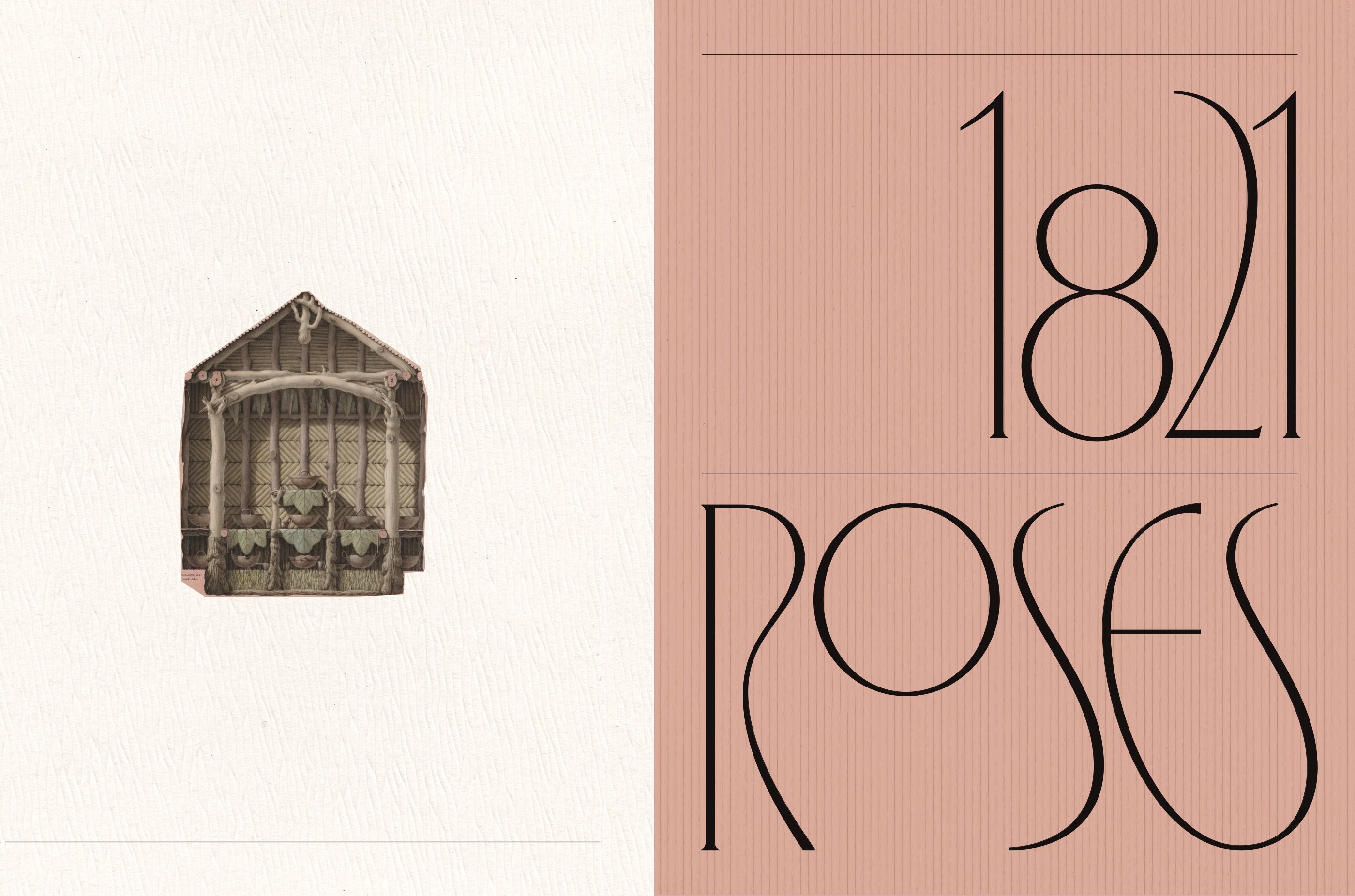
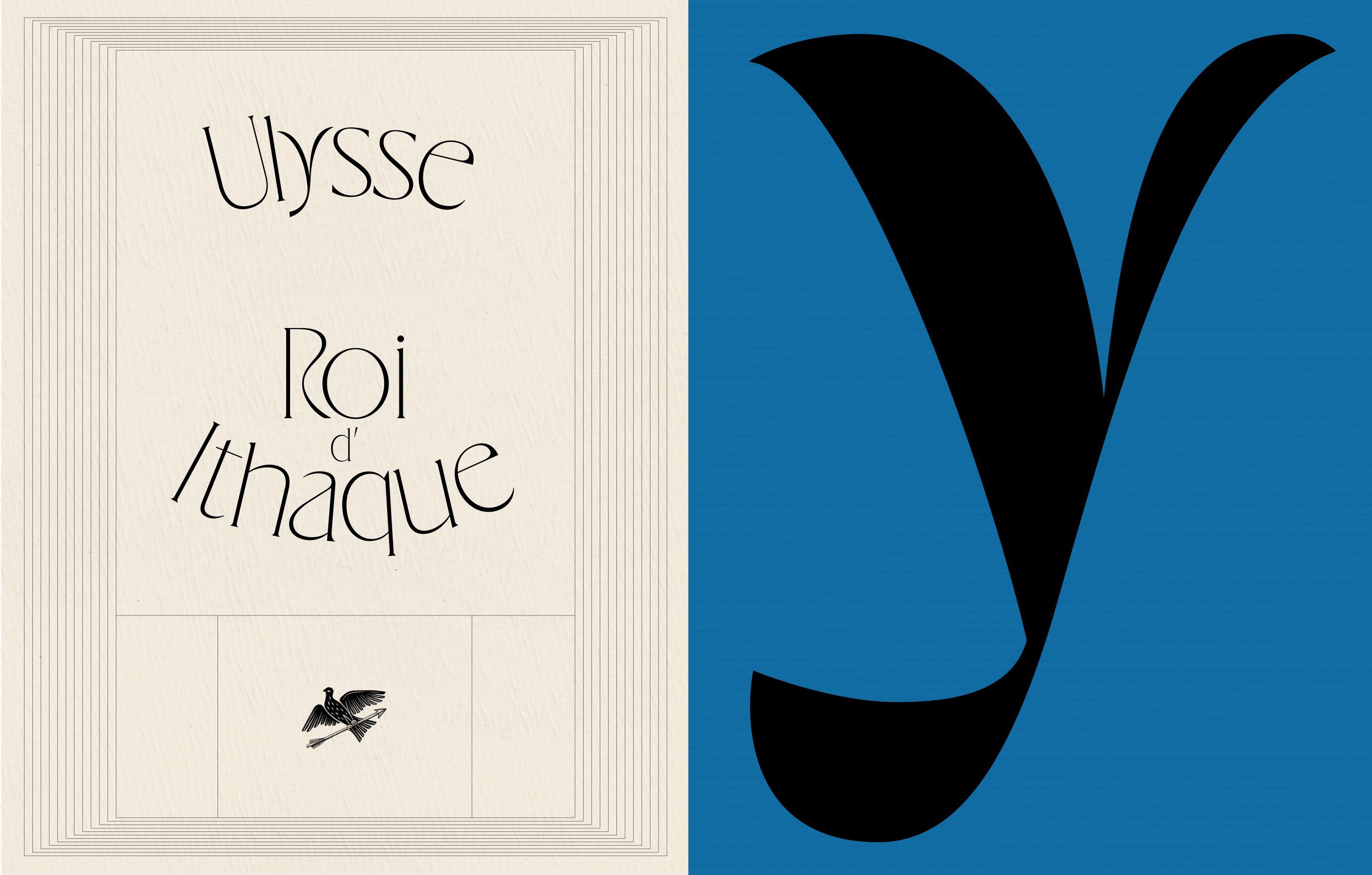
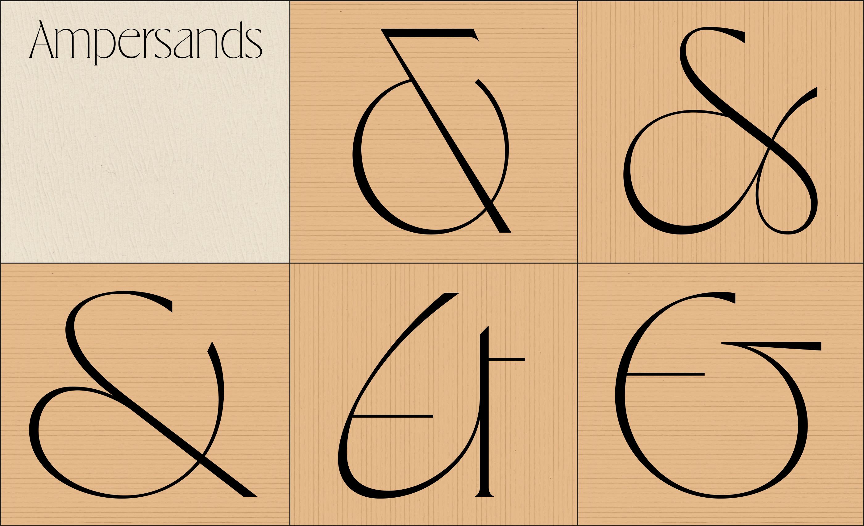
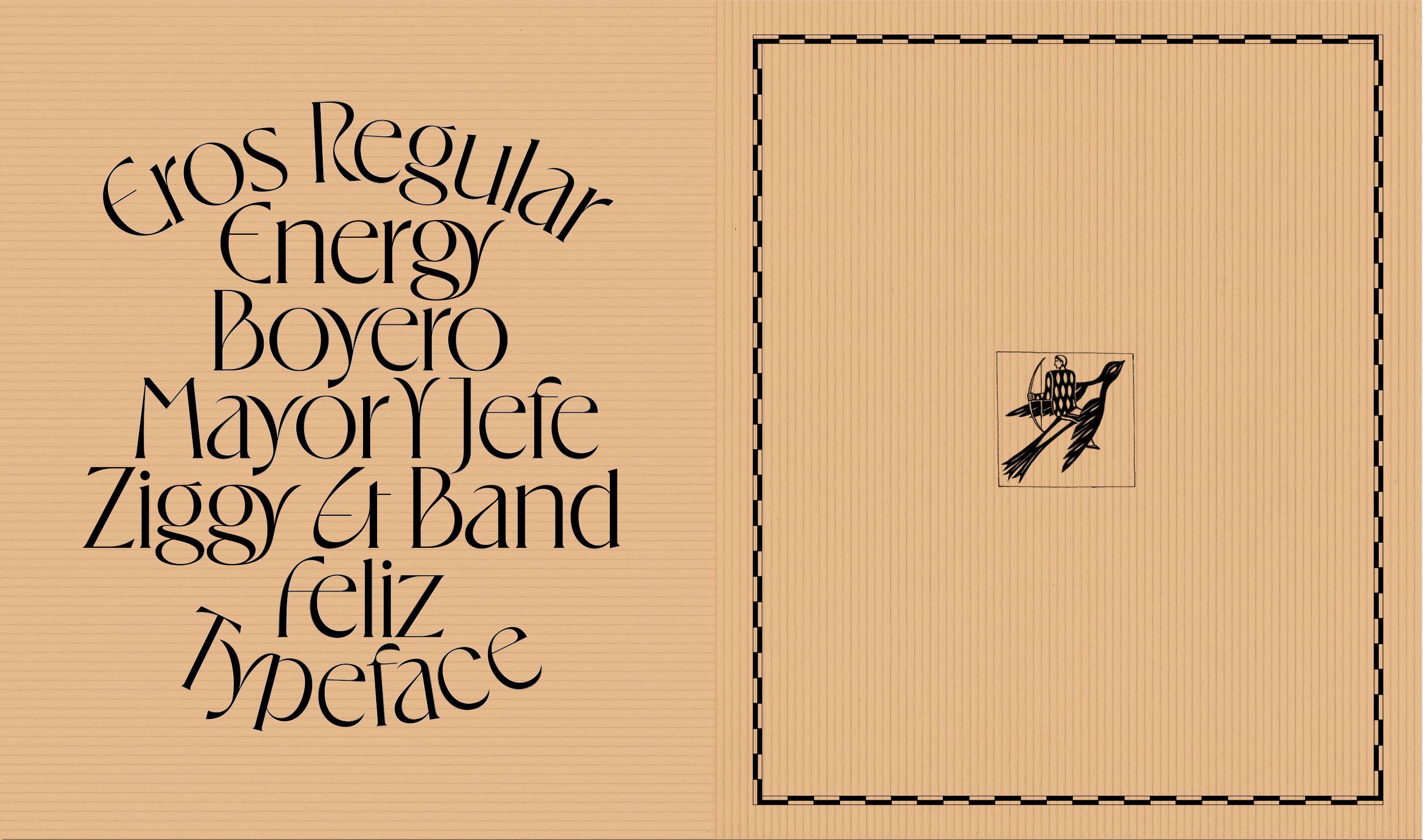
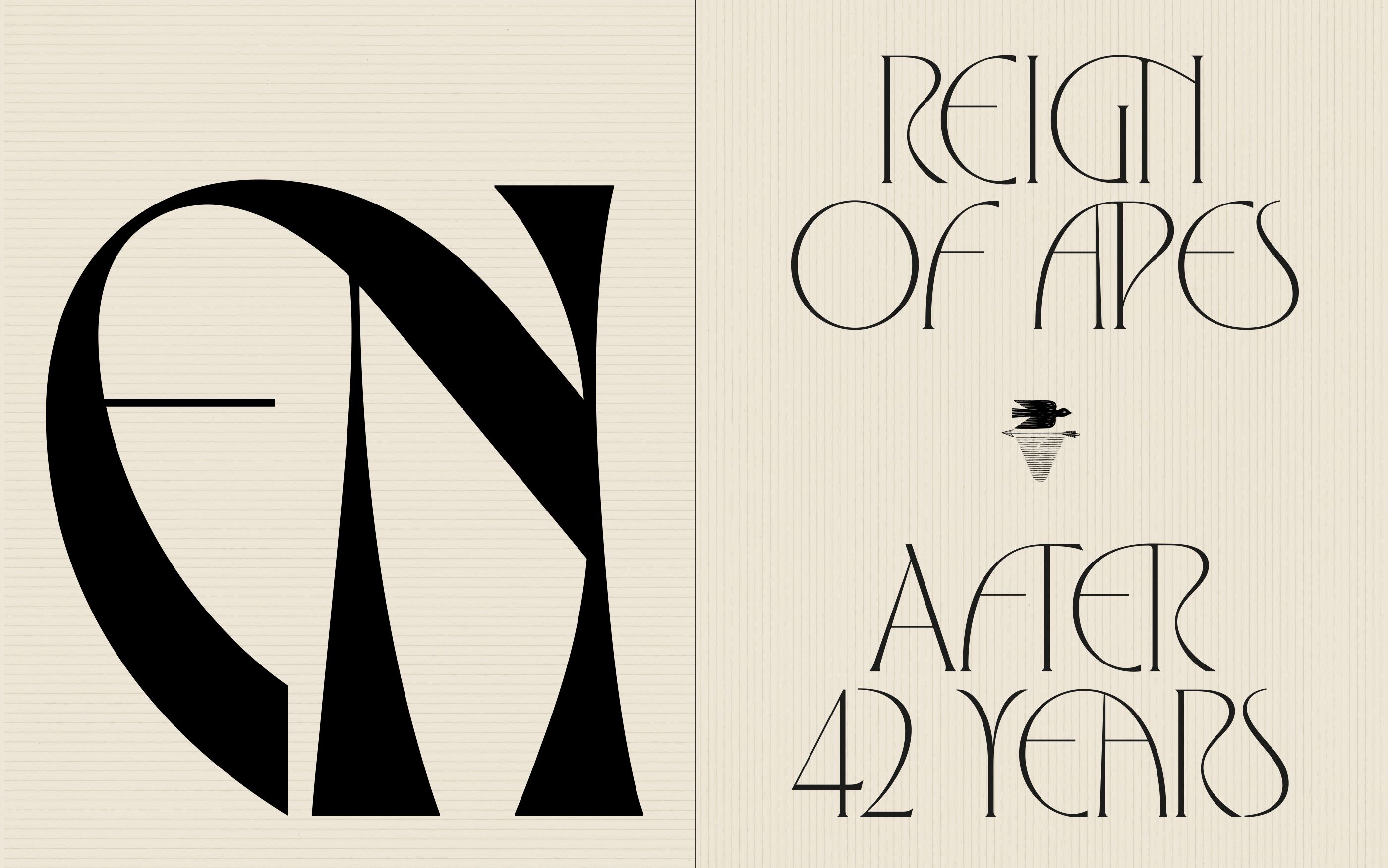
On a general note, Eros is a display typeface featuring 6 styles: standard and condensed each with 3 weights — light, regular, bold. The typeface shows low contrast between upper and lower cases. We added some generous shapes with the rounded E and F. The very special features of Eros are its ligatures. We drew 30 pairs of uppercase ligatures and 30 pairs of lowercases ligatures to ensure the most beautiful sequences of words possible.
A sweet surprise is hidden in the font file. We drew tiny beautiful birds and added them to the glyphset.
Enjoy, lovebirds! ➳

