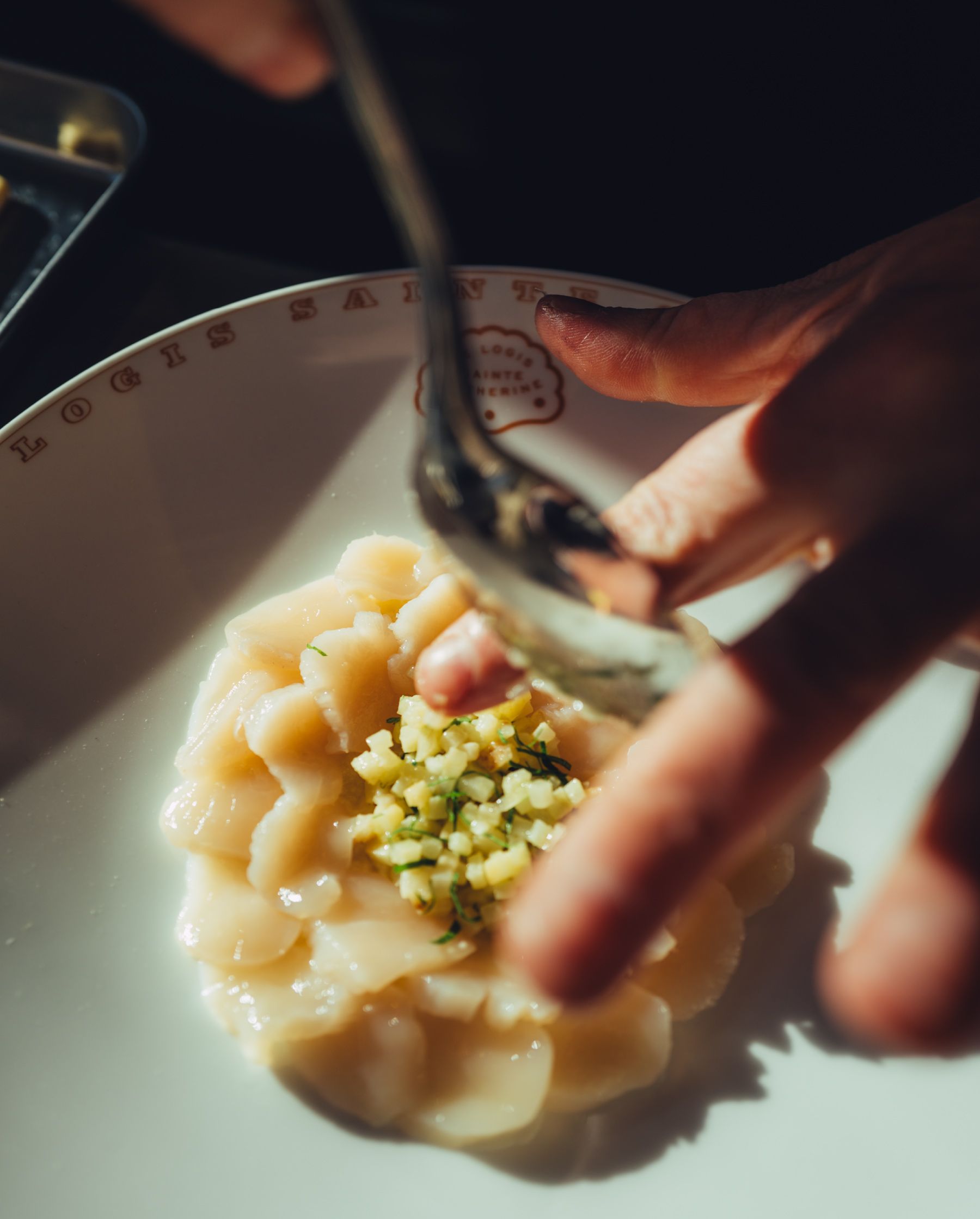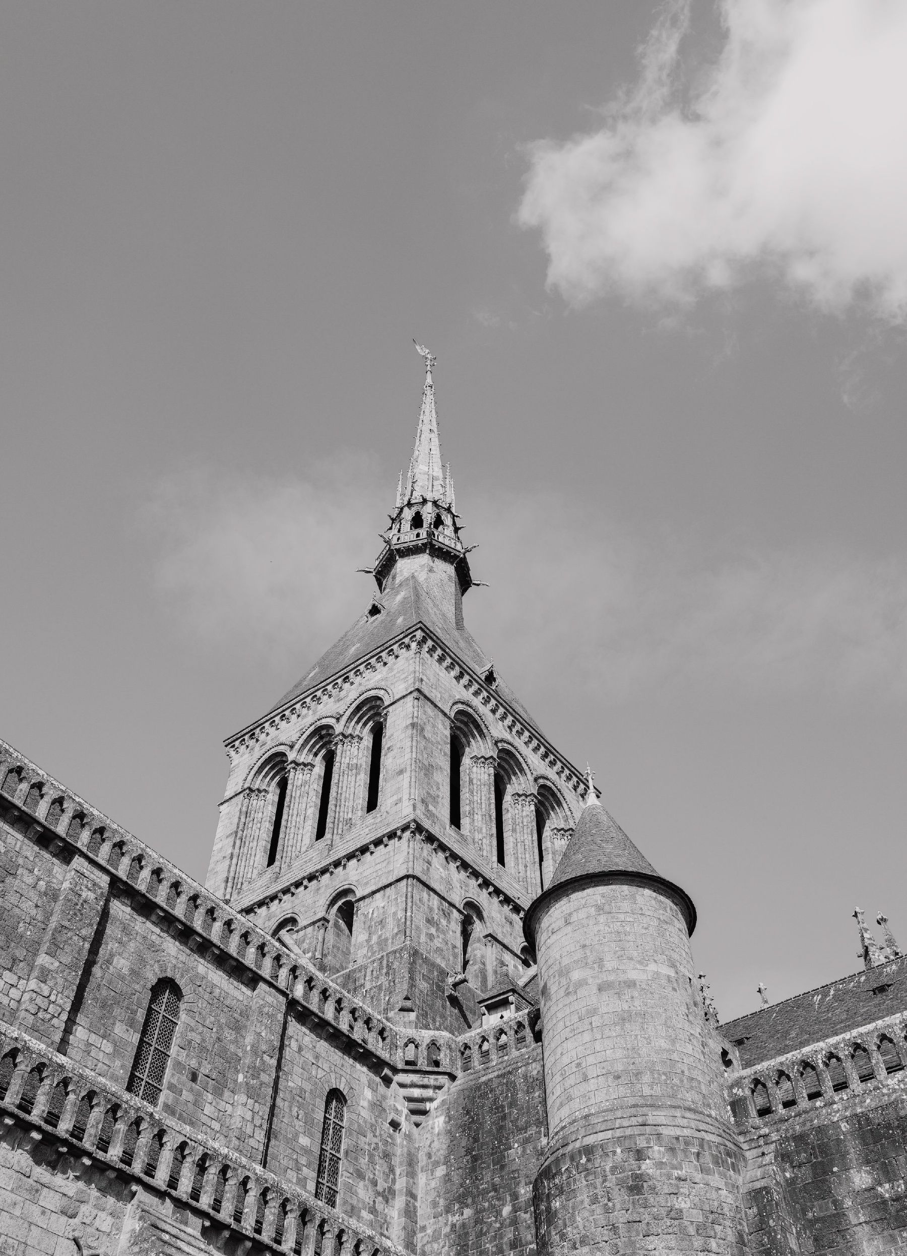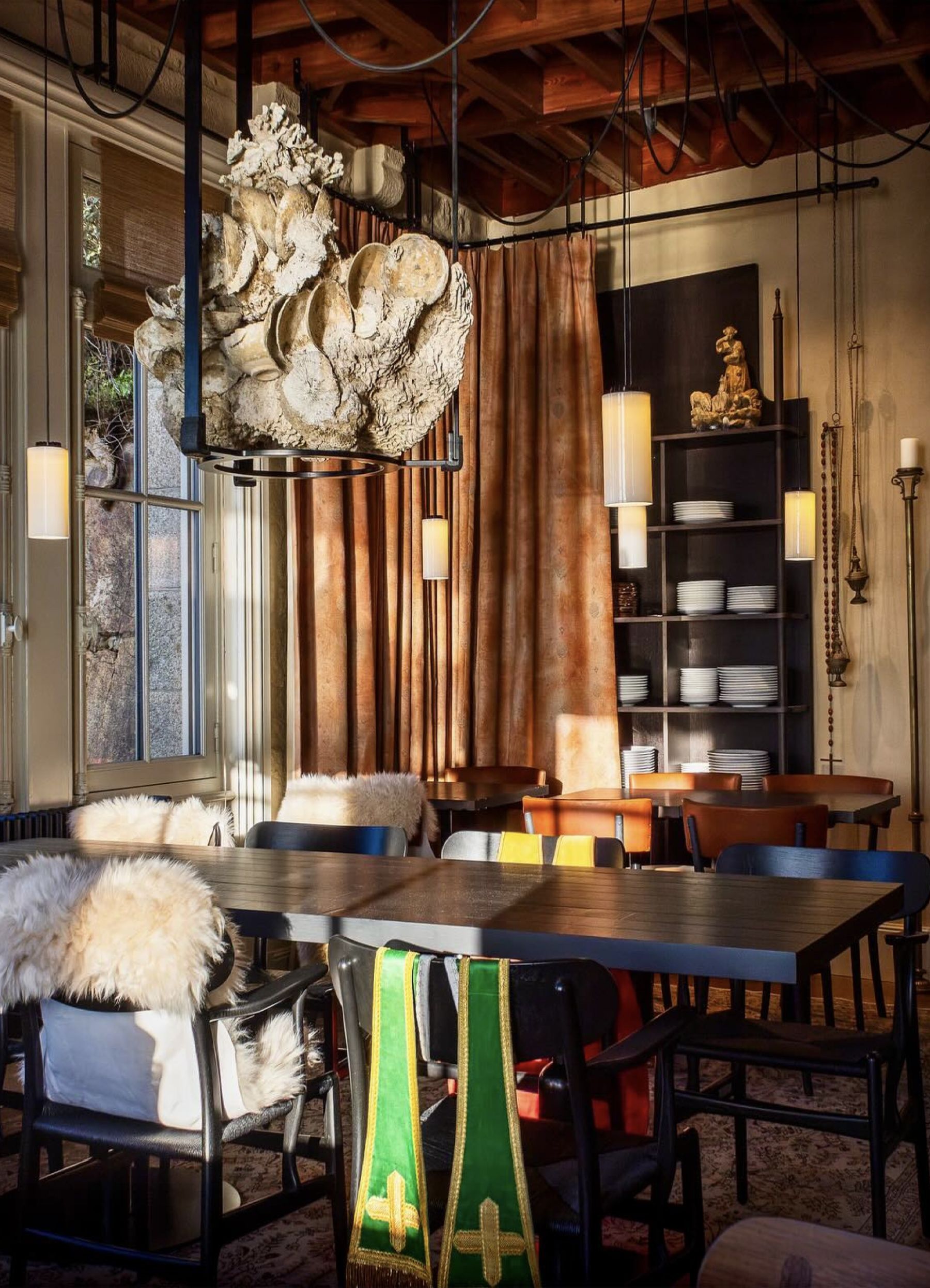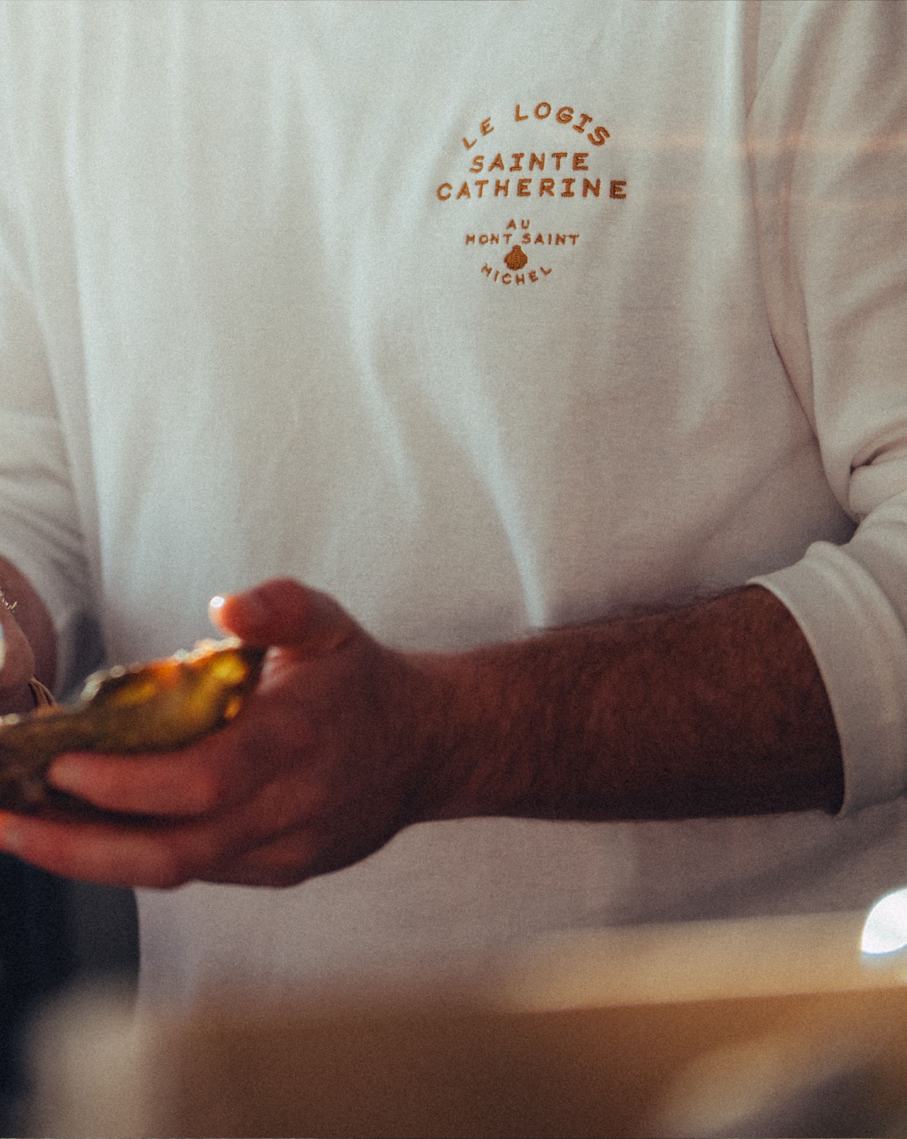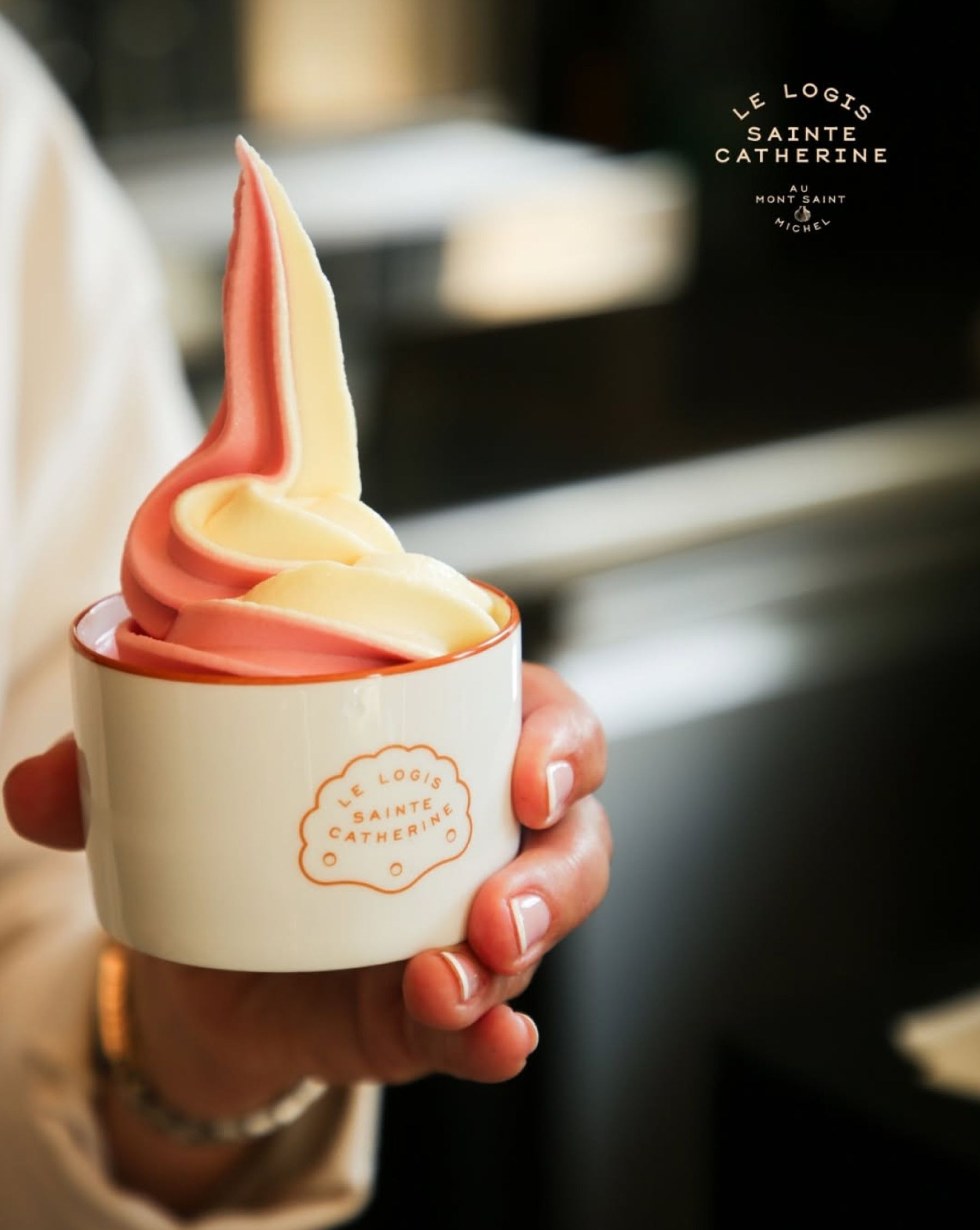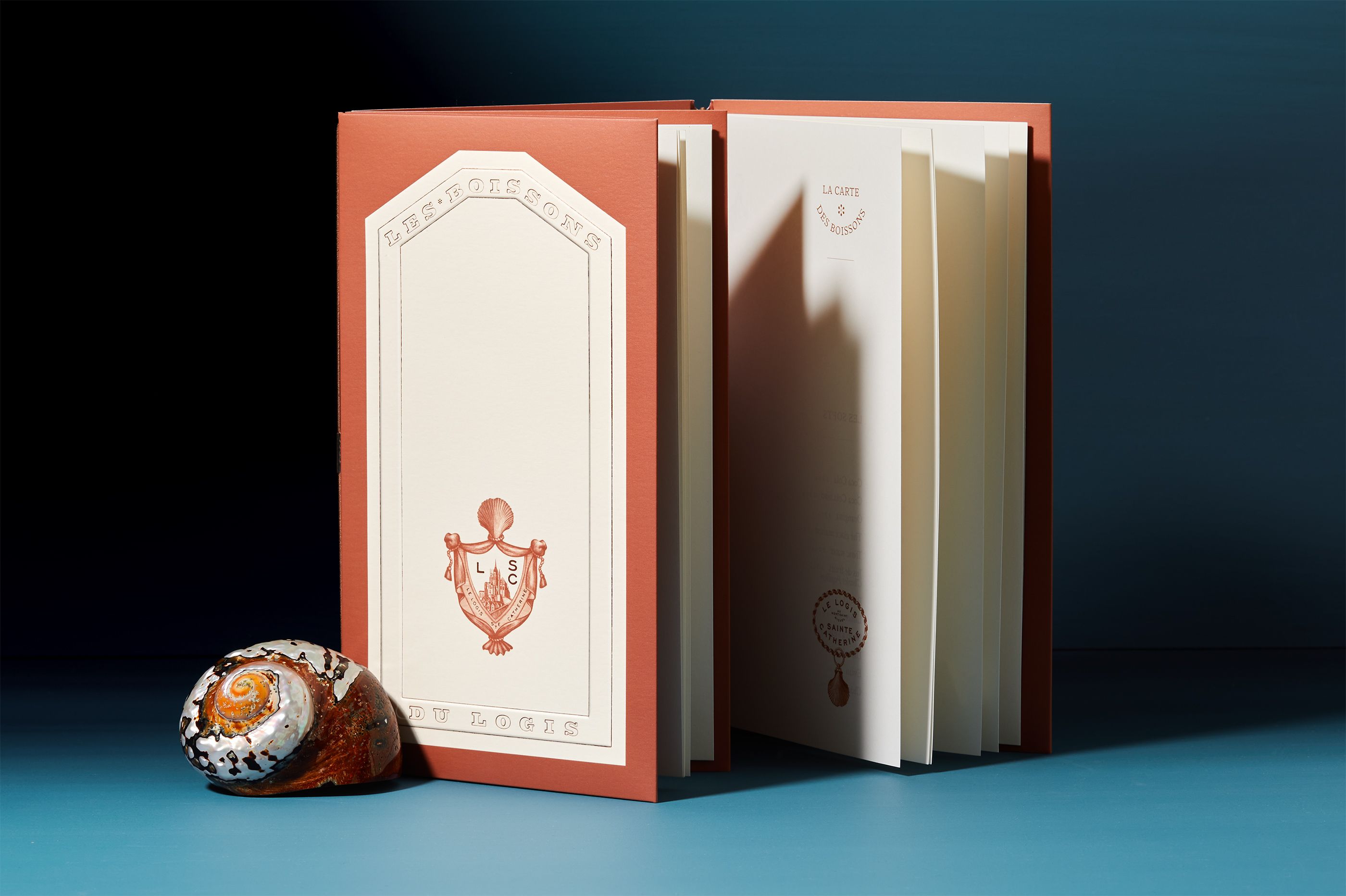
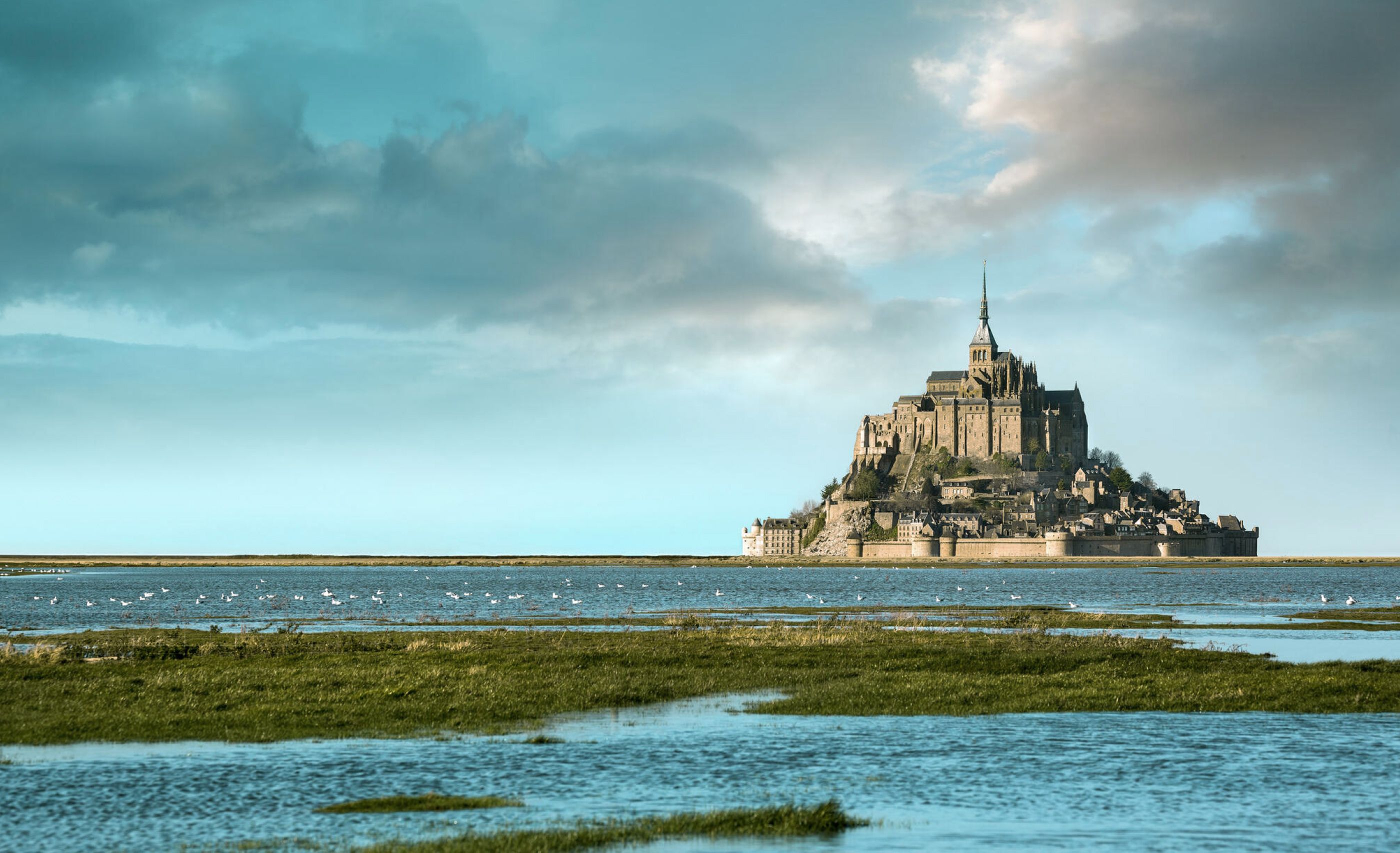
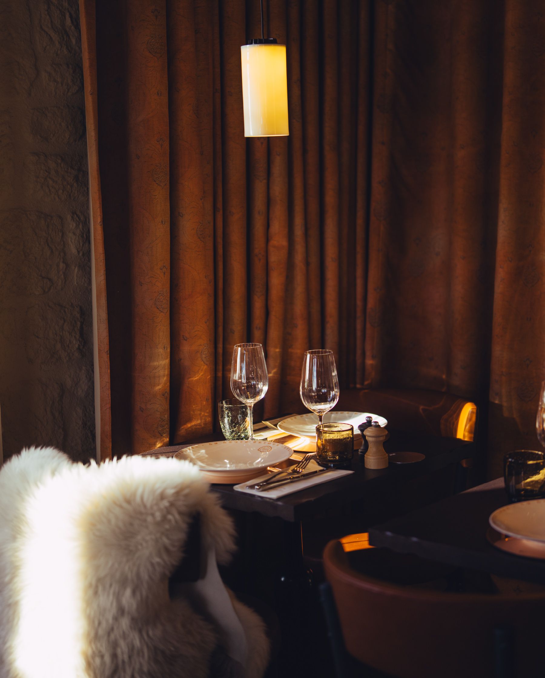
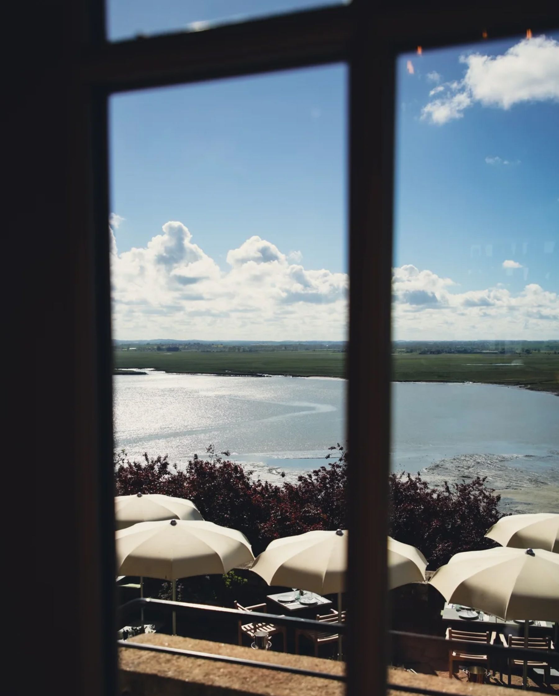
Le Logis Sainte Catherine is a restaurant, nestled against the rock and overlooking
the village of Mont Saint-Michel. We designed the Visual Identity, from logotypes, monograms, hand drawn illustrations, signage, menus, tableware, packagings, its structures, its decorations, its patterns and all the finishes. We paid particular attention to its manufacture.
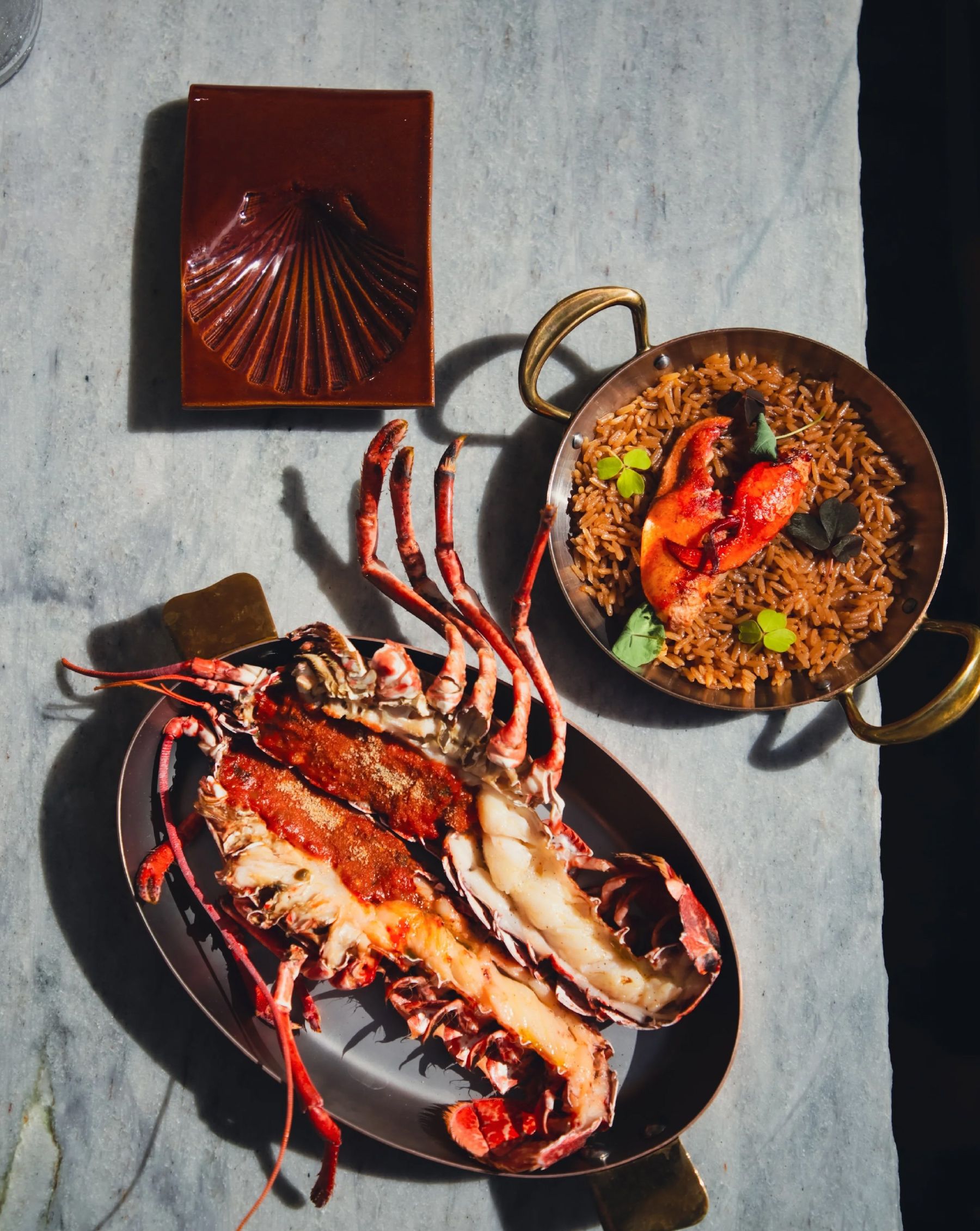
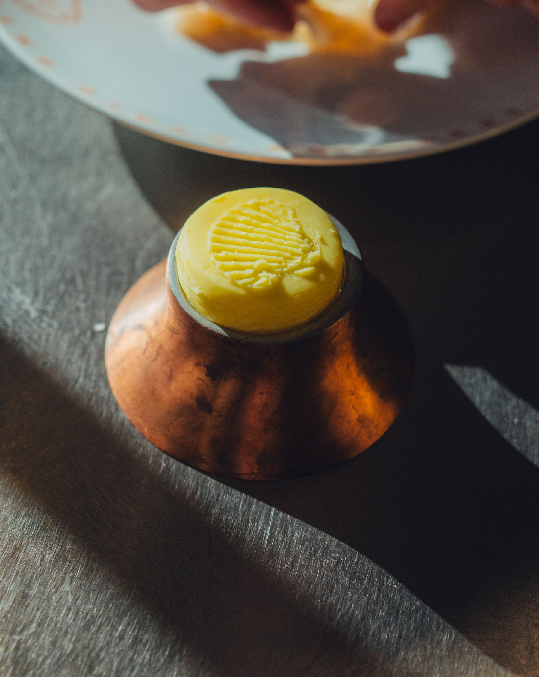
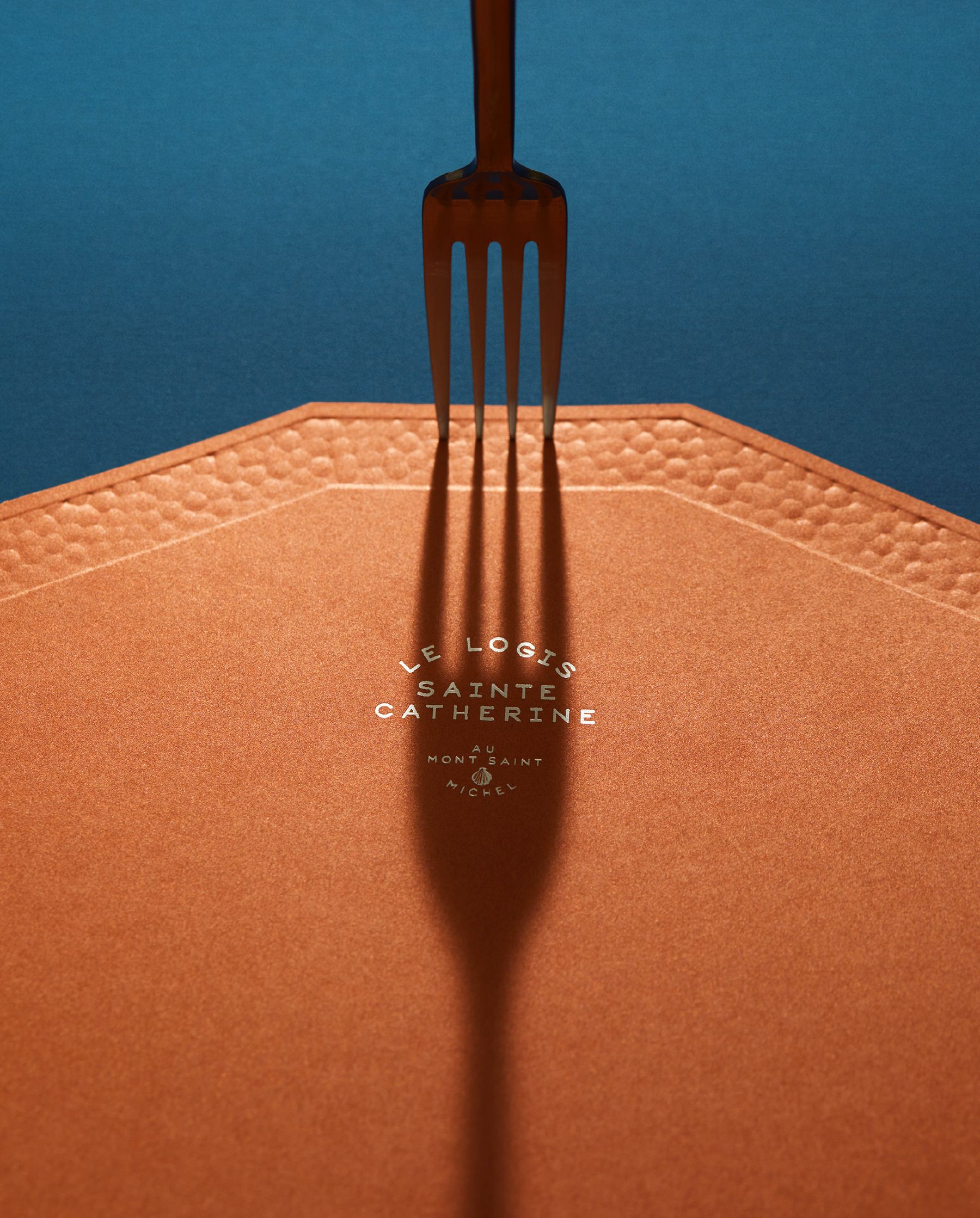
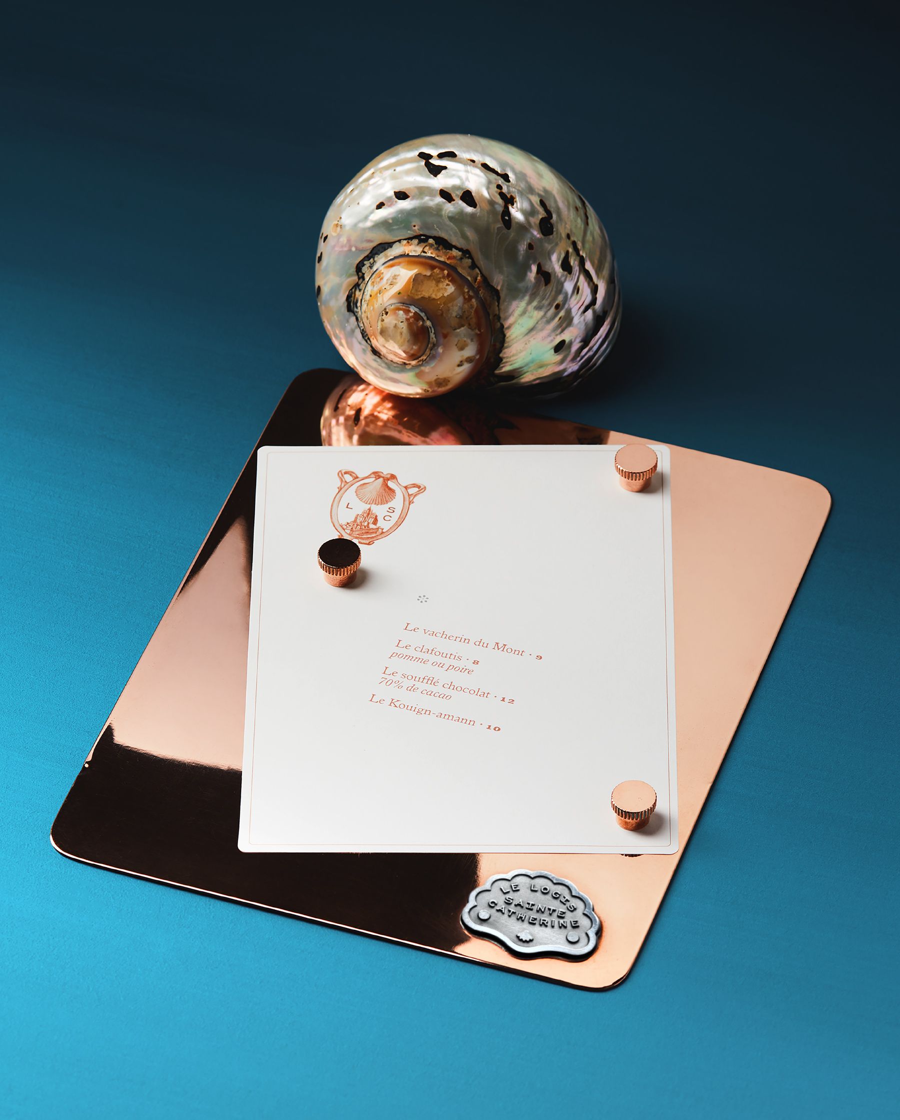
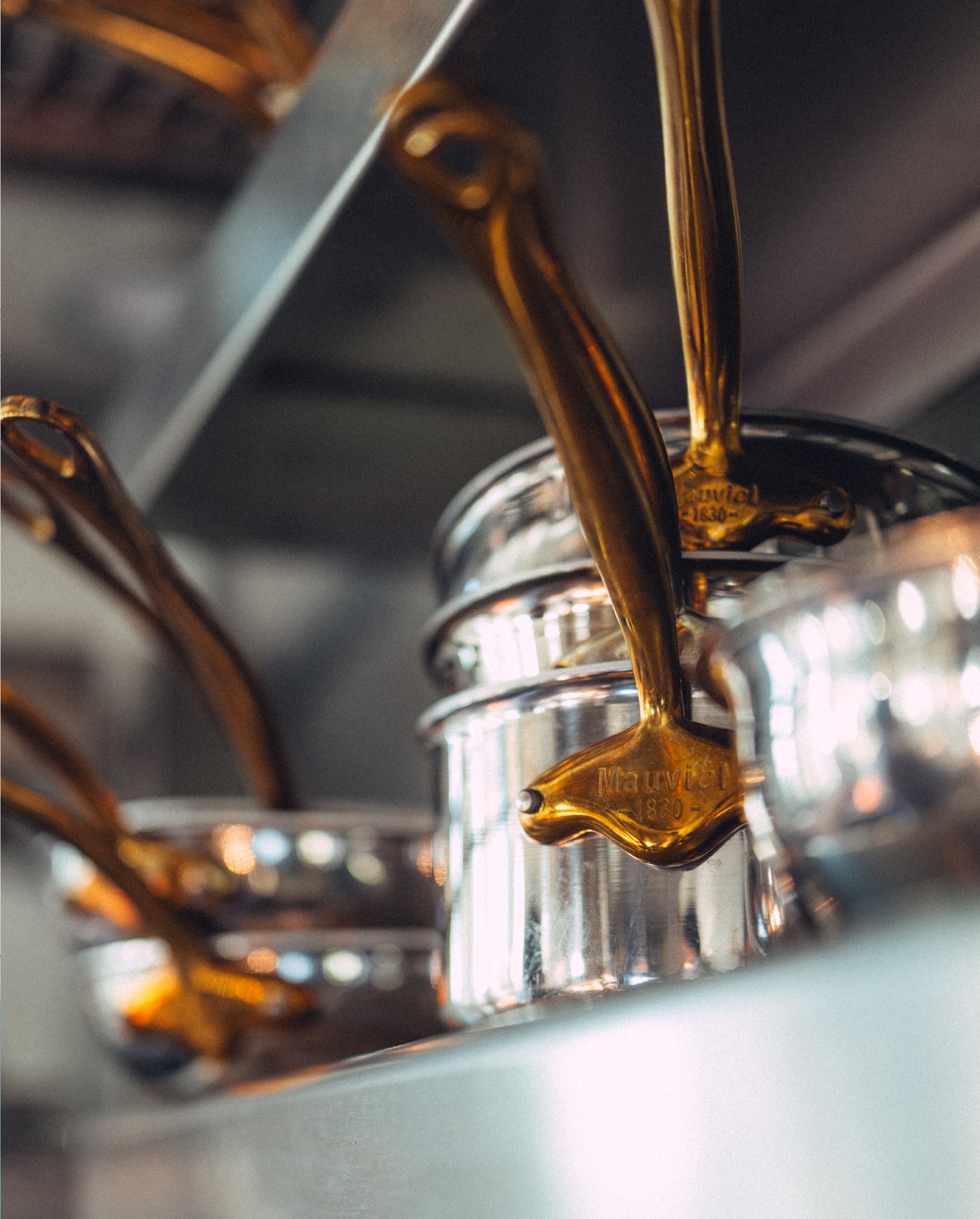
The project was developed in connection with Mauviel 1830, the historic cookware manufacturer. We wanted to pay tribute to Mauviel's iconic material: copper.
We designed the dessert menu holder: a dual-material plate made of copper on the front and aluminum on the back, with rivets specially designed for the project and a decorative aluminum plate as the object's signature. We worked in collaboration with
Etienne Chollet, our friend and metal craftsman.
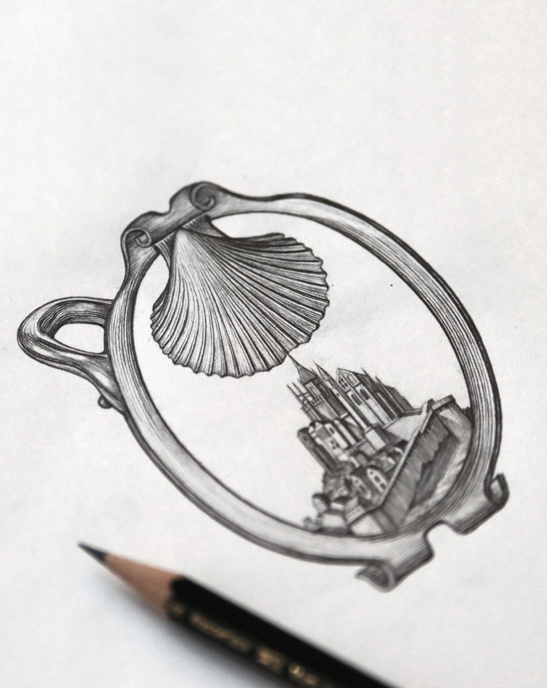
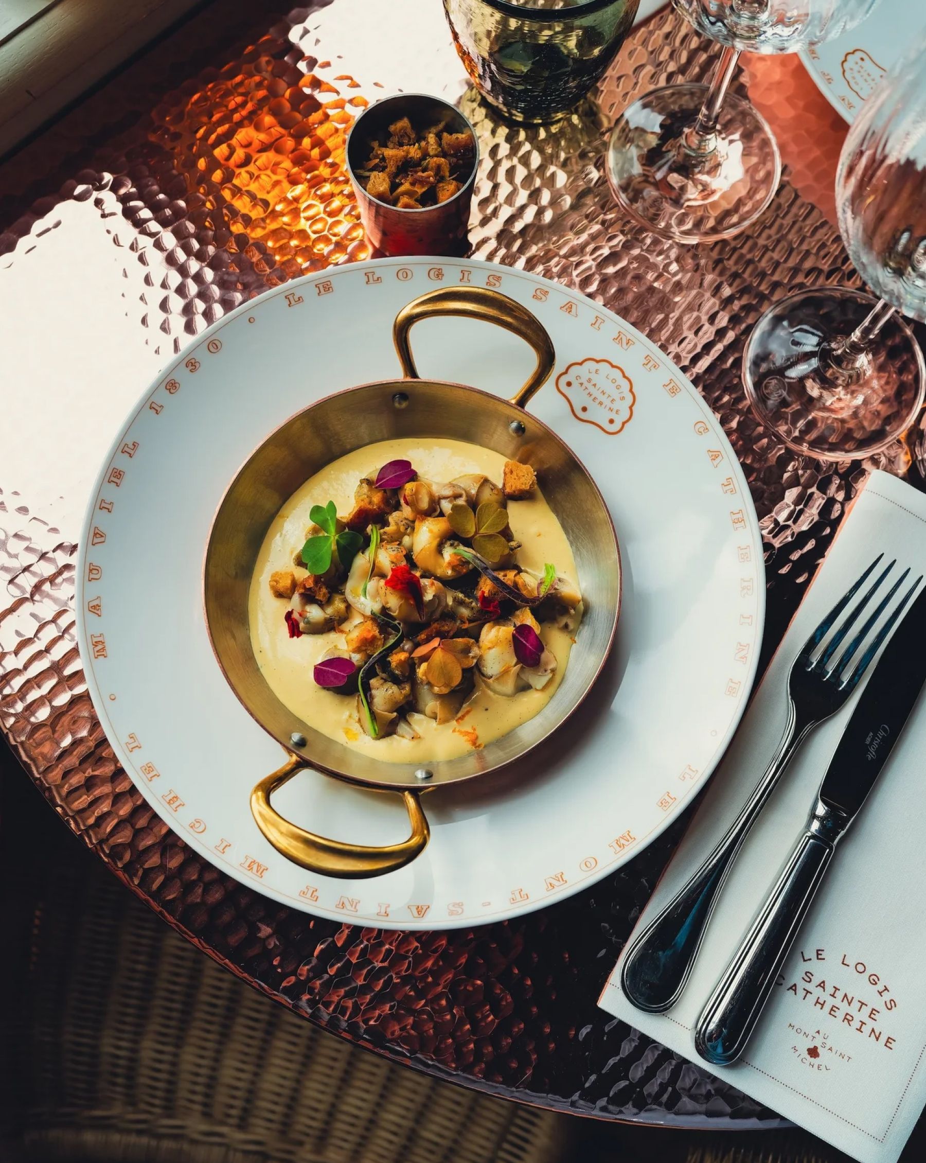
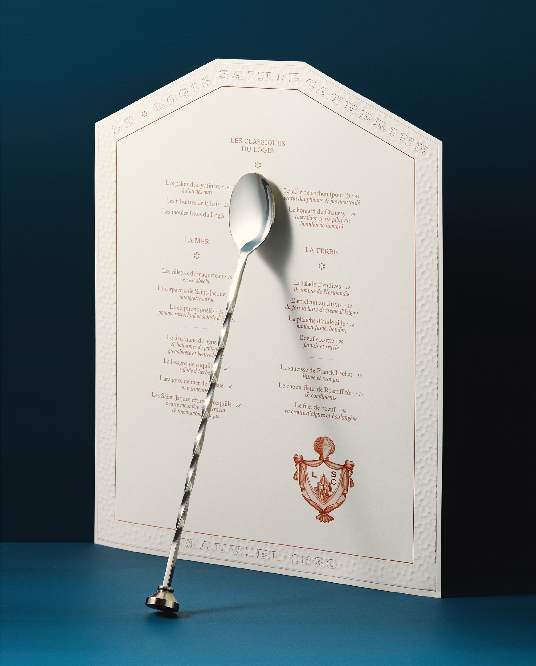
The main menu features a die-cut design inspired by the building shape. The texture,
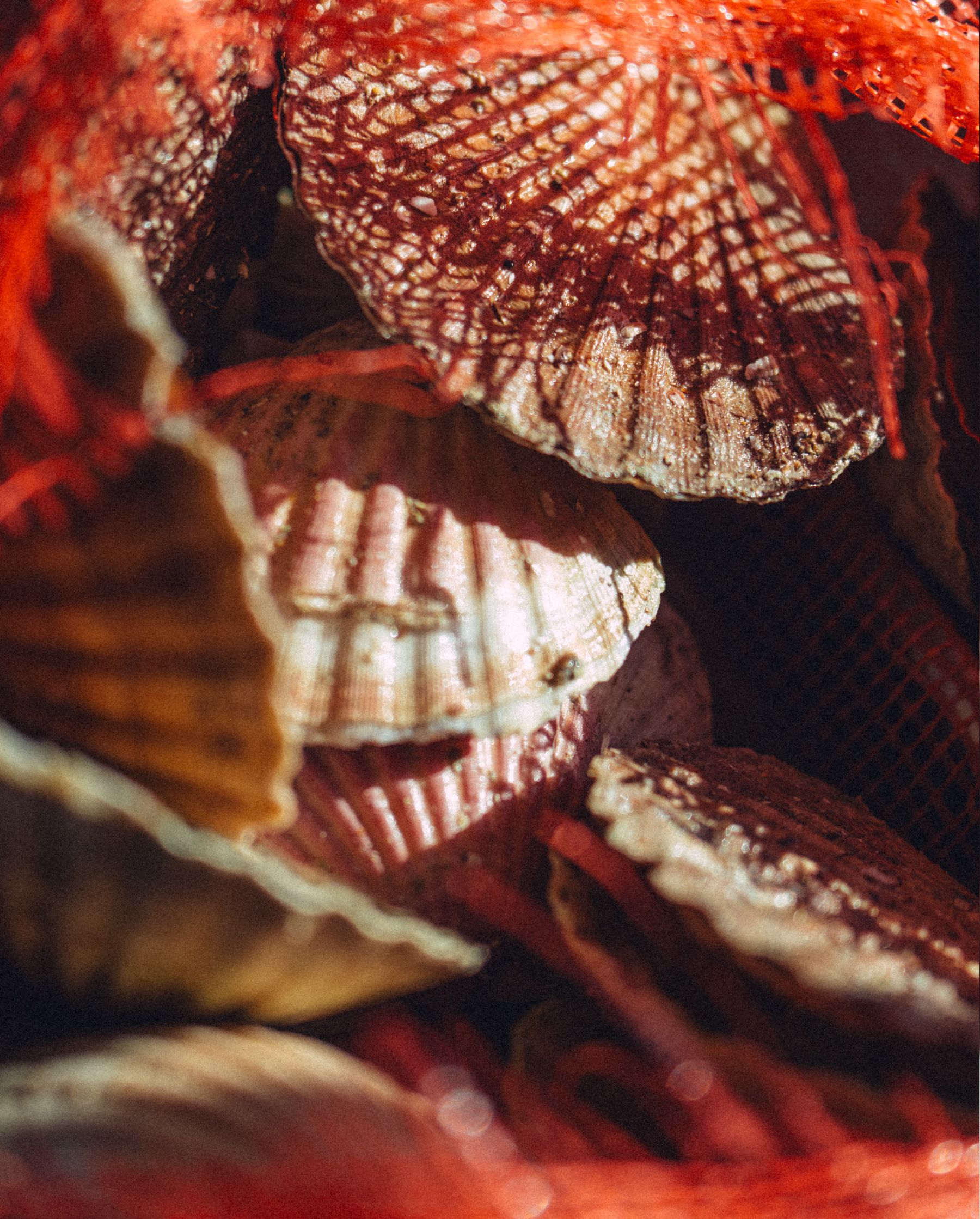
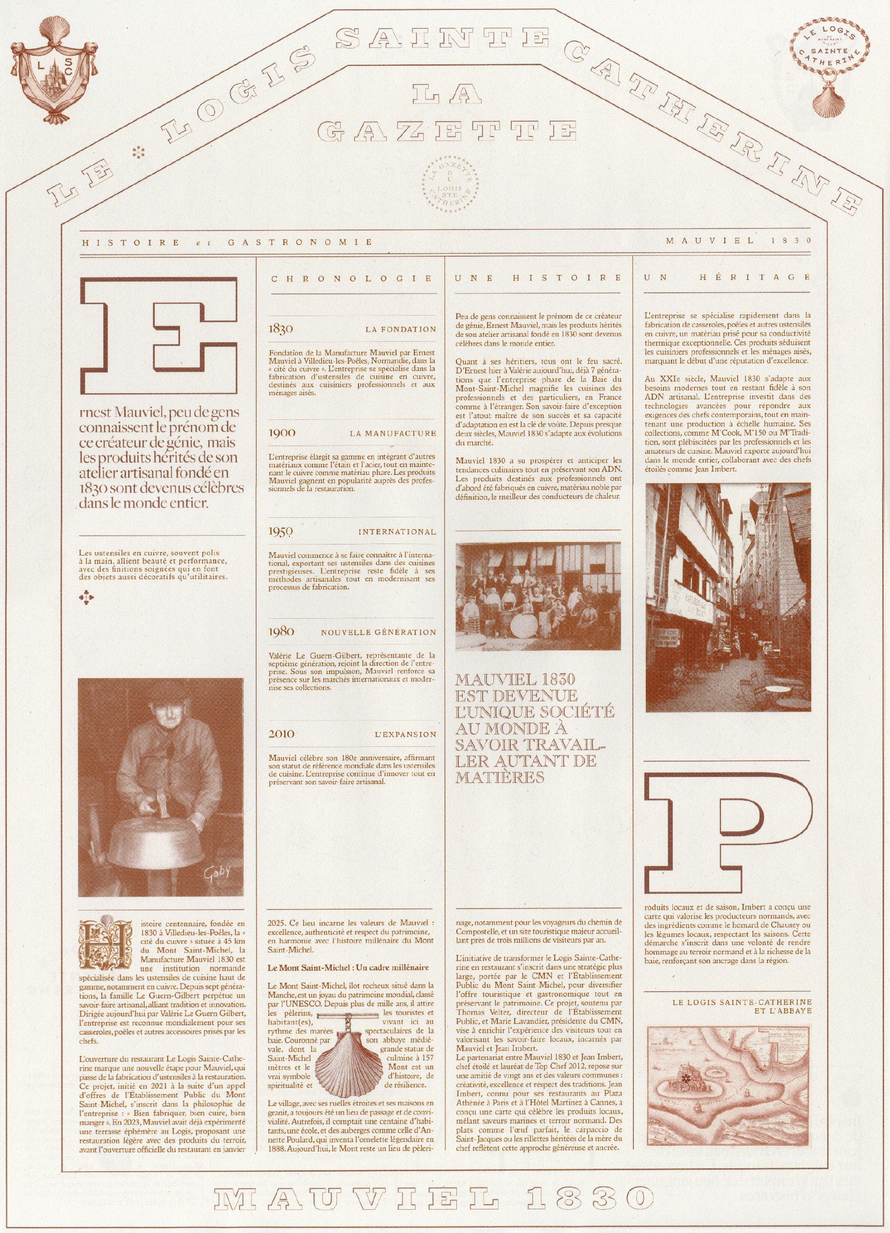
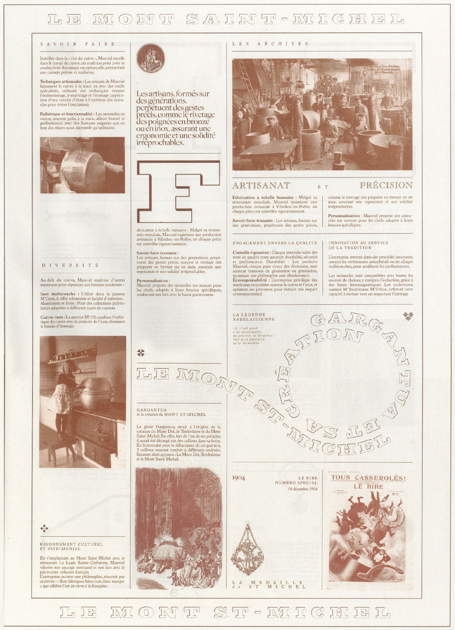
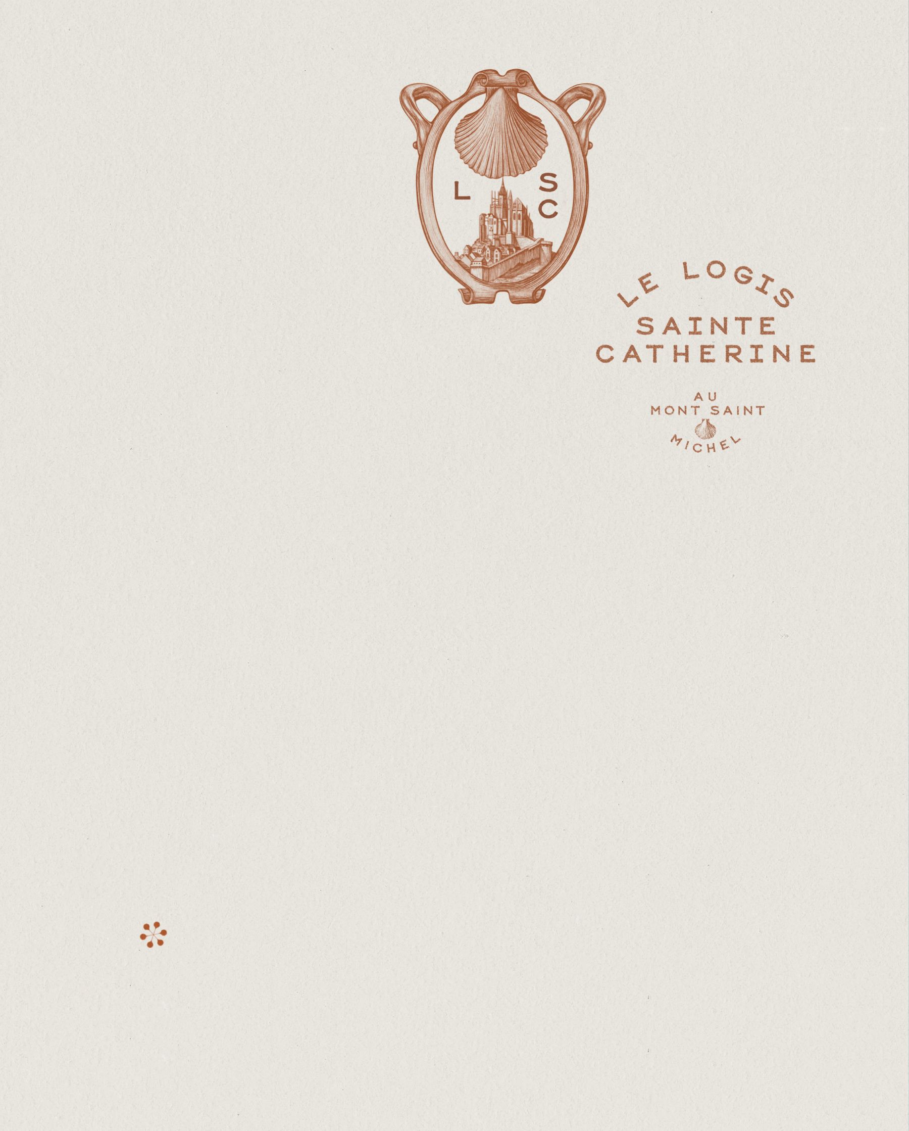
which is embossed along its edge, evokes the hand-hammered finish of Mauviel cookware. The identity also draws on the scallop (Saint-Jacques), the restaurant’s and regional emblematic dish. All the cabochons and monograms were hand-drawn and refer to the history of the Abbey of Mont Saint Michel. The typographic logotype is custom. We drew the tableware with manufacturer Bernardaud, and created the editorial object La Gazette du Logis.
We worked in collaboration with the Brittany-based architecture studio Bachmann
et Associés. ❉
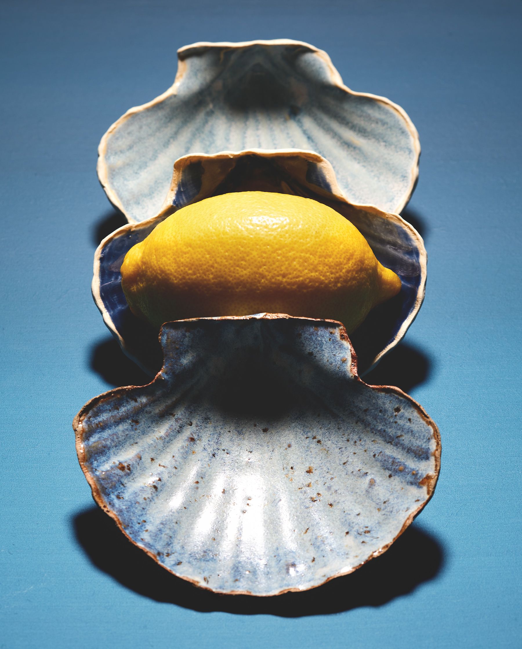
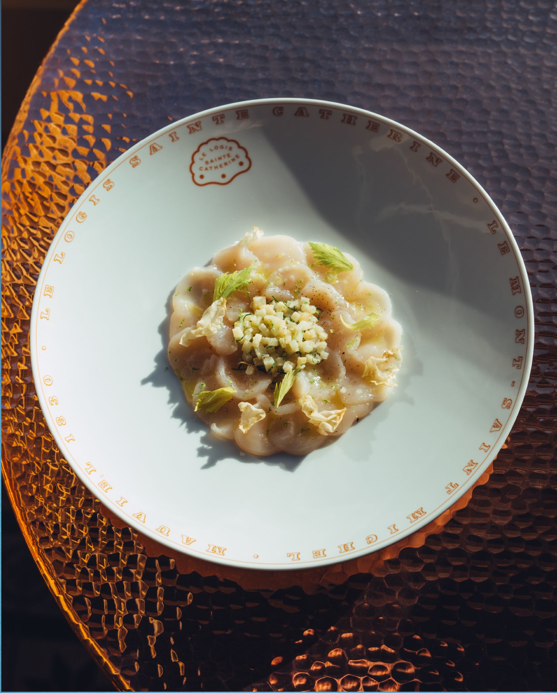
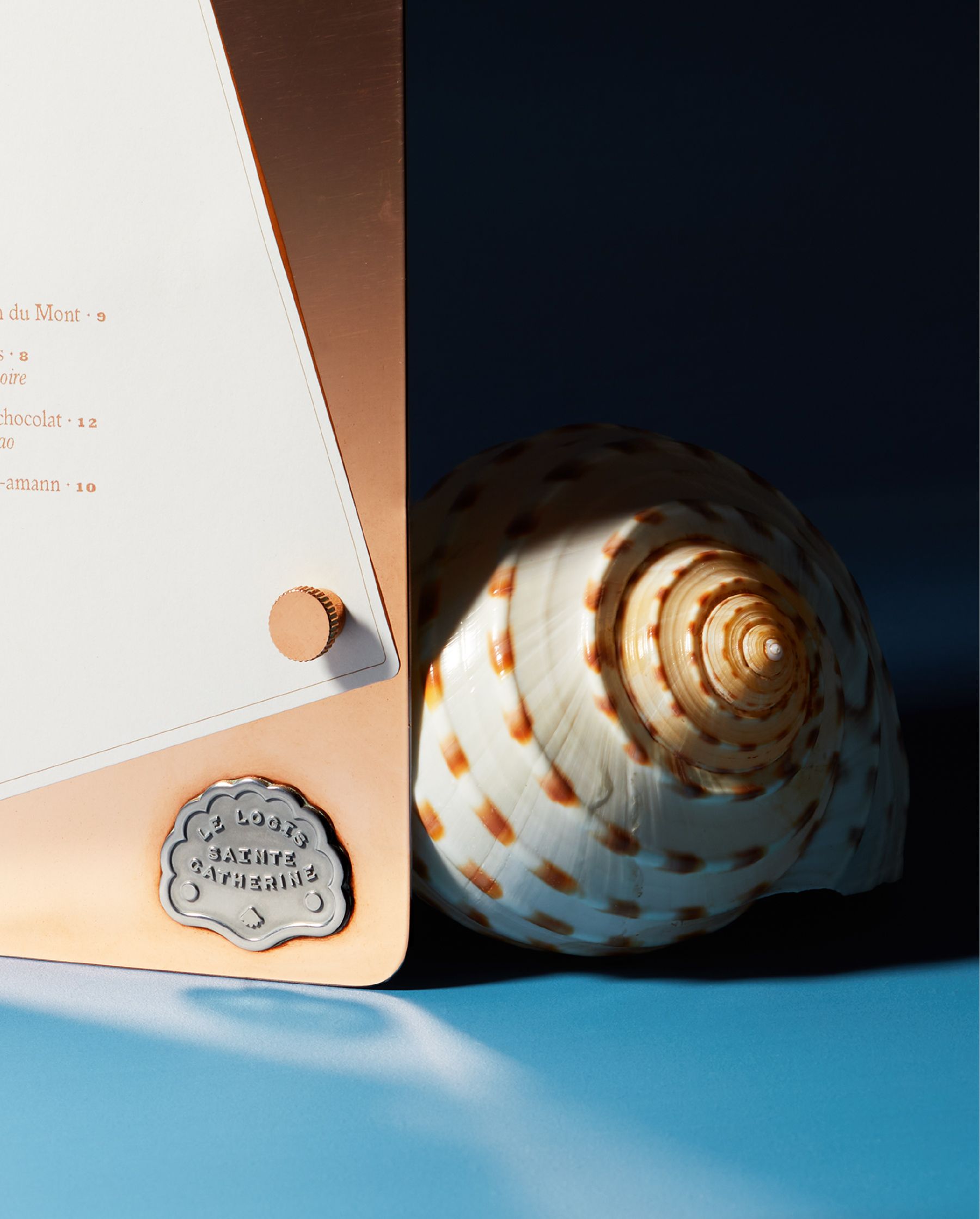
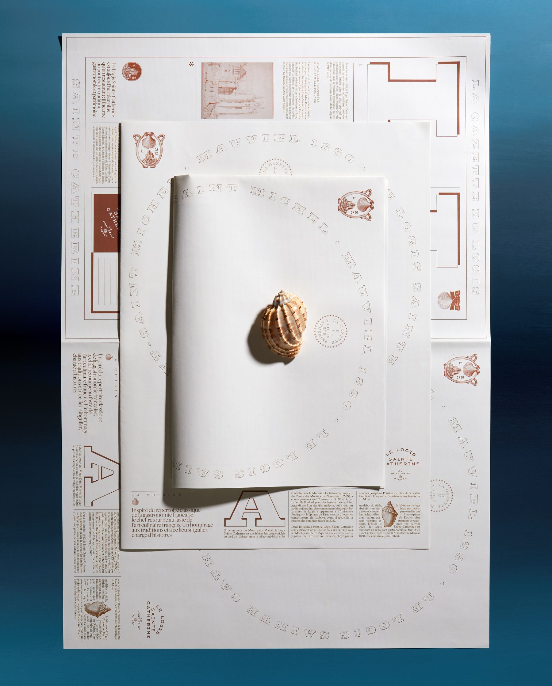
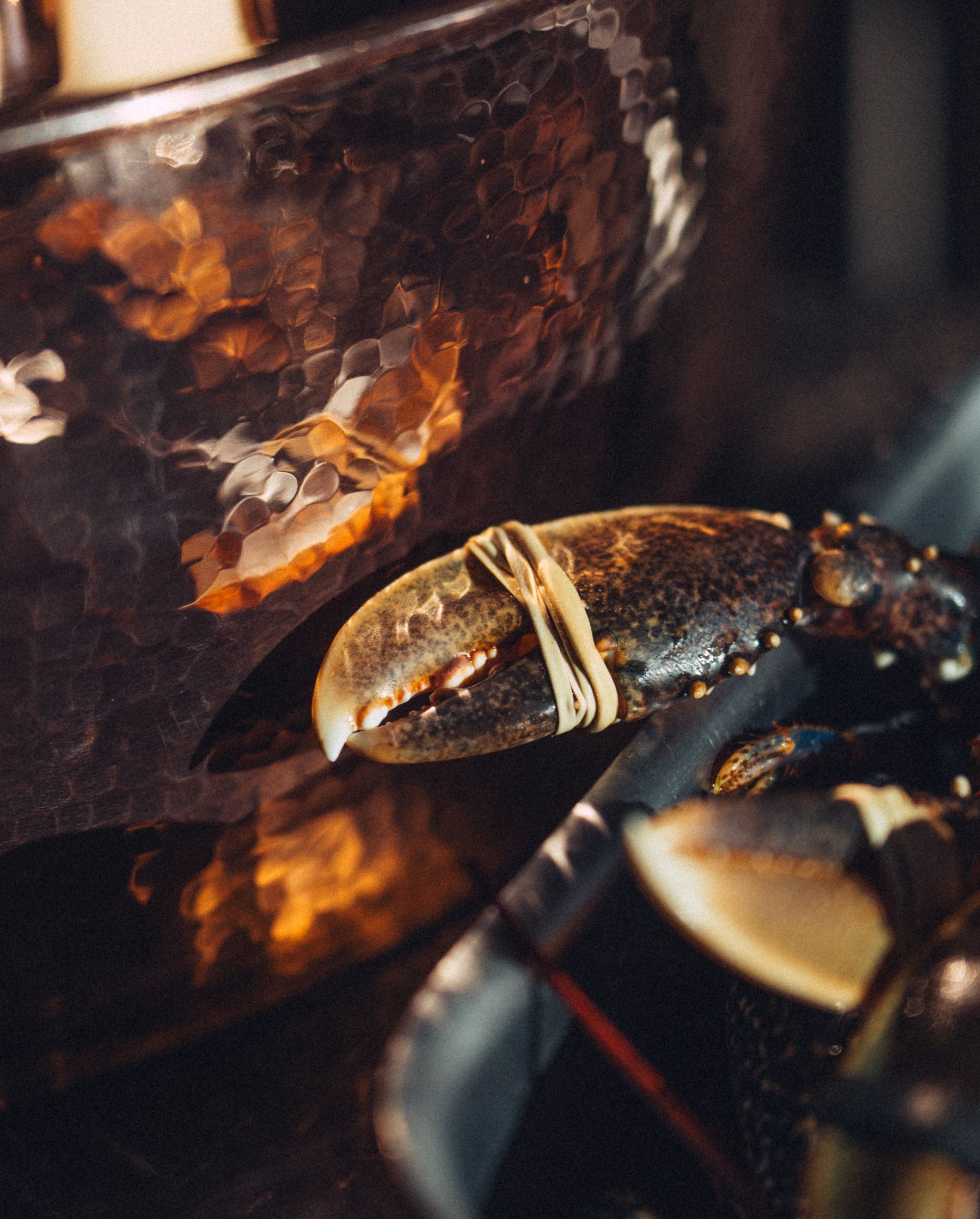
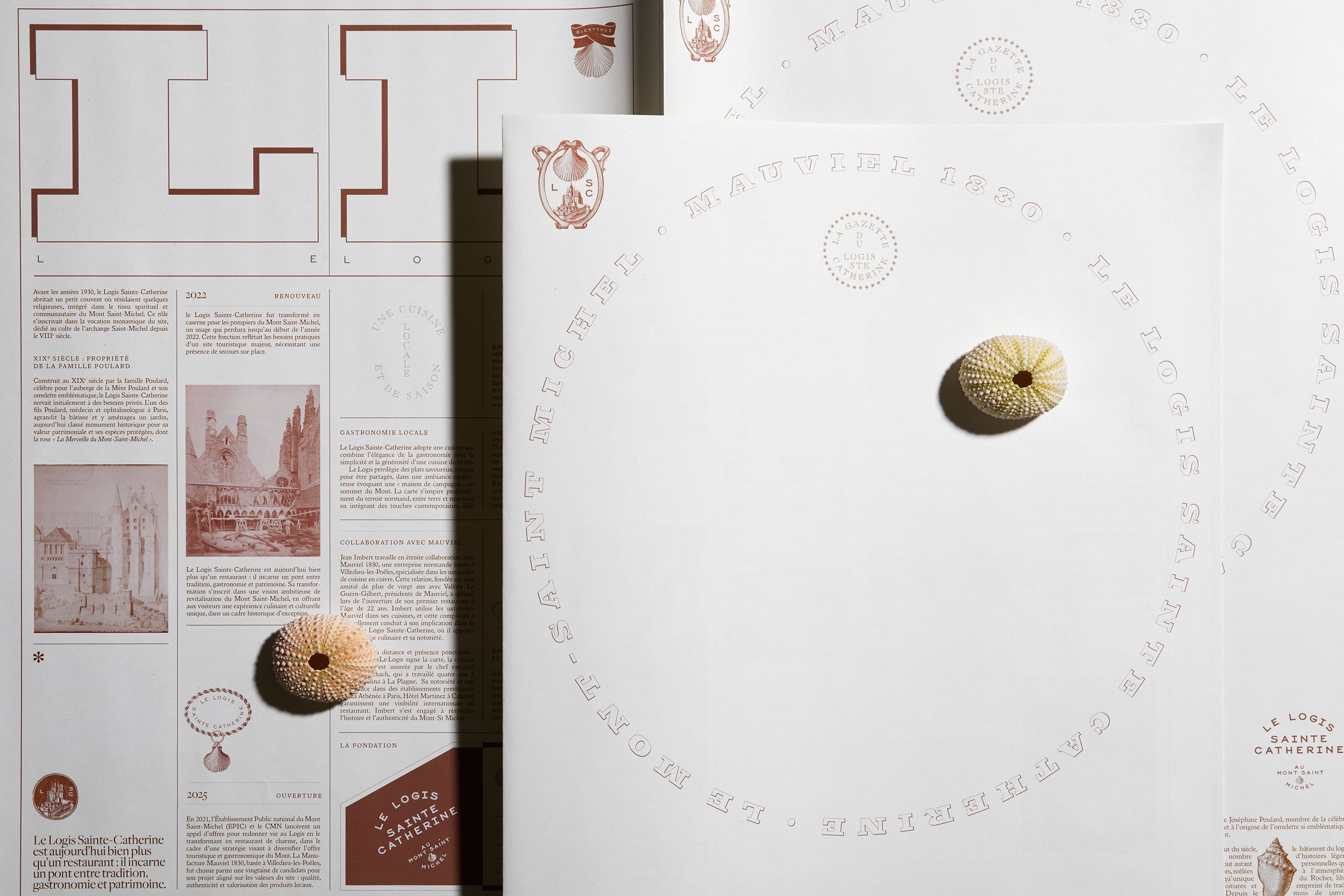
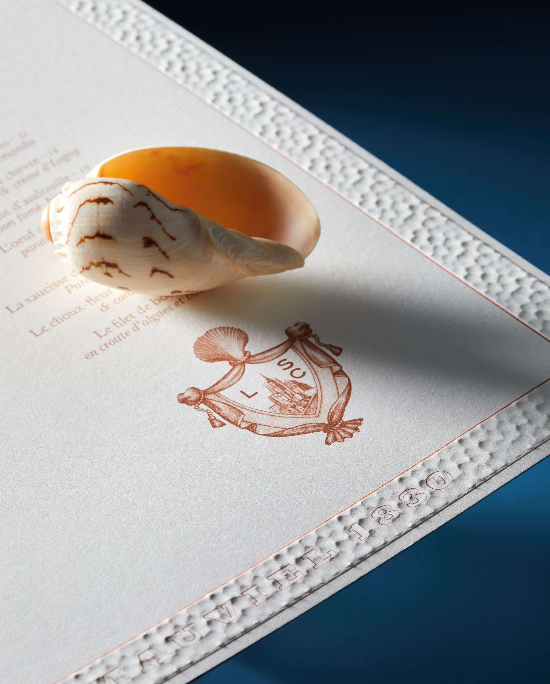
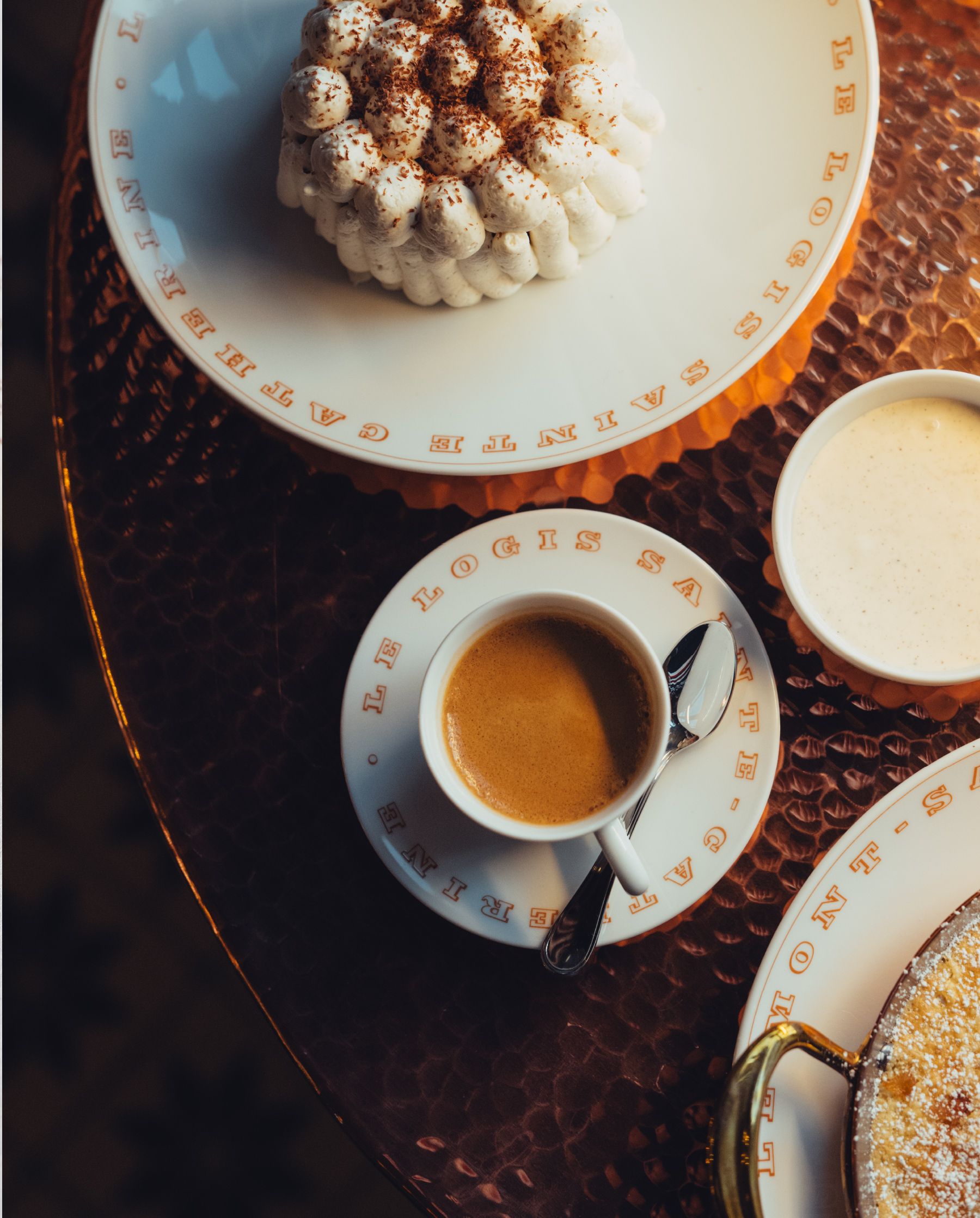
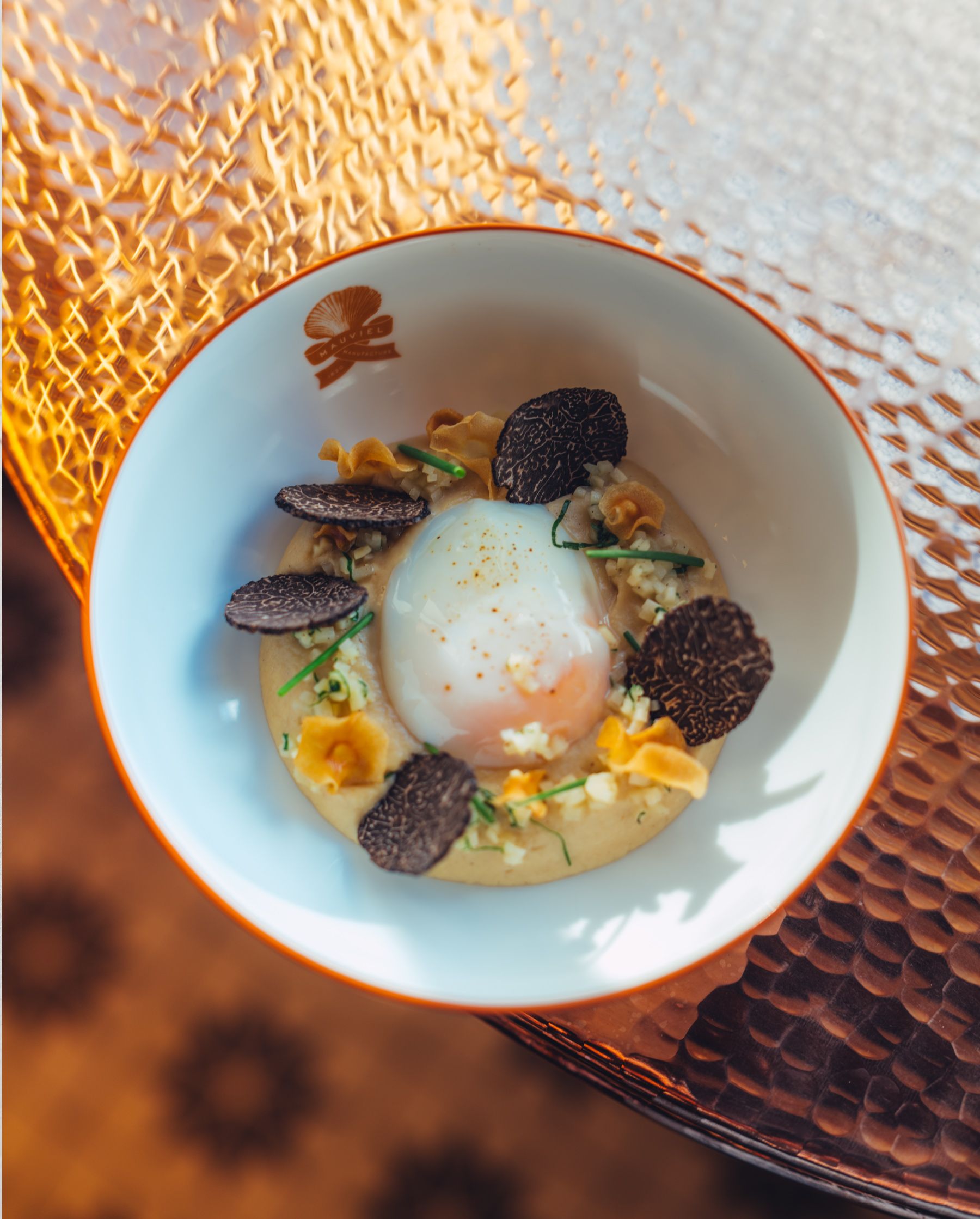
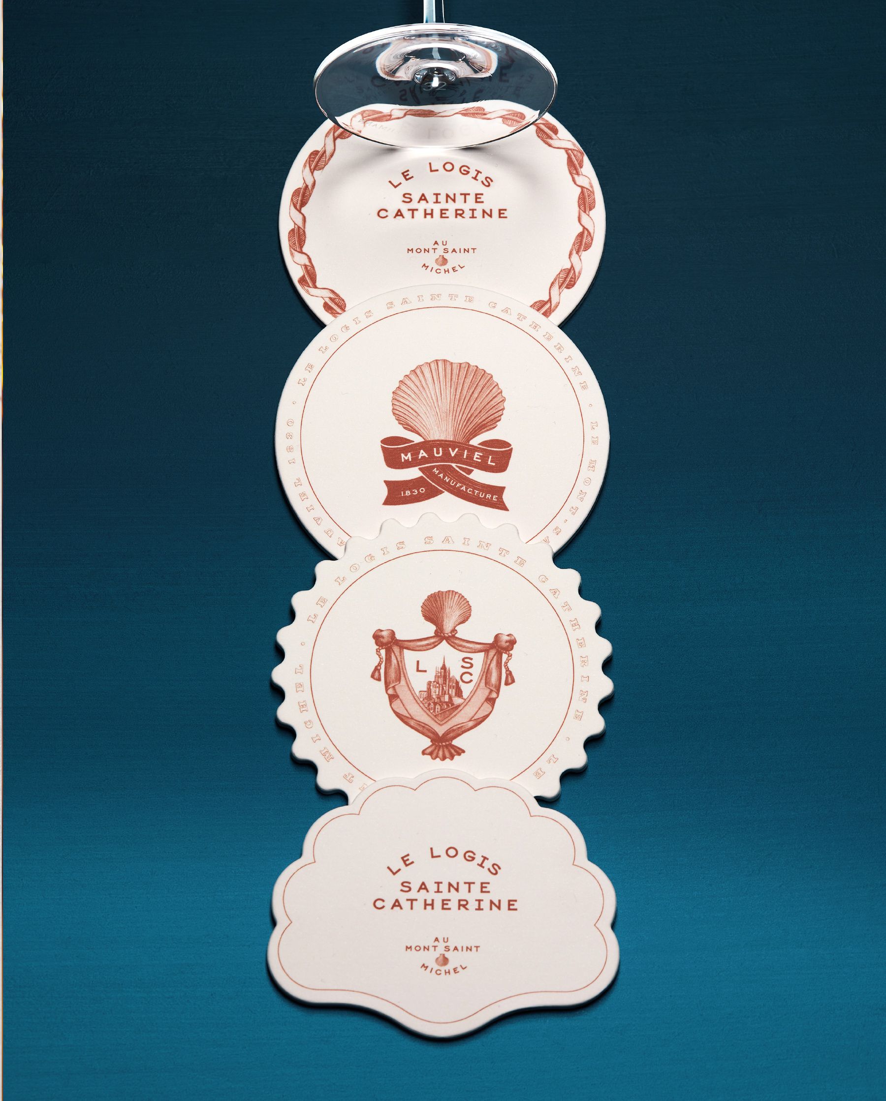
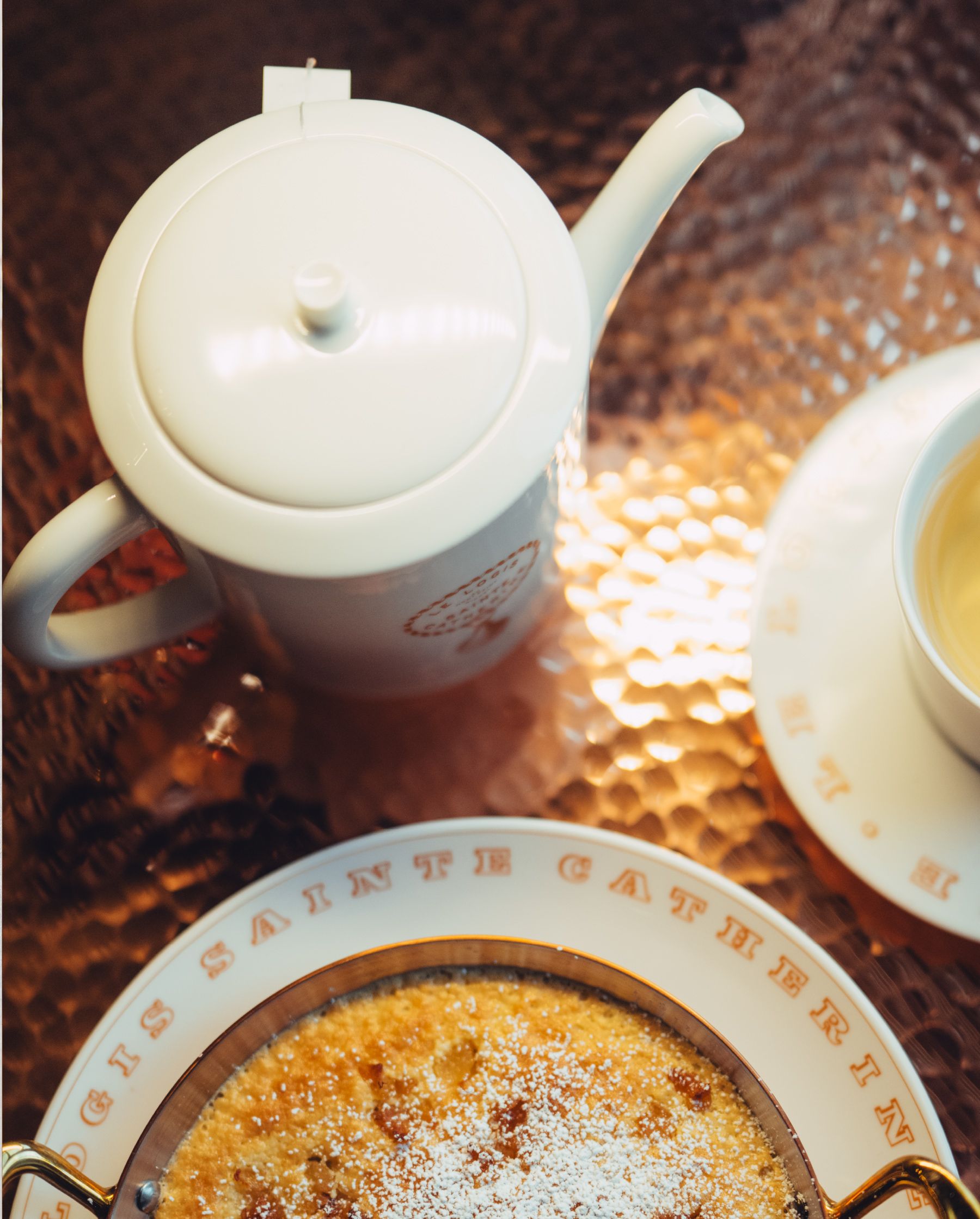
The identity also draws on the scallop (Saint-Jacques), the restaurant’s and regional emblematic dish. All the cabochons and monograms were hand-drawn and refer to the history of the Abbey of Mont Saint Michel.